我想要绘制具有特定值(例如:中位数/平均值等)的密度图。我还想在绘图区域上方显示选择的值(例如中位数),以使其不干扰分布本身。此外,现实生活中我的数据框更大、更多样化(具有更多类别),因此我希望展开标签,使它们彼此不干扰(我希望它们易读且视觉上愉悦)。
我在这里找到了类似的主题:ggrepel labels outside (to the right) of ggplot area 我尝试采用这种策略(通过固定x坐标而不是y坐标并扩大上边距),但无济于事。
以下是重现数据框:
以下是我得到的输出: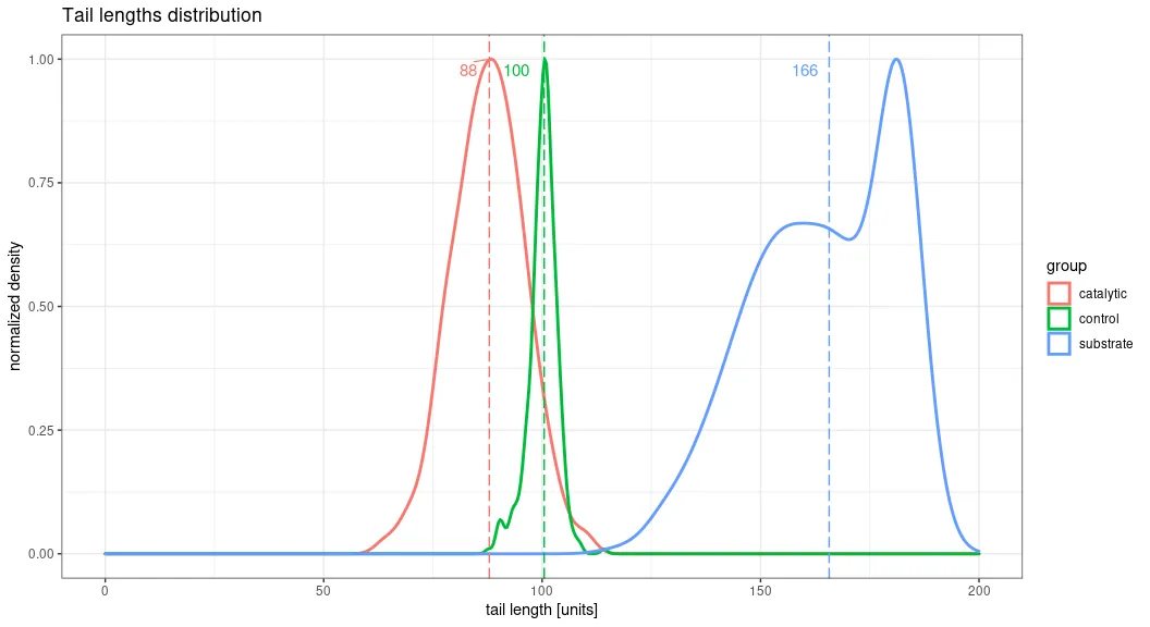 以下是我希望拥有的输出(抱歉图片质量较差,已在paint中编辑):
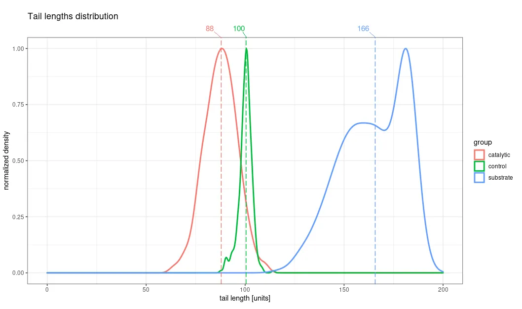
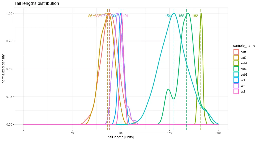
 此外,如果您更改“sample_name”的分组因素,则会看到更多“拥挤”的图形,更类似于我的现实数据。
我在这里找到了类似的主题:ggrepel labels outside (to the right) of ggplot area 我尝试采用这种策略(通过固定x坐标而不是y坐标并扩大上边距),但无济于事。
以下是重现数据框:
set.seed(123)

group <- c(rep("control",367), rep("catalytic",276), rep("substrate",304))
sample_name <- c(rep("wt1",100), rep("wt2",75), rep("wt3",192), rep("cat1",221), rep("cat2",55), rep("sub1",84), rep("sub2",67), rep("sub3",153))
tail_length<- c(rnorm(100, mean=100, sd=3), rnorm(75, mean=98, sd=5),rnorm(192, mean=101, sd=2),rnorm(221, mean=88, sd=9),rnorm(55, mean=87, sd=6),rnorm(84, mean=182, sd=2),rnorm(67, mean=165, sd=9),rnorm(153, mean=153, sd=14))

tail_data <- data.frame(group, sample_name,tail_length)
这是我的绘图函数:
plot_distribution_with_values <- function(input_data,value_to_show="mean", grouping_factor = "group", title="", limit="") {

  #determine the center values to be plotted as x intercepting line(s)
  center_values = input_data %>% dplyr::group_by(!!rlang::sym(grouping_factor)) %>% dplyr::summarize(median_value = median(tail_length,na.rm = TRUE),mean_value=mean(tail_length,na.rm=T))

  #main core of the plot
  plot_distribution <- ggplot2::ggplot(input_data, aes_string(x=tail_length,color=grouping_factor)) + geom_density(size=1, aes(y=..ndensity..)) + theme_bw() + scale_x_continuous(limits=c(0, as.numeric(limit))) + coord_cartesian(ylim = c(0, 1))

  if (value_to_show=="median") {
    center_value="median_value"
  }
  else if (value_to_show=="mean") {
    center_value="mean_value"
  }

  #Plot settings (aesthetics, geoms, axes behavior etc.):
  g.line <- ggplot2::geom_vline(data=center_values,aes(xintercept=!!rlang::sym(center_value),color=!!rlang::sym(grouping_factor)),linetype="longdash",show.legend = FALSE)
  g.labs <- ggplot2::labs(title= "Tail lengths distribution",
                          x="tail length [units]",
                          y= "normalized density",
                          color=grouping_factor)
  g.values <- ggrepel::geom_text_repel(data=center_values,aes(x=round(!!rlang::sym(center_value)),y=length(data),color=!!rlang::sym(grouping_factor),label=formatC(round(!!rlang::sym(center_value)),digits=1,format = "d")),size=4, direction = "x", segment.size = 0.4, show.legend =F, hjust =0, xlim = c(0,200), ylim = c(0, 1))


  #Overall plotting configuration:
  plot <- plot_distribution + g.line + g.labs + g.values


  return(plot)
}
这里是一个函数调用的示例:
plot_distribution_with_values(tail_data, value_to_show = "median", grouping_factor = "group", title = "Tail plot", limit=200)
以下是我得到的输出:
以下是我希望拥有的输出(抱歉图片质量较差,已在paint中编辑):
此外,如果您更改“sample_name”的分组因素,则会看到更多“拥挤”的图形,更类似于我的现实数据。
