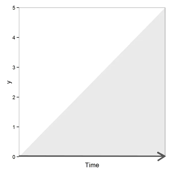
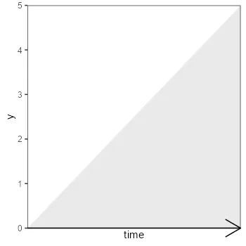
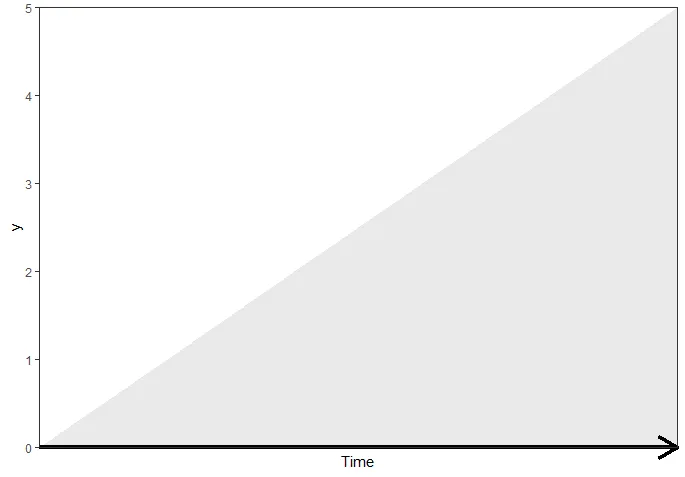
我想添加一个有颜色的箭头(轴的全部长度)以显示时间向一个方向移动(可以假定,但对于这个图表没有数值,因此我希望箭头显示方向)。我可以使用
我看过这篇文章:R & ggplot2:如何在坐标轴标签下获取箭头? 但是这种解决方法是对轴标题的黑客攻击。这篇文章:https://dev59.com/Ymkv5IYBdhLWcg3wiRWo#10542622 显示文本区域外的线条,但不是彩色箭头。 MWE
geom_segment来绘制它,但是在图形区域之外的部分会被省略。我看过这篇文章:R & ggplot2:如何在坐标轴标签下获取箭头? 但是这种解决方法是对轴标题的黑客攻击。这篇文章:https://dev59.com/Ymkv5IYBdhLWcg3wiRWo#10542622 显示文本区域外的线条,但不是彩色箭头。 MWE
library(ggplot2); library(grid); library(scales)

dat <- data.frame(Time=0:5, y=0:5)

ggplot(dat, aes(x=Time, y=y)) +
    geom_area(alpha=.1) + theme_bw() +
    scale_y_continuous(expand = c(0, 0)) +
    scale_x_continuous(expand = c(0, 0)) +
    theme(panel.grid.major = element_blank(),
        panel.grid.minor = element_blank(),
          axis.text.x=element_blank(),
          axis.ticks.x=element_blank()
    )
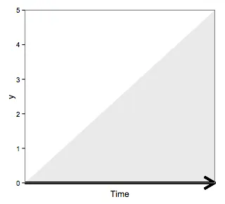
我尝试过:
ggplot(dat, aes(x=Time, y=y)) +
    geom_area(alpha=.1) + theme_bw() +
    scale_y_continuous(expand = c(0, 0)) +
    scale_x_continuous(expand = c(0, 0)) +
    theme(panel.grid.major = element_blank(),
        panel.grid.minor = element_blank(),
          axis.text.x=element_blank(),
          axis.ticks.x=element_blank()
    ) +
    geom_segment(aes(x=0, xend = 5 , y=0, yend = 0), size=1.5,
        arrow = arrow(length = unit(0.6,"cm")))
给予
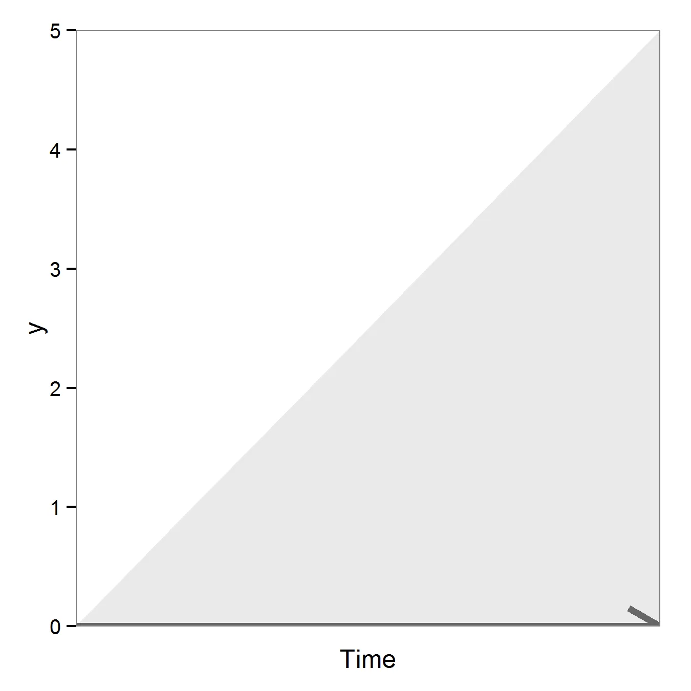
但是我想要的是