我有一个带有y轴标签的图表(在使用coord_flip之后)
这是一个可复现的例子
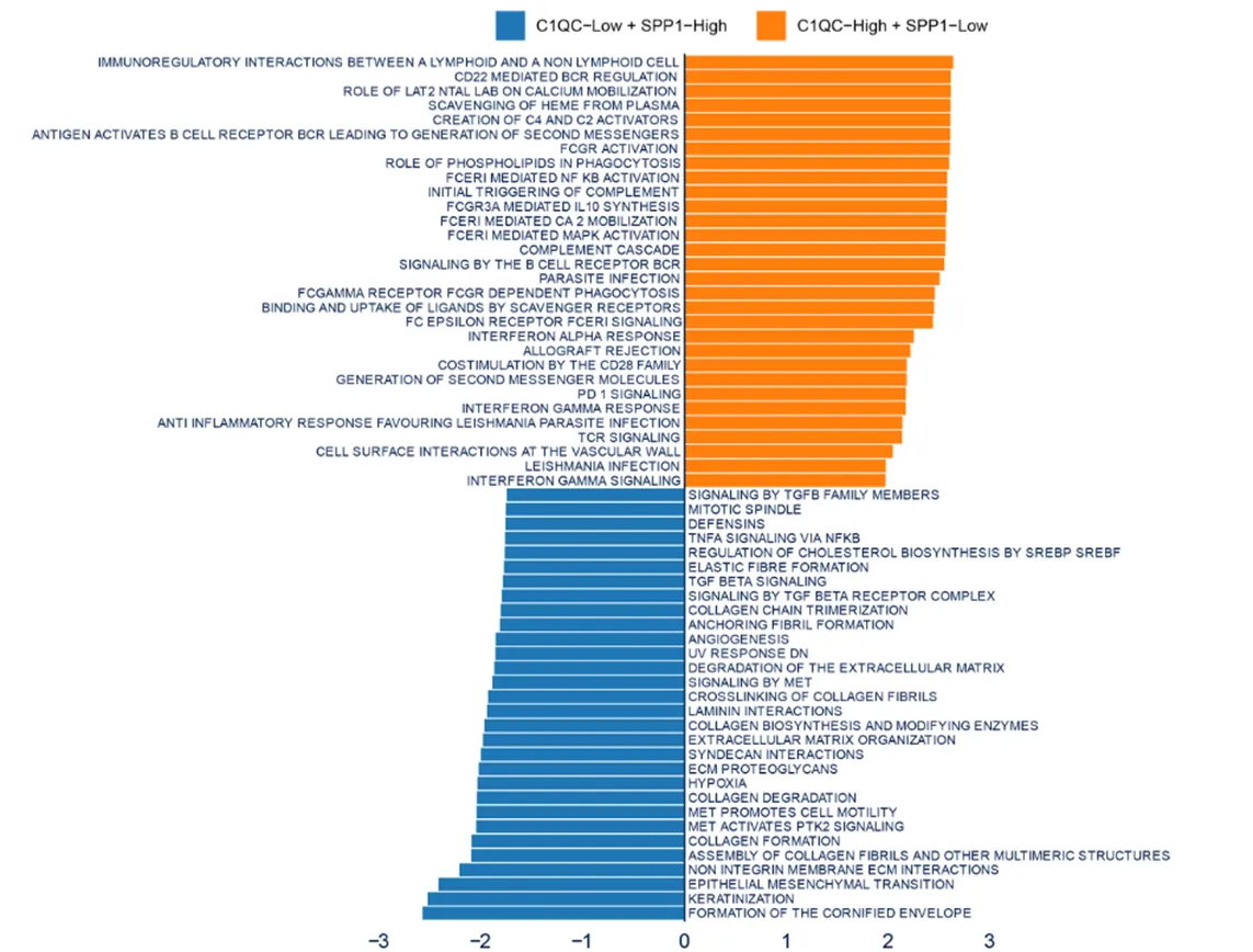 (Li等人,2021年 https://doi.org/10.3389/fimmu.2021.694801)。
我尝试了: ggplot:将轴文本放在图内 但没有成功。
这个。
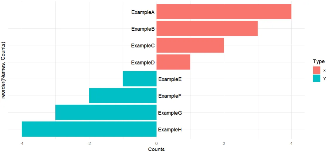
Names <- c("ExampleA","ExampleB","ExampleC","ExampleD", "ExampleE", "ExampleF","ExampleG", "ExampleH")
Counts <- c(4,3,2,1,-1,-2,-3,-4)
Type <- c("X","X","X","X", "Y","Y","Y","Y")
df <-data.frame(Names,Counts, Type)

ggplot(df, aes(x=reorder(Names,Counts), y=Counts, fill=Type))+
  geom_col()+
  coord_flip()+
  theme_minimal()
我希望标签写在柱状图旁边。也就是说,“ExampleA/B/C/D”等应该紧挨着柱状图写,而不是列在y轴上。 或者用可视化的方式来表达: 我现在的情况
(Li等人,2021年 https://doi.org/10.3389/fimmu.2021.694801)。我尝试了: ggplot:将轴文本放在图内 但没有成功。
这个。
geom_label(label=Names, parse=TRUE)
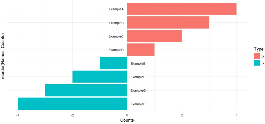
接近但不是我想要的(而且对于真实数据而言,只有在我将每个名称逐个键入向量时才起作用,如果不必要的话我希望避免这样做)。 我希望有一种类似的方法
geom_label(label=Names, position="inside")
或者
scale_x_discrete(position = "inside")
可能是可以的,但到目前为止我还没有找到任何相关的东西。