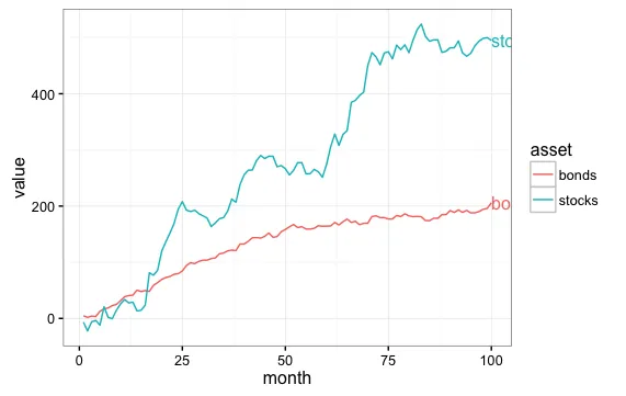
在我看来,直接标签是可行的方式。实际上,我会将标签放置在行的开头和结尾,并利用
expand()为标签创建空间。此外,请注意,有了标签,就不需要图例。
这类似于
这里和
这里的答案。
library(ggplot2)
library(directlabels)
library(grid)
library(tidyr)

x <- seq(1:100)
y <- cumsum(rnorm(n = 100, mean = 6, sd = 15))
y2 <- cumsum(rnorm(n = 100, mean = 2, sd = 4))
data <- as.data.frame(cbind(x, y, y2))
names(data) <- c("month", "stocks", "bonds")
tidy_data <- gather(data, month)
names(tidy_data) <- c("month", "asset", "value")

ggplot(tidy_data, aes(x = month, y = value, colour = asset, group = asset)) +
     geom_line() +
     scale_colour_discrete(guide = 'none')  +
     scale_x_continuous(expand = c(0.15, 0)) +
     geom_dl(aes(label = asset), method = list(dl.trans(x = x + .3), "last.bumpup")) +
     geom_dl(aes(label = asset), method = list(dl.trans(x = x - .3), "first.bumpup")) +
     theme_bw()
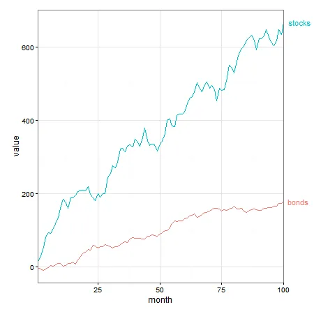
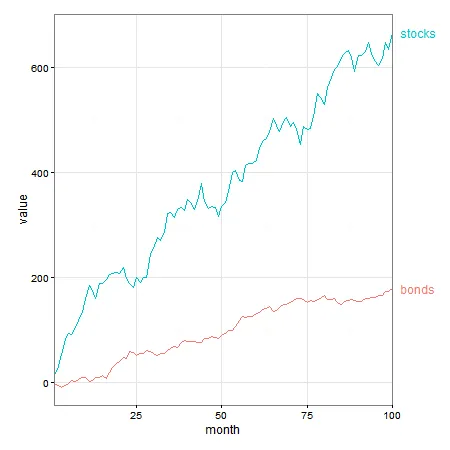
如果您希望将标签推入图形边缘,直接标签可以做到这一点。但是由于标签位于绘图面板外部,所以需要关闭裁剪。
p1 <- ggplot(tidy_data, aes(x = month, y = value, colour = asset, group = asset)) +
geom_line() +
scale_colour_discrete(guide = 'none') +
scale_x_continuous(expand = c(0, 0)) +
geom_dl(aes(label = asset), method = list(dl.trans(x = x + .3), "last.bumpup")) +
theme_bw() +
theme(plot.margin = unit(c(1,4,1,1), "lines"))
gt1 <- ggplotGrob(p1)
gt1$layout$clip[gt1$layout$name == "panel"] <- "off"
grid.draw(gt1)
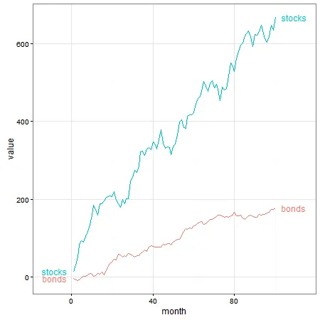
这种效果也可以使用
geom_text(可能还包括
annotate)实现,而无需直接标记。
p2 = ggplot(tidy_data, aes(x = month, y = value, group = asset, colour = asset)) +
geom_line() +
geom_text(data = subset(tidy_data, month == 100),
aes(label = asset, colour = asset, x = Inf, y = value), hjust = -.2) +
scale_x_continuous(expand = c(0, 0)) +
scale_colour_discrete(guide = 'none') +
theme_bw() +
theme(plot.margin = unit(c(1,3,1,1), "lines"))
gt2 <- ggplotGrob(p2)
gt2$layout$clip[gt2$layout$name == "panel"] <- "off"
grid.draw(gt2)