在使用ggplot绘制具有相同x轴的折线图和条形图时,是否有一种方法可以使折线图的点与条形图的条对齐?以下是我试图使用的样本数据。
library(ggplot2)
library(gridExtra)

data=data.frame(x=rep(1:27, each=5), y = rep(1:5, times = 27))
yes <- ggplot(data, aes(x = x, y = y))
yes <- yes + geom_point() + geom_line()

other_data = data.frame(x = 1:27, y = 50:76  )

no <- ggplot(other_data, aes(x=x, y=y))
no <- no + geom_bar(stat = "identity")

grid.arrange(no, yes)
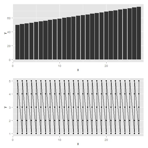
这里是输出结果:
线状图的第一个点位于第一条柱形图的左侧,而线状图的最后一个点位于最后一条柱形图的右侧。
感谢您的时间。