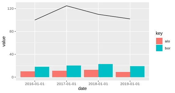
将两列数据绘制成柱状图,将第三列数据绘制成折线图,使用ggplot。

3

我的数据框长这样:

df <- data.frame(date = c('2016-01-01', '2017-01-01', '2018-01-01', '2019-01-01'),
                 "alo" = c(10, 11, 12.5, 9),
                 "bor" = c(18, 20, 23, 19),
                 "car" = c(100, 125, 110, 102)) %>%
  gather(-date, key = "key", value = "value")

我想在同一个图上绘制alo和bor两列的条形图,因此我收集了df。然而,我希望将car列作为线图而不是与其他列一起作为条形图绘制在同一张图上。

目前,我的绘图代码如下:

ggplot(df, aes(date, value, fill = key)) +
           geom_bar(stat = 'identity', position = "dodge")

请指导我如何将第三列的柱状图改为折线图。谢谢!
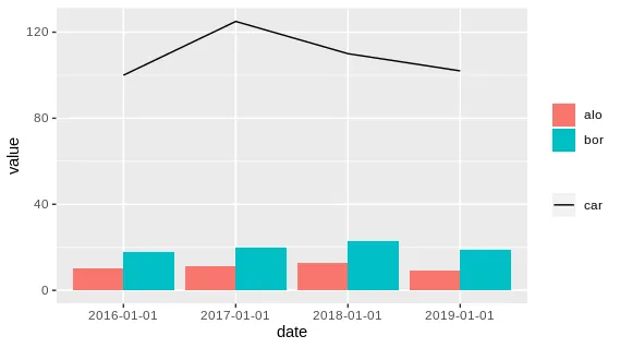
1个回答

6

在条形图中,只需要收集你想要的列:

df <- data.frame(date = c('2016-01-01', '2017-01-01', '2018-01-01', '2019-01-01'),
                 "alo" = c(10, 11, 12.5, 9),
                 "bor" = c(18, 20, 23, 19),
                 "car" = c(100, 125, 110, 102)) %>%
  gather(alo, bor, key = "key", value = "value")

ggplot(df, aes(date)) +
  geom_col(aes(y = value, fill = key), position = "dodge") +
  geom_line(aes(y = car, group = 1))

enter image description here

如果您想在图例中添加一个car标签,请进行一些诡计:
ggplot(df, aes(date)) +
  geom_col(aes(y = value, fill = key), position = "dodge") +
  geom_line(aes(y = car, group = 1, col = 'car')) +
  scale_color_manual(values = 'black') +
  labs(color = NULL, fill = NULL)

enter image description here


2
@Moshee 我会坚持使用上面的解决方案,但是如果你gather所有列,然后使用适当的数据子集传递给geom_colgeom_line。像这样:ggplot() + geom_col(data = df %>% filter(key != "car"), aes(date, value, fill = key), position = "dodge") + geom_line(data = df %>% filter(key == "car"), aes(date, value, group = 1)) - AntoniosK
2
@AntoniosK,更进一步的技巧是,你实际上可以将一个函数传递给数据参数,这意味着你可以使用例如geom_col(data = . %>% filter(key != "car") .....,这样你就不必多次定义你的数据框。 - Axeman

网页内容由stack overflow 提供, 点击上面的
可以查看英文原文,
原文链接