我有一个带有一些相关值的矩阵。现在我想要将其绘制成一个看起来差不多的图形。
ellipse:plotcorr创建的。 - daroczig快速、简单、大致正确:
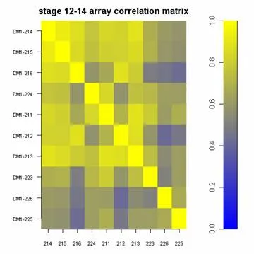
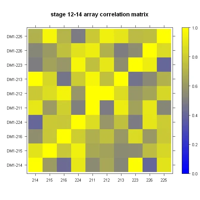
library(lattice)

#Build the horizontal and vertical axis information
hor <- c("214", "215", "216", "224", "211", "212", "213", "223", "226", "225")
ver <- paste("DM1-", hor, sep="")

#Build the fake correlation matrix
nrowcol <- length(ver)
cor <- matrix(runif(nrowcol*nrowcol, min=0.4), nrow=nrowcol, ncol=nrowcol, dimnames = list(hor, ver))
for (i in 1:nrowcol) cor[i,i] = 1

#Build the plot
rgb.palette <- colorRampPalette(c("blue", "yellow"), space = "rgb")
levelplot(cor, main="stage 12-14 array correlation matrix", xlab="", ylab="", col.regions=rgb.palette(120), cuts=100, at=seq(0,1,0.01))
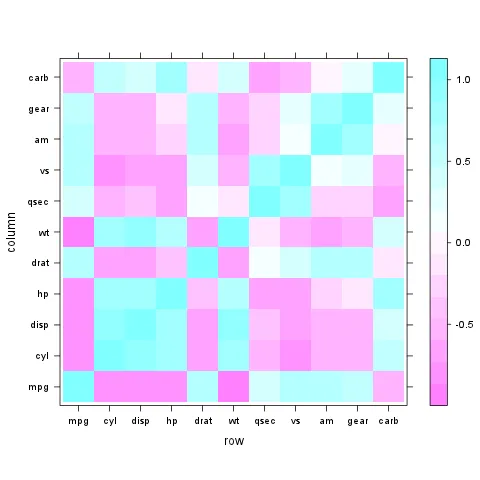
使用lattice::levelplot非常简单:
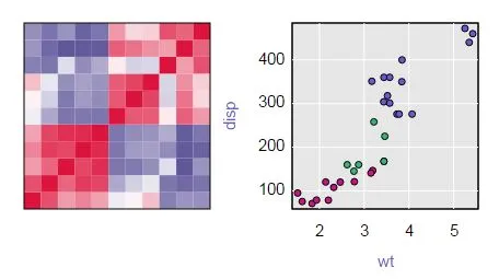
z <- cor(mtcars)
require(lattice)
levelplot(z)
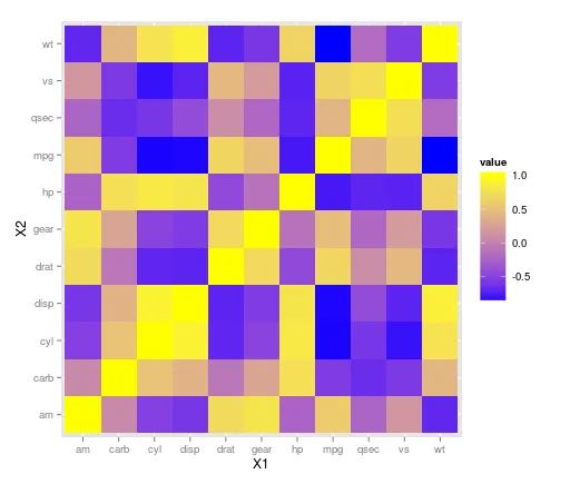
使用 geom_tile() 函数,ggplot2 库可以处理此类情况。由于上面的图中不存在负相关性,因此需要考虑数据的重新缩放。下面使用 mtcars 数据集:
library(ggplot2)
library(reshape)

z <- cor(mtcars)
z.m <- melt(z)

ggplot(z.m, aes(X1, X2, fill = value)) + geom_tile() +
scale_fill_gradient(low = "blue",  high = "yellow")
编辑:
ggplot(z.m, aes(X1, X2, fill = value)) + geom_tile() +
scale_fill_gradient2(low = "blue",  high = "yellow")
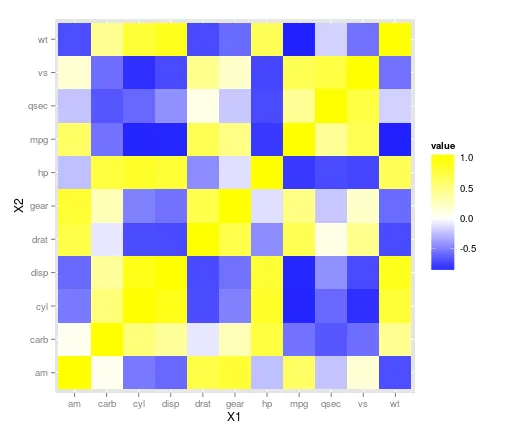
c(-1, -0.6, -0.3, 0, 0.3, 0.6, 1)) 并在中间加上 "white",以反映相关系数对称性的颜色。 - daroczigscale_fill_gradient2()可以自动实现您所描述的功能。我不知道那个存在。 - Chasep <- ggplot(.....) + ... + ....; library(plotly); ggplotly(p) 可以使其交互。 - schlusieX1进行因子水平的反转,使用以下代码:z.m$X1 <- factor(z.m$X1, levels = rev(levels( z.m$X1 ))) - arunlibrary(corrplot)
data(mtcars)
M <- cor(mtcars)
## different color series
col1 <- colorRampPalette(c("#7F0000","red","#FF7F00","yellow","white",
"cyan", "#007FFF", "blue","#00007F"))
col2 <- colorRampPalette(c("#67001F", "#B2182B", "#D6604D", "#F4A582", "#FDDBC7",
"#FFFFFF", "#D1E5F0", "#92C5DE", "#4393C3", "#2166AC", "#053061"))
col3 <- colorRampPalette(c("red", "white", "blue"))
col4 <- colorRampPalette(c("#7F0000","red","#FF7F00","yellow","#7FFF7F",
"cyan", "#007FFF", "blue","#00007F"))
wb <- c("white","black")
par(ask = TRUE)
## different color scale and methods to display corr-matrix
corrplot(M, method="number", col="black", addcolorlabel="no")
corrplot(M, method="number")
corrplot(M)
corrplot(M, order ="AOE")
corrplot(M, order ="AOE", addCoef.col="grey")
corrplot(M, order="AOE", col=col1(20), cl.length=21,addCoef.col="grey")
corrplot(M, order="AOE", col=col1(10),addCoef.col="grey")
corrplot(M, order="AOE", col=col2(200))
corrplot(M, order="AOE", col=col2(200),addCoef.col="grey")
corrplot(M, order="AOE", col=col2(20), cl.length=21,addCoef.col="grey")
corrplot(M, order="AOE", col=col2(10),addCoef.col="grey")
corrplot(M, order="AOE", col=col3(100))
corrplot(M, order="AOE", col=col3(10))
corrplot(M, method="color", col=col1(20), cl.length=21,order = "AOE", addCoef.col="grey")
if(TRUE){
corrplot(M, method="square", col=col2(200),order = "AOE")
corrplot(M, method="ellipse", col=col1(200),order = "AOE")
corrplot(M, method="shade", col=col3(20),order = "AOE")
corrplot(M, method="pie", order = "AOE")
## col=wb
corrplot(M, col = wb, order="AOE", outline=TRUE, addcolorlabel="no")
## like Chinese wiqi, suit for either on screen or white-black print.
corrplot(M, col = wb, bg="gold2", order="AOE", addcolorlabel="no")
}
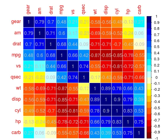
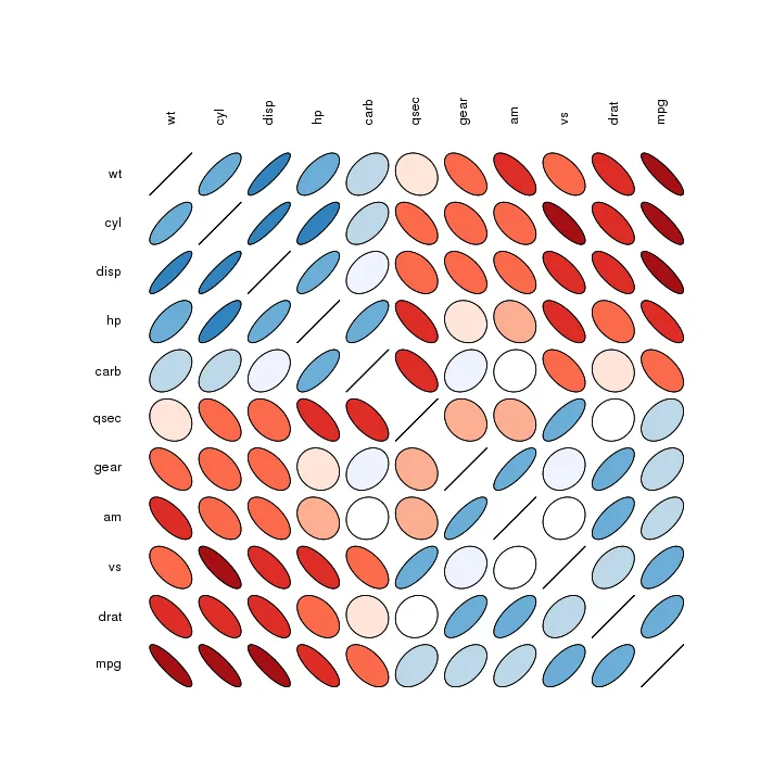
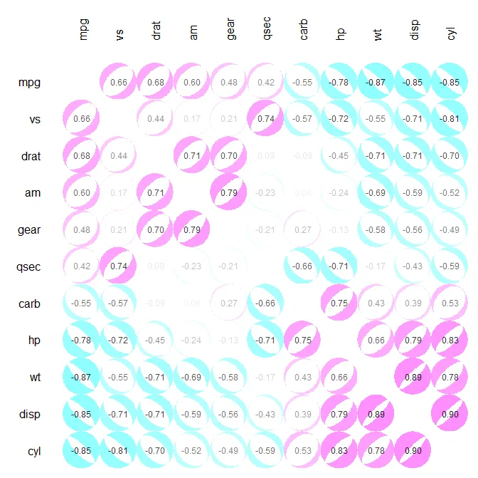
ellipse软件包中的plotcorr()函数。我喜欢使用椭圆来表示相关性,使用颜色来表示正负相关。但是,我希望这些引人注目的颜色能够突出显示接近1和-1的相关性,而不是接近0的相关性。plotcor()可在以下网址找到:https://github.com/JVAdams/jvamisc/blob/master/R/plotcor.r。mtcars数据集生成的示例绘图。library(plotrix)
library(seriation)
library(MASS)
plotcor(cor(mtcars), mar=c(0.1, 4, 4, 0.1))
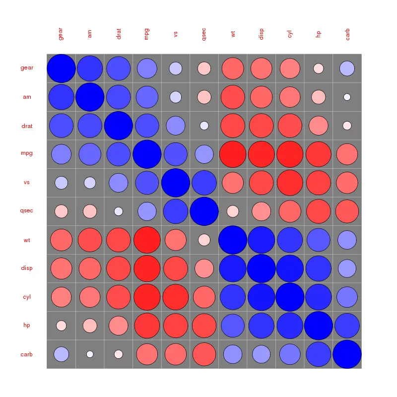
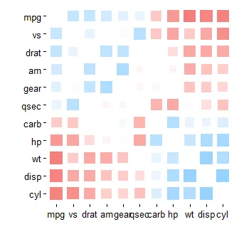
我知道已经过了一段时间,但对于新读者来说,他们可能会对corrr包(https://cran.rstudio.com/web/packages/corrr/index.html)中的rplot()感兴趣。这个函数可以生成类似@daroczig提到的图形,但是设计成数据管道的方式:
install.packages("corrr")
library(corrr)
mtcars %>% correlate() %>% rplot()
mtcars %>% correlate() %>% rearrange() %>% rplot()
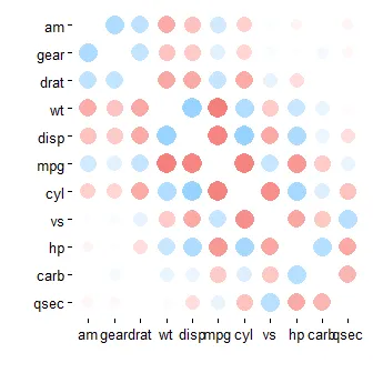
mtcars %>% correlate() %>% rearrange() %>% rplot(shape = 15)
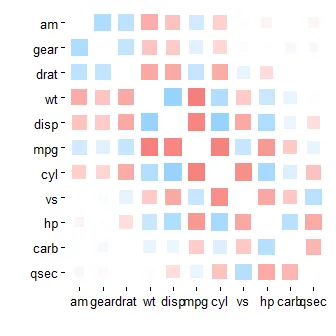
mtcars %>% correlate() %>% rearrange() %>% shave() %>% rplot(shape = 15)
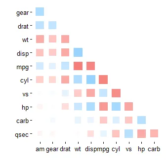
mtcars %>% correlate() %>% rearrange(absolute = FALSE) %>% rplot(shape = 15)
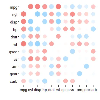
corrplot R包中的corrplot()函数也可以用于绘制相关图。
library(corrplot)
M<-cor(mtcars) # compute correlation matrix
corrplot(M, method="circle")
这里发布了几篇关于如何计算和可视化相关矩阵的文章:
这些文章介绍了如何使用 correlogram 和 symnum 函数来可视化相关矩阵,帮助您更好地理解数据之间的关系。我最近了解到的另一种解决方案是使用qtlcharts包创建的交互式热图。
install.packages("qtlcharts")
library(qtlcharts)
iplotCorr(mat=mtcars, group=mtcars$cyl, reorder=TRUE)
 您可以在我的博客上查看交互式版本。将鼠标悬停在热图上可查看行、列和单元格值。单击单元格可查看符号按组着色的散点图(在此示例中,4个汽缸是红色,6个汽缸是绿色,8个汽缸是蓝色)。在散点图中悬停在点上可得到行的名称(在本例中为汽车制造商)。