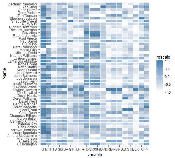
X和Y变量是因子,如果想要交换或删除它们,只需使用这些因子来排除或排序级别即可。
library(reshape2)
library(ggplot2)
library(plyr)
nba <- read.csv("http://datasets.flowingdata.com/ppg2008.csv")
nba.m <- melt(nba)
nba.m <- ddply(nba.m, .(variable), transform, rescale = rescale(value))
p <- ggplot(nba.m, aes(variable, Name, fill = rescale))+
geom_tile(colour = "white")+
scale_fill_gradient(low = "white",high = "steelblue")
print(p)
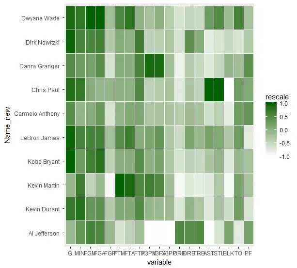
desired<-c("Al Jefferson ","Carmelo Anthony ","Chris Paul ",
"Danny Granger ","Dirk Nowitzki ","Dwyane Wade ",
"Kevin Durant ","Kevin Martin ","Kobe Bryant ",
"LeBron James ")
nba.m2<-nba.m[nba.m$Name %in% desired,]
nba.m2$Name_new<-factor(nba.m2$Name)
nba.m2$Name_new<-factor(nba.m2$Name_new,ordered = T, levels = c(
"Al Jefferson ","Kevin Durant ","Kevin Martin ","Kobe Bryant ","LeBron James ",
"Carmelo Anthony ","Chris Paul ","Danny Granger ","Dirk Nowitzki ","Dwyane Wade "
))
nba.m2<-nba.m2[nba.m2$variable != "PTS",]
p <- ggplot(nba.m2, aes(variable, Name_new, fill = rescale))+
geom_tile(colour = "white")+
scale_fill_gradient(low = "white", high = "darkgreen")
print(p)