绘制国债收益率曲线,使用matplotlib如何叠加两条收益率曲线

5
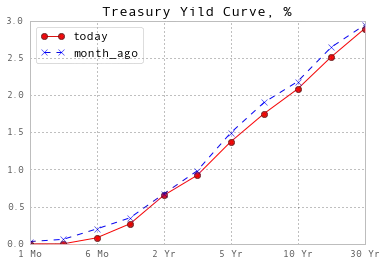
我正在尝试创建一张图表来比较两个不同日期的国债收益率曲线。我遇到了将两条曲线合并并创建干净的图表的困难。我的问题:如何将这两条收益率曲线绘制在一起,使得y轴上是收益率(利率),x轴上是到期时间(2年、5年、10年、20年、30年)?请参考美国财政部的历史国债收益率数据可视化页面
import numpy as np
import pandas as pd
import datetime as dt
import pandas.io.data as web
import matplotlib.pyplot as plt
import quandl as q
from pandas import DataFrame
import matplotlib
matplotlib.style.use('ggplot')

treasury = q.get("USTREASURY/YIELD", trim_start="2000-01-01", returns="pandas")

fig, ax = plt.subplots()

treas = DataFrame(treasury)
treas.drop(treas.columns[[0,1,2,3,5,7]], axis=1, inplace=True)
today = treas.iloc[-1:]
first = treas.iloc[:1]
first = first.T
today = today.T

ax.plot(first, 'o')
ax.plot(today, 'x')

#first.plot(marker='o')
#today.plot(marker='o')
plt.show()

你能否包含当前的图表并解释一下你期望得到什么? - cel
基本上,我希望它看起来就像我添加的treasury.gov链接中的收益率曲线一样。 - Brian
你的意思是想要将这些点用一条线连接起来,还是还有其他要求? - iayork
是的,我想要用一条线连接这些点,但我的主要问题是它们没有按照我希望的方式绘制(y轴上的收益率和x轴上的到期时间)。现在,它被翻转了。 - Brian
ax.plot(maturity, yield, '-o') - tacaswell
2个回答

9

这是您正在寻找的内容吗?

import matplotlib.pyplot as plt
import pandas as pd
import quandl as ql
#import Quandl as ql
%matplotlib inline

yield_ = ql.get("USTREASURY/YIELD")
today = yield_.iloc[-1,:]
month_ago = yield_.iloc[-30,:]
df = pd.concat([today, month_ago], axis=1)
df.columns = ['today', 'month_ago']

df.plot(style={'today': 'ro-', 'month_ago': 'bx--'}
        ,title='Treasury Yield Curve, %');

enter image description here


2

提示: 我正在使用Python 3.8和带有Anaconda的Spyder。我花了很多时间解决“找不到Quandl模块”的问题,最终发现应该是小写的quandl。


很好的观点。在这个问题被提出后不久,他们将其从Quandl更改为quandl,我想是在2016年的某个时候。 - Brian

网页内容由stack overflow 提供, 点击上面的
可以查看英文原文,
原文链接