使用Matplotlib在对数坐标下绘制直方图

47

我有一个Pandas DataFrame,其中的Series包含以下值

x = [2, 1, 76, 140, 286, 267, 60, 271, 5, 13, 9, 76, 77, 6, 2, 27, 22, 1, 12, 7, 19, 81, 11, 173, 13, 7, 16, 19, 23, 197, 167, 1]

我被指示在使用Python 3.6的Jupyter笔记本中绘制两个直方图。

x.plot.hist(bins=8)
plt.show()

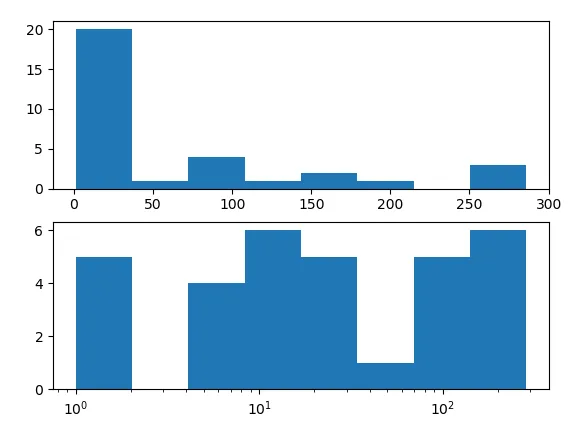
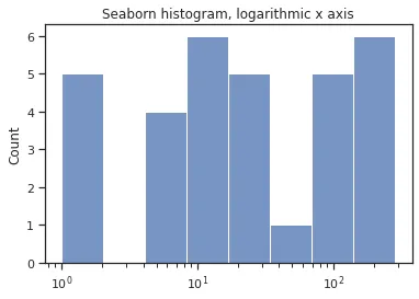
我选择了8个箱子,因为这样看起来最好。 我还被指示使用x的对数绘制另一个直方图。

x.plot.hist(bins=8)
plt.xscale('log')
plt.show()

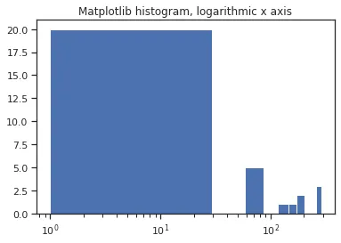
这个直方图看起来太糟糕了。我是不是做错了什么?我尝试了调整绘图,但我所尝试的一切似乎只能让直方图看起来更糟糕。例如:

x.plot(kind='hist', logx=True)

除了要绘制X的对数直方图之外,我没有收到任何其他指示。

值得一提的是,我已经导入了pandas、numpy和matplotlib,并指定图表应该是内联的。


直方图中的“Terrible”是什么意思? - Umang Gupta
最好的方法/解决办法就是 plt.hist(np.log(x)) - ei-grad
5个回答

66

hist函数的调用中指定bins=8意味着将最小值和最大值之间的范围等分为8个区间。 在线性比例尺上相等的东西在对数比例尺上是扭曲的。

你可以指定直方图的区间宽度不相等,以使它们在对数比例尺下看起来相等。

import pandas as pd
import numpy as np
import matplotlib.pyplot as plt

x = [2, 1, 76, 140, 286, 267, 60, 271, 5, 13, 9, 76, 77, 6, 2, 27, 22, 1, 12, 7, 
     19, 81, 11, 173, 13, 7, 16, 19, 23, 197, 167, 1]
x = pd.Series(x)

# histogram on linear scale
plt.subplot(211)
hist, bins, _ = plt.hist(x, bins=8)

# histogram on log scale. 
# Use non-equal bin sizes, such that they look equal on log scale.
logbins = np.logspace(np.log10(bins[0]),np.log10(bins[-1]),len(bins))
plt.subplot(212)
plt.hist(x, bins=logbins)
plt.xscale('log')
plt.show()

在此输入图片描述


21
我会使用logbins = np.geomspace(x.min(), x.max(), 8)来取代手动计算对数值和分组,因为bins[0]bins[-1]就是最小值和最大值。这样做可以简化代码且效果相同。 - user6655984

36

这里有另外一种解决方案,不需要使用subplot或在同一图像中绘制两个东西。

import numpy as np
import matplotlib.pyplot as plt

def plot_loghist(x, bins):
  hist, bins = np.histogram(x, bins=bins)
  logbins = np.logspace(np.log10(bins[0]),np.log10(bins[-1]),len(bins))
  plt.hist(x, bins=logbins)
  plt.xscale('log')

plot_loghist(np.random.rand(200), 10)

示例直方图


2
在发布代码之前,你应该先进行测试——因为函数声明后没有“:”,所以它无法编译。即使添加了“:”,代码仍然无法正常工作——只会崩溃。 - zzy
2
感谢指出。已修正打字错误。这段代码在 Python 3.5 上对我运行良好。 - Rahul Shaw
3
我也试过了,Python 3.8可以运行。感谢您的有用贡献。 - tobi delbruck

13
用 x 的对数绘制另一个直方图并不同于在对数刻度上绘制 x。绘制 x 的对数将会是:
np.log(x).plot.hist(bins=8)
plt.show()

hist

区别在于x的值本身被转换了:我们正在看它们的对数。

这与在对数刻度上绘图不同,我们保持x不变,但改变了水平轴的标记方式(这会将杆向右压缩并拉伸向左侧的杆)。


2
Seaborn也是一个很好的解决方案,用于具有对数刻度的直方图,而无需手动指定直方图的箱边界,就像你只使用matplotlib一样。
# standard imports...
import seaborn as sns

x = [2, 1, 76, 140, 286, 267, 60, 271, 5, 13, 9, 76, 77, 6, 2, 27, 22, 1, 12, 7, 19, 81, 11, 173, 13, 7, 16, 19, 23, 197, 167, 1]
x = pd.Series(x)
plt.hist(x)
plt.xscale('log')
plt.gca().set(title='Matplotlib histogram, logarithmic x axis')
plt.show()
#x.plot(kind='hist', log=True)

sns.histplot(x, bins=8, log_scale=True)
plt.gca().set(title='Seaborn histogram, logarithmic x axis')
plt.show()
sns.histplot(x, bins=8, log_scale=True)
plt.gca().set(title='Seaborn histogram, logarithmic x axis, with scalar ticks')
plt.gca().xaxis.set_major_formatter(mpl.ticker.ScalarFormatter())
plt.gca().set_xticks([1, 10, 100, 150])
plt.show()

graph And another And another


1
根据我的实验,使用np.histogram可能是不必要的,因为x的两端恰好是最小值和最大值,不需要使用np.histogram来计算。
import numpy as np
from matplotlib import pyplot as plt

def plot_loghist(x, bins):
    logbins = np.logspace(np.log10(np.min(x)),np.log10(np.max(x)),bins+1)
    plt.hist(x, bins=logbins)
    plt.xscale('log')


plot_loghist(np.random.rand(200), 10)

网页内容由stack overflow 提供, 点击上面的
可以查看英文原文,
原文链接