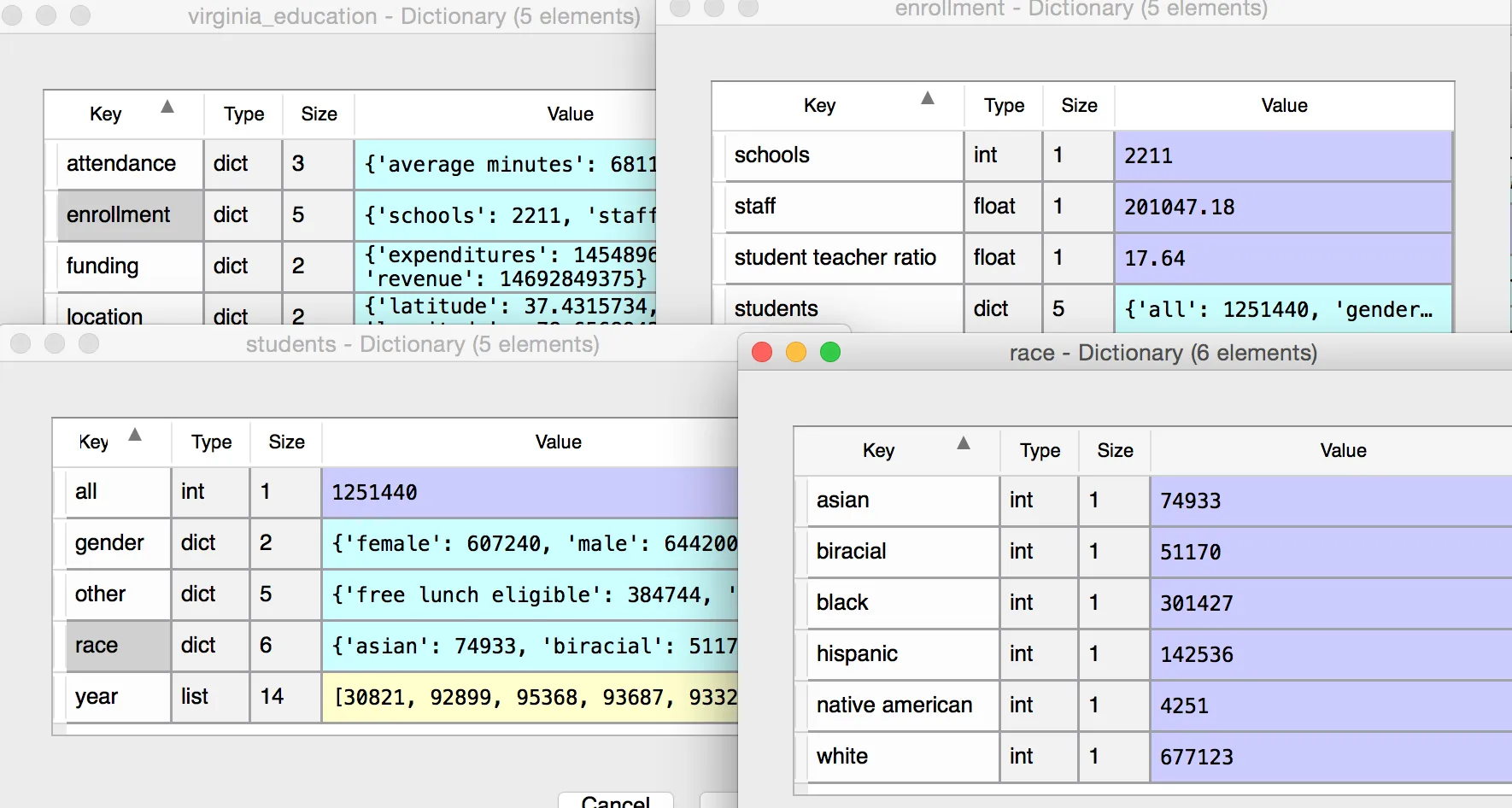
import matplotlib.pyplot as plt
import education
list_of_record = education.get_all_states

virginia_education = education.get_state('Virginia')
enrollment = virginia_education ["enrollment"]
students = enrollment ["students"]
race = students ["race"]

asian = race["asian"]
biracial = race["biracial"]
hispanic = race ["hispanic"]
white = race ["white"]
black = race["black"]
native_american = race["native american"]

all_race = [asian, biracial, hispanic, white, black, native_american]

plt.hist (all_race)
plt.show ()
当前直方图图片:
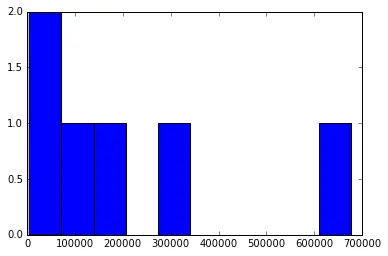
我想修改它,使其显示所有种族的名称。x轴和y轴上的数字是错误的,我不确定如何修复。
一些数据: