如何在R中制作带有透明度的散点图和无刻度直方图,就像这个图片?
看起来这不是使用ggplot2制作的。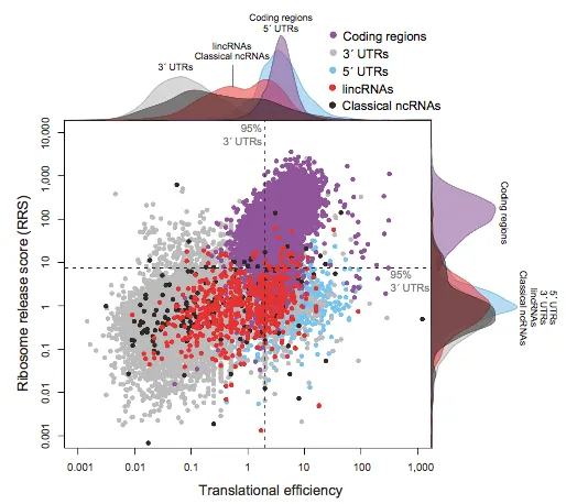
请问有人知道使用了什么命令吗?
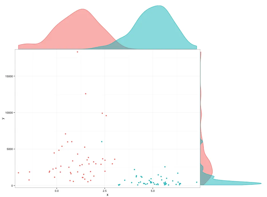
library(ggplot2)
library(gridExtra)

set.seed(42)
DF <- data.frame(x=rnorm(100,mean=c(1,5)),y=rlnorm(100,meanlog=c(8,6)),group=1:2)

p1 <- ggplot(DF,aes(x=x,y=y,colour=factor(group))) + geom_point() +
  scale_x_continuous(expand=c(0.02,0)) +
  scale_y_continuous(expand=c(0.02,0)) +
  theme_bw() +
  theme(legend.position="none",plot.margin=unit(c(0,0,0,0),"points"))

theme0 <- function(...) theme( legend.position = "none",
                               panel.background = element_blank(),
                               panel.grid.major = element_blank(),
                               panel.grid.minor = element_blank(),
                               panel.margin = unit(0,"null"),
                               axis.ticks = element_blank(),
                               axis.text.x = element_blank(),
                               axis.text.y = element_blank(),
                               axis.title.x = element_blank(),
                               axis.title.y = element_blank(),
                               axis.ticks.length = unit(0,"null"),
                               axis.ticks.margin = unit(0,"null"),
                               panel.border=element_rect(color=NA),...)

p2 <- ggplot(DF,aes(x=x,colour=factor(group),fill=factor(group))) +
  geom_density(alpha=0.5) +
  scale_x_continuous(breaks=NULL,expand=c(0.02,0)) +
  scale_y_continuous(breaks=NULL,expand=c(0.02,0)) +
  theme_bw() +
  theme0(plot.margin = unit(c(1,0,0,2.2),"lines"))

p3 <- ggplot(DF,aes(x=y,colour=factor(group),fill=factor(group))) +
  geom_density(alpha=0.5) +
  coord_flip()  +
  scale_x_continuous(labels = NULL,breaks=NULL,expand=c(0.02,0)) +
  scale_y_continuous(labels = NULL,breaks=NULL,expand=c(0.02,0)) +
  theme_bw() +
  theme0(plot.margin = unit(c(0,1,1.2,0),"lines"))

grid.arrange(arrangeGrob(p2,ncol=2,widths=c(3,1)),
             arrangeGrob(p1,p3,ncol=2,widths=c(3,1)),
             heights=c(1,3))

我无法找出导致密度图下方空间的原因。你可以调整图形边距来避免它,但我不太喜欢那样做。
p2 <- ggplot(DF,aes(x=x,colour=factor(group),fill=factor(group))) +
  geom_density(alpha=0.5) +
  scale_x_continuous(breaks=NULL,expand=c(0.02,0)) +
  scale_y_continuous(breaks=NULL,expand=c(0.00,0)) +
  theme_bw() +
  theme0(plot.margin = unit(c(1,0,-0.48,2.2),"lines"))

p3 <- ggplot(DF,aes(x=y,colour=factor(group),fill=factor(group))) +
  geom_density(alpha=0.5) +
  coord_flip()  +
  scale_x_continuous(labels = NULL,breaks=NULL,expand=c(0.02,0)) +
  scale_y_continuous(labels = NULL,breaks=NULL,expand=c(0.00,0)) +
  theme_bw() +
  theme0(plot.margin = unit(c(0,1,1.2,-0.48),"lines"))
我不知道是否有一个直接实现这个功能的包,但我相信这可以在R中完成。透明度很容易:您只需为给定颜色的RGB规范添加另外两个数字即可:
#FF0000 # red
#FF0000FF # full opacity
#FF000000 # full transparency
使用layout函数也很容易组合不同的图形。至于垂直密度图,它与水平图相同,只是x和y交换了。这里给出的示例here可以轻松扩展以包括颜色、较小的边距等。如果这个描述不够清晰,我可以尝试提供一个更详细的示例。