在R中,从同一个变量绘制边际直方图(作为因子)和散点图(作为数值)。

3
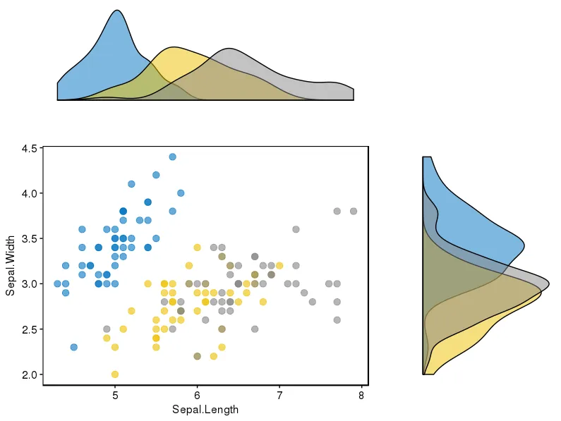
我试图创建一个散点图,在其中加入边际直方图,就像这个问题中所示。 我的数据包括两个(数值)变量,它们共享七个离散的(某种程度上)对数间隔级别。
我已经成功地使用
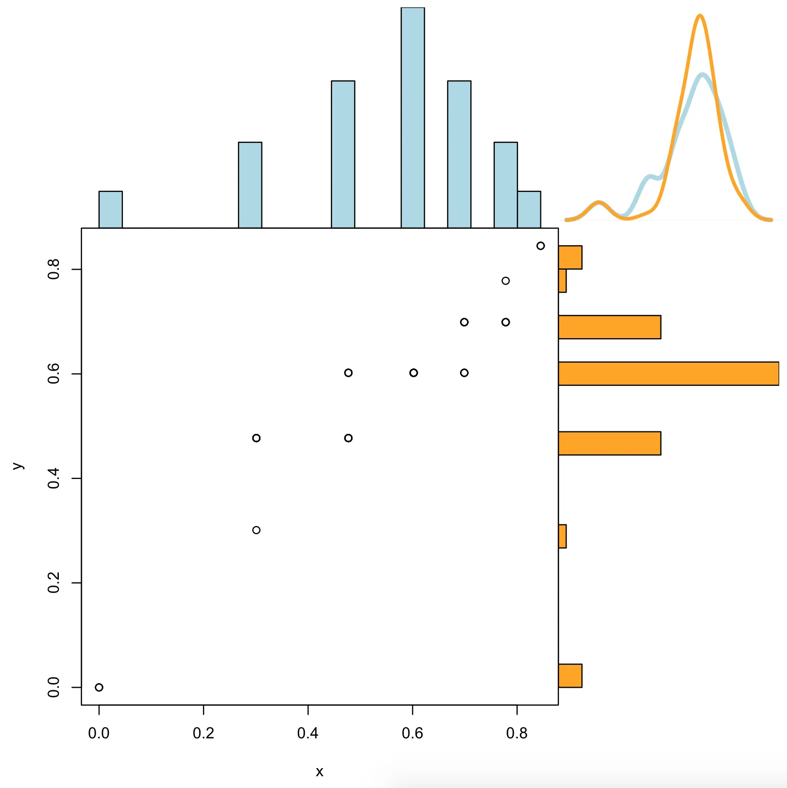
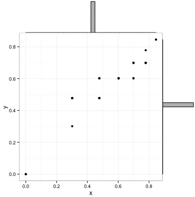
ggExtra包中的ggMarginal完成了这项工作。然而,我对结果并不满意,因为当使用与散点图相同的数据绘制边际直方图时,事情并不匹配。 如下所示,直方图条偏向于数据点本身的右侧或左侧。
library(ggMarginal)
library(ggplot2)
x <- rep(log10(c(1,2,3,4,5,6,7)), times=c(3,7,12,18,12,7,3))
y <- rep(log10(c(1,2,3,4,5,6,7)), times=c(3,1,13,28,13,1,3))
d <- data.frame("x" = x,"y" = y)
p1 <- ggMarginal(ggplot(d, aes(x,y)) + geom_point() + theme_bw(), type = "histogram")

p1

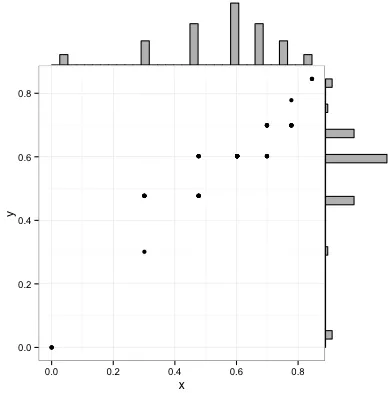
这个问题的一个可能解决方案是将直方图中使用的变量改为因子,这样它们就可以与散点图轴很好地对齐。 在使用ggplot创建直方图时,这种方法效果很好:

p2 <- ggplot(data.frame(lapply(d, as.factor)), aes(x = x)) + geom_histogram()

p2

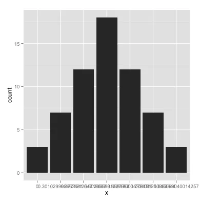
然而,当我尝试使用 ggMarginal 进行操作时,我没有得到预期的结果——似乎 ggMarginal 的直方图仍将我的变量视为数字型。

p3 <- ggMarginal(ggplot(d, aes(x,y)) + geom_point() + theme_bw(),
                 x = as.factor(x), y = as.factor(y), type = "histogram")

p3

如何确保我的直方图条形图在数据点上居中?

我绝对愿意接受不涉及使用 ggMarginal 的答案。

2个回答

5

不确定是否在这里复制我回答的问题(你提到的)是一个好主意,但我没有评论的权利,请告诉我是否可以。

我找到了一个包(ggpubr),它似乎非常适合解决这个问题,并且考虑了多种显示数据的可能性。

该包的链接在此处,在此链接中,您将找到一个很好的教程来使用它。为了完整起见,我附上了我重现的示例之一。

我首先安装了该软件包(它需要devtools

if(!require(devtools)) install.packages("devtools")
devtools::install_github("kassambara/ggpubr")

针对为不同分组展示不同直方图的特定示例,它在涉及ggExtra时提到:“ggExtra的一个限制是它无法处理散点图和边缘图中的多个组。在下面的R代码中,我们提供了使用cowplot包的解决方案。”在我的情况下,我必须安装后者的包:
install.packages("cowplot")

我遵循了这段代码:

# Scatter plot colored by groups ("Species")
sp <- ggscatter(iris, x = "Sepal.Length", y = "Sepal.Width",
            color = "Species", palette = "jco",
            size = 3, alpha = 0.6)+
border()                                         
# Marginal density plot of x (top panel) and y (right panel)
xplot <- ggdensity(iris, "Sepal.Length", fill = "Species",
               palette = "jco")
yplot <- ggdensity(iris, "Sepal.Width", fill = "Species", 
               palette = "jco")+
rotate()
# Cleaning the plots
sp <- sp + rremove("legend")
yplot <- yplot + clean_theme() + rremove("legend") 
xplot <- xplot + clean_theme() + rremove("legend")
# Arranging the plot using cowplot
library(cowplot)
plot_grid(xplot, NULL, sp, yplot, ncol = 2, align = "hv", 
      rel_widths = c(2, 1), rel_heights = c(1, 2))

这对我来说起作用:

鸢尾花边际直方图散点图


2

如果您愿意尝试基础绘图,这里是一个函数:

plots$scatterWithHists <- function(x, y, histCols=c("lightblue","lightblue"), lhist=20, xlim=range(x), ylim=range(y), ...){
  ## set up layout and graphical parameters
  layMat <- matrix(c(1,4,3,2), ncol=2)
  layout(layMat, widths=c(5/7, 2/7), heights=c(2/7, 5/7))
  ospc <- 0.5                                                  # outer space
  pext <- 4                                                    # par extension down and to the left
  bspc <- 1                                                    # space between scatter plot and bar plots
  par. <- par(mar=c(pext, pext, bspc, bspc), oma=rep(ospc, 4)) # plot parameters

  ## barplot and line for x (top)
  xhist <- hist(x, breaks=seq(xlim[1], xlim[2], length.out=lhist), plot=FALSE)
  par(mar=c(0, pext, 0, 0))
  barplot(xhist$density, axes=FALSE, ylim=c(0, max(xhist$density)), space=0, col=histCols[1])

  ## barplot and line for y (right)
  yhist <- hist(y, breaks=seq(ylim[1], ylim[2], length.out=lhist), plot=FALSE)
  par(mar=c(pext, 0, 0, 0))
  barplot(yhist$density, axes=FALSE, xlim=c(0, max(yhist$density)), space=0, col=histCols[2], horiz=TRUE)

  ## overlap
  dx <- density(x)
  dy <- density(y)
  par(mar=c(0, 0, 0, 0))
  plot(dx, col=histCols[1], xlim=range(c(dx$x, dy$x)), ylim=range(c(dx$y, dy$y)),
       lwd=4, type="l", main="", xlab="", ylab="", yaxt="n", xaxt="n", bty="n"
       )
  points(dy, col=histCols[2], type="l", lwd=3)

  ## scatter plot
  par(mar=c(pext, pext, 0, 0))
  plot(x, y, xlim=xlim, ylim=ylim, ...)
}

只需执行:

scatterWithHists(x,y, histCols=c("lightblue","orange"))

你将会得到:

marginalHists

如果你一定要使用ggMargins,那么请查找xparamsyparams。它说你可以使用这些向x-margin和y-margin发送附加参数。我只能成功地发送像颜色这样的琐碎事情。但也许发送像xlim这样的东西会有所帮助。


网页内容由stack overflow 提供, 点击上面的
可以查看英文原文,
原文链接