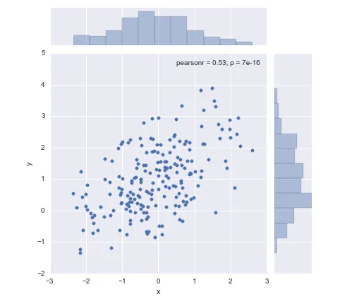
我想制作美观的散点图,并在散点图上方和右侧添加直方图,就像在seaborn中使用jointplot一样:
我正在寻求关于如何实现这一目标的建议。事实上,我在安装Pandas时遇到了一些麻烦,而且我不需要整个Seaborn模块。
我想制作美观的散点图,并在散点图上方和右侧添加直方图,就像在seaborn中使用jointplot一样:
我正在寻求关于如何实现这一目标的建议。事实上,我在安装Pandas时遇到了一些麻烦,而且我不需要整个Seaborn模块。
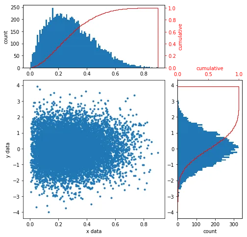
今天我遇到了同样的问题。此外,我想要边缘分布的累积分布函数。
代码:
import matplotlib.pyplot as plt
import matplotlib.gridspec as gridspec
import numpy as np

x = np.random.beta(2,5,size=int(1e4))
y = np.random.randn(int(1e4))

fig = plt.figure(figsize=(8,8))
gs = gridspec.GridSpec(3, 3)
ax_main = plt.subplot(gs[1:3, :2])
ax_xDist = plt.subplot(gs[0, :2],sharex=ax_main)
ax_yDist = plt.subplot(gs[1:3, 2],sharey=ax_main)

ax_main.scatter(x,y,marker='.')
ax_main.set(xlabel="x data", ylabel="y data")

ax_xDist.hist(x,bins=100,align='mid')
ax_xDist.set(ylabel='count')
ax_xCumDist = ax_xDist.twinx()
ax_xCumDist.hist(x,bins=100,cumulative=True,histtype='step',density=True,color='r',align='mid')
ax_xCumDist.tick_params('y', colors='r')
ax_xCumDist.set_ylabel('cumulative',color='r')

ax_yDist.hist(y,bins=100,orientation='horizontal',align='mid')
ax_yDist.set(xlabel='count')
ax_yCumDist = ax_yDist.twiny()
ax_yCumDist.hist(y,bins=100,cumulative=True,histtype='step',density=True,color='r',align='mid',orientation='horizontal')
ax_yCumDist.tick_params('x', colors='r')
ax_yCumDist.set_xlabel('cumulative',color='r')

plt.show()
希望它能帮助下一个寻找具有边缘分布的散点图的人。
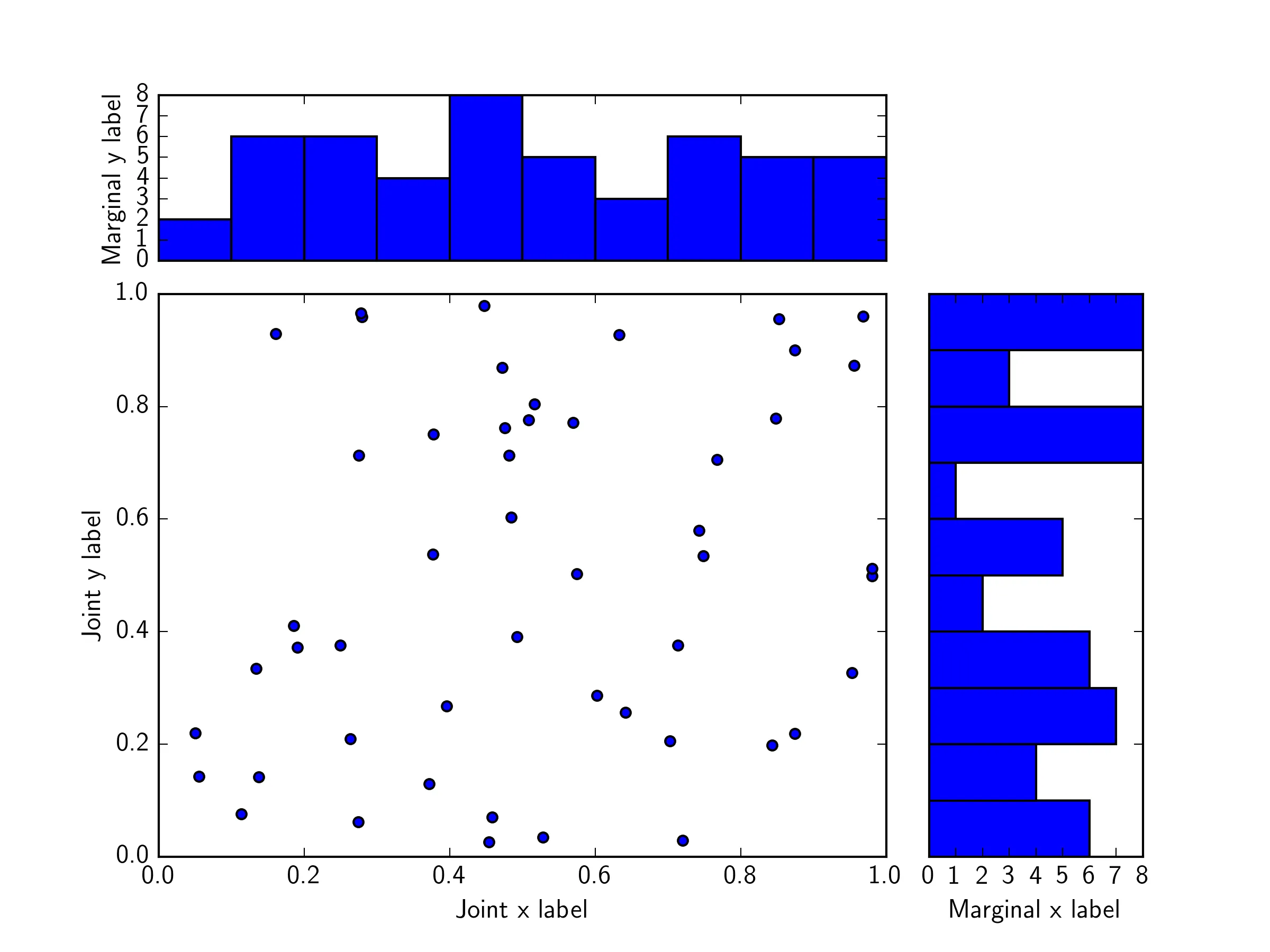
AttributeError: 'Polygon' object has no property 'normed'。请修正你的解决方案或告诉我我做错了什么。 - Leonormed=True 替换为 density=True。 - Leo这是一个使用 gridspec.GridSpec 的示例:
import matplotlib.pyplot as plt
from matplotlib.gridspec import GridSpec
import numpy as np

x = np.random.rand(50)
y = np.random.rand(50)

fig = plt.figure()

gs = GridSpec(4,4)

ax_joint = fig.add_subplot(gs[1:4,0:3])
ax_marg_x = fig.add_subplot(gs[0,0:3])
ax_marg_y = fig.add_subplot(gs[1:4,3])

ax_joint.scatter(x,y)
ax_marg_x.hist(x)
ax_marg_y.hist(y,orientation="horizontal")

# Turn off tick labels on marginals
plt.setp(ax_marg_x.get_xticklabels(), visible=False)
plt.setp(ax_marg_y.get_yticklabels(), visible=False)

# Set labels on joint
ax_joint.set_xlabel('Joint x label')
ax_joint.set_ylabel('Joint y label')

# Set labels on marginals
ax_marg_y.set_xlabel('Marginal x label')
ax_marg_x.set_ylabel('Marginal y label')
plt.show()
plt.show()之前,通过添加以下3行代码来翻转右直方图,以此改进当前最佳答案:ax_yDist.invert_xaxis()
ax_yDist.yaxis.tick_right()
ax_yCumDist.invert_xaxis()
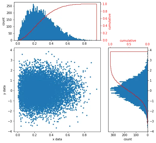
优点在于任何人都可以通过在脑海中移动和顺时针旋转右侧直方图来轻松比较两个直方图。
相比之下,在问题的绘图和所有其他答案中,如果要比较两个直方图,您的第一反应是逆时针旋转右侧直方图,这会导致错误的结论,因为y轴被倒置。实际上,当前最佳答案的右侧CDF乍一看似乎是递减的:
sns.jointplot? - wflynnymatplotlib.gridspec.GridSpec,特别是底部的示例。如果没有gridspec,您可以参考这个清晰的示例。 - wflynny