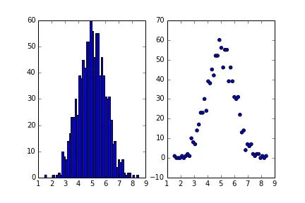
如何使用matplotlib中的直方图输出绘制散点图?

7

我想绘制一个类似于这个的散点图:

enter image description here

我已经可以从我的数据中绘制出直方图,但我希望能够用同样的数据绘制散点图。是否有一种方法可以使用hist()方法的输出作为scatter plot的输入?或者在matplotlib中使用hist()方法绘制scatter plot的其他方法?

用于绘制直方图的代码如下:

data = get_data()
plt.figure(figsize=(7,4))
ax = plt.subplots()
plt.hist(data,histtype='bar',bins = 100,log=True)
plt.show()

2
看一下这个答案,里面有绘制2D或3D直方图的代码... - Saullo G. P. Castro
1个回答

5
我认为您正在寻找以下内容:
基本上plt.hist()输出两个数组(正如Nordev指出的一些补丁)。第一个是每个bin中的计数(n),第二个是bin的边缘。
import matplotlib.pylab as plt
import numpy as np

# Create some example data
y = np.random.normal(5, size=1000)

# Usual histogram plot
fig = plt.figure()
ax1 = fig.add_subplot(121)
n, bins, patches = ax1.hist(y, bins=50)  # output is two arrays

# Scatter plot
# Now we find the center of each bin from the bin edges
bins_mean = [0.5 * (bins[i] + bins[i+1]) for i in range(len(n))]
ax2 = fig.add_subplot(122)
ax2.scatter(bins_mean, n)

示例

如果没有更多问题描述,这是我能想到的最好解决方案。如果我误解了,请谅解。


output 不仅包含两个数组,还包括一个 Patch 对象列表。为什么不使用“标准”的 n, bins, patches = ax1.hist(...,因为这会将返回的数组/列表解包到相应的变量中?在我看来,这些更直观的变量名使代码更易读。 - sodd
如果您不需要补丁程序,只需使用 np.histogram 即可。plt.hist 只是围绕着 histogram 的包装器,使用 plt.bar 绘制结果。 - tacaswell

网页内容由stack overflow 提供, 点击上面的
可以查看英文原文,
原文链接