考虑与两个numpy数组x和y相关联的以下曲线:
数据在这里(两列):http://lite4.framapad.org/p/xqhpGJpV5R
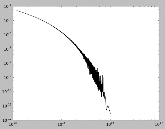
xmax附近出现问题?(如果应用高斯滤波器,则曲线会在末端上升)数据在这里(两列):http://lite4.framapad.org/p/xqhpGJpV5R
xmax附近出现问题?(如果应用高斯滤波器,则曲线会在末端上升)import numpy as np
from scipy.interpolate import interp1d, splrep, splev
import pylab
x = np.log10(x)
y = np.log10(y)
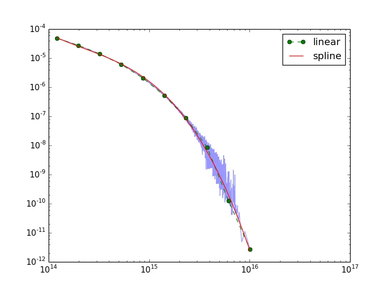
ip = interp1d(x,y)
xi = np.linspace(x.min(),x.max(),10)
yi = ip(xi)
tcl = splrep(xi,yi,s=1)
xs = np.linspace(x.min(), x.max(), 100)
ys = splev(xs, tcl)
xi = np.power(10,xi)
yi = np.power(10,yi)
xs = np.power(10,xs)
ys = np.power(10,ys)
f = pylab.figure()
pl = f.add_subplot(111)
pl.loglog(aset.x,aset.y,alpha=0.4)
pl.loglog(xi,yi,'go--',linewidth=1, label='linear')
pl.loglog(xs,ys,'r-',linewidth=1, label='spline')
pl.legend(loc=0)
f.show()
import numpy as np
import matplotlib.pyplot as plt
from scipy.ndimage import gaussian_filter1d

x, y = np.loadtxt('spectrum.dat').T

# Smooth with a guassian filter
smooth = gaussian_filter1d(y, 10)

fig, ax = plt.subplots()
ax.loglog(x, y, color='black')
ax.loglog(x, smooth, color='red')
plt.show()

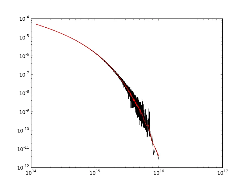
哎呀!数据末端(右侧)的边缘效应最为严重,因为这是斜率最陡的地方。如果起始点的斜率更陡峭,你也会在那里看到更强的边缘效应。
好消息是有许多方法可以修正这个问题。@ChristianK. 的回答展示了如何使用平滑样条实现低通滤波器。我将使用其他一些信号处理方法来演示如何达到相同的目的。哪种方法“最好”取决于你的需求。平滑样条很简单。使用“高级”信号处理方法可以精确控制滤除的频率。
在对数-对数空间中,您的数据看起来像一个抛物线,因此让我们在对数-对数空间中使用二阶多项式去趋势化数据,然后应用滤波器。
这是一个快速示例:
import numpy as np
import matplotlib.pyplot as plt
from scipy.ndimage import gaussian_filter1d

x, y = np.loadtxt('spectrum.dat').T

# Let's detrend by fitting a second-order polynomial in log space
# (Note that your data looks like a parabola in log-log space.)
logx, logy = np.log(x), np.log(y)
model = np.polyfit(logx, logy, 2)
trend = np.polyval(model, logx)

# Smooth with a guassian filter
smooth = gaussian_filter1d(logy - trend, 10)

# Add the trend back in and convert back to linear space
smooth = np.exp(smooth + trend)

fig, ax = plt.subplots()
ax.loglog(x, y, color='black')
ax.loglog(x, smooth, color='red')
plt.show()
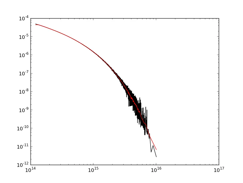
请注意,我们仍然存在一些边缘效应。这是因为我使用的高斯滤波器会导致相位移动。如果我们真的想要变得更加高级,我们可以去趋势化并使用零相位滤波器来进一步减少边缘效应。
import numpy as np
import matplotlib.pyplot as plt
import scipy.signal as signal

def main():
    x, y = np.loadtxt('spectrum.dat').T

    logx, logy = np.log(x), np.log(y)
    smooth_log = detrend_zero_phase(logx, logy)
    smooth = np.exp(smooth_log)

    fig, ax = plt.subplots()
    ax.loglog(x, y, 'k-')
    ax.loglog(x, smooth, 'r-')
    plt.show()

def zero_phase(y):
    # Low-pass filter...
    b, a = signal.butter(3, 0.05)

    # Filtfilt applies the filter twice to avoid phase shifts.
    return signal.filtfilt(b, a, y)

def detrend_zero_phase(x, y):
    # Fit a second order polynomial (Can't just use scipy.signal.detrend here,
    # because we need to know what the trend is to add it back in.)
    model = np.polyfit(x, y, 2)
    trend = np.polyval(model, x)

    # Apply a zero-phase filter to the detrended curve.
    smooth = zero_phase(y - trend)

    # Add the trend back in
    return smooth + trend

main()