- 创建箱线图之后,使用
.set()。
.set(xticklabels=[])可以删除刻度标签。
- 如果使用
.set_title(),则此方法无效,但可以使用.set(title='')。
.set(xlabel=None)可以删除轴标签。.tick_params(bottom=False)将删除刻度线。- 同样,对于y轴:如何从matplotlib / seaborn绘图中删除或隐藏y轴刻度标签?
- 在
python 3.11、pandas 1.5.2、matplotlib 3.6.2和seaborn 0.12.1中测试通过
来自OP:没有示例数据
fig, ax = plt.subplots(2, 1)

g1 = sb.boxplot(x="user_type", y="Seconds", data=df, color = default_color, ax = ax[0], sym='')
g1.set(xticklabels=[])
g1.set(title='User-Type (0=Non-Subscriber, 1=Subscriber)')
g1.set(xlabel=None)

g2 = sb.boxplot(x="member_gender", y="Seconds", data=df, color = default_color, ax = ax[1], sym='')
g2.set(xticklabels=[])
g2.set(title='Gender (0=Male, 1=Female, 2=Other)')
g2.set(xlabel=None)
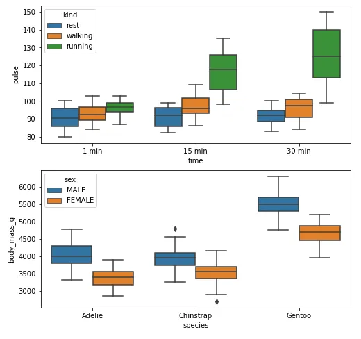
例子1
带有刻度和x轴标签
import seaborn as sns
import matplotlib.pyplot as plt
exercise = sns.load_dataset('exercise')
pen = sns.load_dataset('penguins')
fig, ax = plt.subplots(2, 1, figsize=(8, 8))
g1 = sns.boxplot(x='time', y='pulse', hue='kind', data=exercise, ax=ax[0])
g2 = sns.boxplot(x='species', y='body_mass_g', hue='sex', data=pen, ax=ax[1])
plt.show()
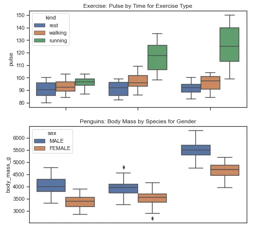
没有xticks和xlabel
fig, ax = plt.subplots(2, 1, figsize=(8, 8))
g1 = sns.boxplot(x='time', y='pulse', hue='kind', data=exercise, ax=ax[0])
g1.set(xticklabels=[])
g1.set(title='Exercise: Pulse by Time for Exercise Type')
g1.set(xlabel=None)
g2 = sns.boxplot(x='species', y='body_mass_g', hue='sex', data=pen, ax=ax[1])
g2.set(xticklabels=[])
g2.set(title='Penguins: Body Mass by Species for Gender')
g2.set(xlabel=None)
g2.tick_params(bottom=False)
plt.show()
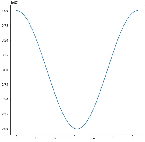
示例 2
import numpy as np
import matplotlib.pyplot as plt
import pandas as pd
sample_length = range(1, 1+1)
rads = np.arange(0, 2*np.pi, 0.01)
data = np.array([(np.cos(t*rads)*10**67) + 3*10**67 for t in sample_length])
df = pd.DataFrame(data.T, index=pd.Series(rads.tolist(), name='radians'), columns=[f'freq: {i}x' for i in sample_length])
df.reset_index(inplace=True)
fig, ax = plt.subplots(figsize=(8, 8))
ax.plot('radians', 'freq: 1x', data=df)
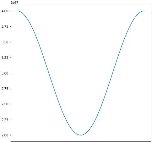
移除标签
fig, ax = plt.subplots(figsize=(8, 8))
ax.plot('radians', 'freq: 1x', data=df)
ax.set(xticklabels=[])
ax.tick_params(bottom=False)