seaborn被用来绘制图表,但它只是matplotlib的高级API。- 调用函数以删除y轴标签和刻度线使用的是
matplotlib方法。
- 创建图表后,使用
.set()。
.set(yticklabels=[])可用于删除刻度标签。
- 如果使用
.set_title(),这将无效,但可以使用.set(title='')
.set(ylabel=None)可用于删除轴标签。.tick_params(left=False)将删除刻度线。- 同样,对于x轴:如何从seaborn/matplotlib图表中删除或隐藏x轴标签?
- 在
python 3.11、pandas 1.5.2、matplotlib 3.6.2和seaborn 0.12.1中进行测试
示例1
import seaborn as sns
import matplotlib.pyplot as plt
exercise = sns.load_dataset('exercise')
pen = sns.load_dataset('penguins')
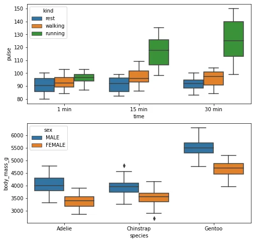
fig, ax = plt.subplots(2, 1, figsize=(8, 8))
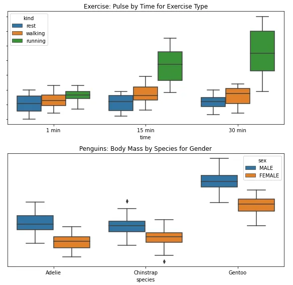
g1 = sns.boxplot(x='time', y='pulse', hue='kind', data=exercise, ax=ax[0])
g2 = sns.boxplot(x='species', y='body_mass_g', hue='sex', data=pen, ax=ax[1])
plt.show()
去除标签
(注:此处指IT技术中的“标签”,非商品标签等其他含义)
fig, ax = plt.subplots(2, 1, figsize=(8, 8))
g1 = sns.boxplot(x='time', y='pulse', hue='kind', data=exercise, ax=ax[0])
g1.set(yticklabels=[])
g1.set(title='Exercise: Pulse by Time for Exercise Type')
g1.set(ylabel=None)
g2 = sns.boxplot(x='species', y='body_mass_g', hue='sex', data=pen, ax=ax[1])
g2.set(yticklabels=[])
g2.set(title='Penguins: Body Mass by Species for Gender')
g2.set(ylabel=None)
g2.tick_params(left=False)
plt.tight_layout()
plt.show()
示例2
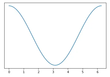
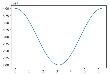
import numpy as np
import matplotlib.pyplot as plt
import pandas as pd
sample_length = range(1, 1+1)
rads = np.arange(0, 2*np.pi, 0.01)
data = np.array([(np.cos(t*rads)*10**67) + 3*10**67 for t in sample_length])
df = pd.DataFrame(data.T, index=pd.Series(rads.tolist(), name='radians'), columns=[f'freq: {i}x' for i in sample_length])
df.reset_index(inplace=True)
fig, ax = plt.subplots(figsize=(8, 8))
ax.plot('radians', 'freq: 1x', data=df)
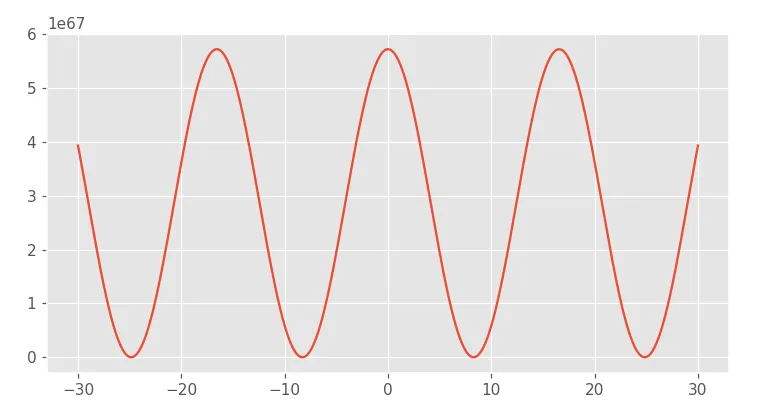
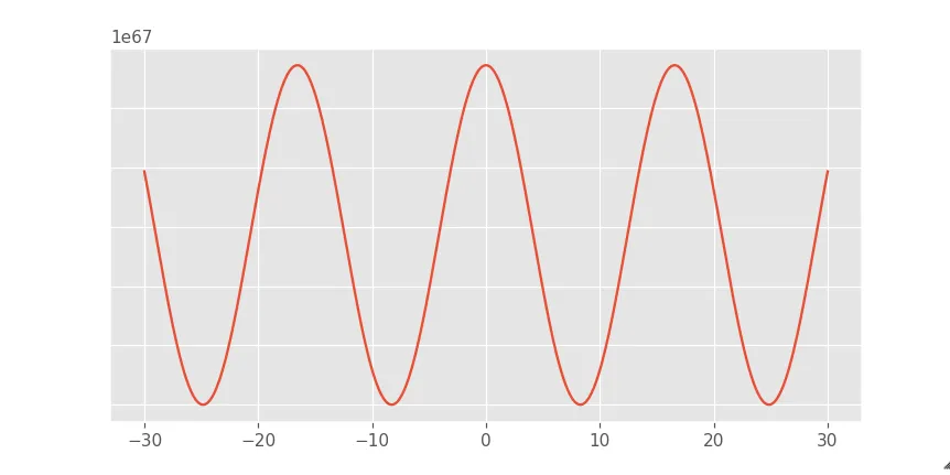
移除标签
fig, ax = plt.subplots(figsize=(8, 8))
ax.plot('radians', 'freq: 1x', data=df)
ax.set(yticklabels=[])
ax.tick_params(left=False)