Matplotlib - 在动态折线图中实现多个y轴刻度

3
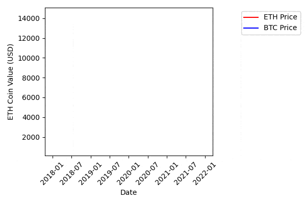
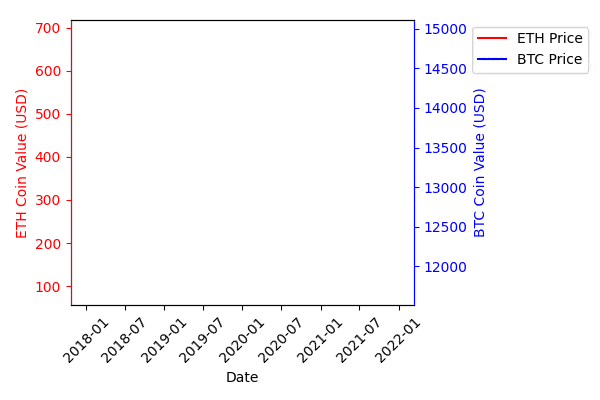
我正在尝试重新制作一份我之前创建的动画折线图,其中每条线都有一个独特的纵坐标轴-左边一个,右边一个。该图比较了两种价值迥异的加密货币(eth/btc)的价值,这就是为什么我需要多个刻度来观察变化的原因。
我的数据已经按照pd df格式排列(这里的数字是随机的):
                   Date  ETH Price     BTC Price
0   2020-10-30 00:00:00   0.155705  1331.878496
1   2020-10-31 00:00:00   0.260152  1337.174272
..                  ...        ...           ...
290 2021-08-15 16:42:09   0.141994  2846.719819
[291 rows x 3 columns]

代码大致如下:

import pandas as pd
import numpy as np
import matplotlib.pyplot as plt
import matplotlib.animation as ani

color = ['cyan', 'orange', 'red']
fig = plt.figure()
plt.xticks(rotation=45, ha="right", rotation_mode="anchor") 
plt.subplots_adjust(bottom = 0.2, top = 0.9) 
plt.ylabel('Coin Value (USD)')
plt.xlabel('Date')

def buildChart(i=int):
    df1 = df.set_index('Date', drop=True)
    plt.legend(["ETH Price", "BTC Price"])
    p = plt.plot(df1[:i].index, df1[:i].values) 
    for i in range(0,2):
        p[i].set_color(color[i])

animator = ani.FuncAnimation(fig, buildChart, interval = 10)
plt.show()

生成的动画

我试图在第一个轴上创建一个双X轴来生成第二个轴。

color = ['cyan', 'orange', 'blue']
fig, ax1 = plt.subplots() #Changes over here
plt.xticks(rotation=45, ha="right", rotation_mode="anchor") 
plt.subplots_adjust(bottom = 0.2, top = 0.9) 
plt.ylabel('Coin Value (USD)')
plt.xlabel('Date')

def buildChart(i=int):
    df1 = df.set_index('Date', drop=True)
    plt.legend(["ETH Price", "Bitcoin Price"])
    data1 = df1.iloc[:i, 0:1] # Changes over here
    # ------------- More Changes Start
    ax2 = ax1.twinx() 
    ax2.set_ylabel('Cost of Coin (USD)') 
    data2 = df1.iloc[:i, 1:2] 
    ax2.plot(df1[:i].index, data2)
    ax2.tick_params(axis='y')
    # -------------- More Changes End
    p = plt.plot(df1[:i].index, data1) 
    for i in range(0,1):
        p[i].set_color(color[i])

import matplotlib.animation as ani
animator = ani.FuncAnimation(fig, buildChart, interval = 10)
plt.show()

更改后的动画结果

当前问题:

  • X轴起始于约1999年而不是2020年末 ---- 导致y轴上的所有变化几乎成为垂直线
  • 左侧Y轴标签在0-1的比例尺上?
  • 右侧y轴标签重复、重叠、移动。

我认为我的制作第二个比例尺的方法可能有误,才会出现这么多错误,但这似乎是正确的方法。

1个回答

2
我重新组织了你的代码,以便轻松设置第二个轴动画。
这是使用单个y轴的动画代码:
import pandas as pd
import numpy as np
import matplotlib.pyplot as plt
from matplotlib.animation import FuncAnimation


df = pd.DataFrame({'date': pd.date_range(start = '2020-01-01', end = '2020-04-01', freq = 'D')})
df['ETH'] = 2*df.index + 300 + 100*np.random.randn(len(df))
df['BTC'] = 5*df.index + 13000 + 200*np.random.randn(len(df))


def update(i):
    ax.cla()

    ax.plot(df.loc[:i, 'date'], df.loc[:i, 'ETH'], label = 'ETH Price', color = 'red')
    ax.plot(df.loc[:i, 'date'], df.loc[:i, 'BTC'], label = 'BTC Price', color = 'blue')

    ax.legend(frameon = True, loc = 'upper left', bbox_to_anchor = (1.15, 1))

    ax.set_ylim(0.9*min(df['ETH'].min(), df['BTC'].min()), 1.1*max(df['ETH'].max(), df['BTC'].max()))

    ax.tick_params(axis = 'x', which = 'both', top = False)
    ax.tick_params(axis = 'y', which = 'both', right = False)

    plt.setp(ax.xaxis.get_majorticklabels(), rotation = 45)

    ax.set_xlabel('Date')
    ax.set_ylabel('ETH Coin Value (USD)')

    plt.tight_layout()


fig, ax = plt.subplots(figsize = (6, 4))

ani = FuncAnimation(fig = fig, func = update, frames = len(df), interval = 100)

plt.show()

enter image description here

从以上代码开始,您应该将轴从update函数中拆分出来:如果您将ax.twinx()保留在函数内部,则此操作将在每次迭代中重复,您将每次都获得一个新轴。
以下是带有辅助轴的动画代码:

import pandas as pd
import numpy as np
import matplotlib.pyplot as plt
from matplotlib.animation import FuncAnimation


df = pd.DataFrame({'date': pd.date_range(start = '2020-01-01', end = '2020-04-01', freq = 'D')})
df['ETH'] = 2*df.index + 300 + 100*np.random.randn(len(df))
df['BTC'] = 5*df.index + 13000 + 200*np.random.randn(len(df))


def update(i):
    ax1.cla()
    ax2.cla()

    line1 = ax1.plot(df.loc[:i, 'date'], df.loc[:i, 'ETH'], label = 'ETH Price', color = 'red')
    line2 = ax2.plot(df.loc[:i, 'date'], df.loc[:i, 'BTC'], label = 'BTC Price', color = 'blue')

    lines = line1 + line2
    labels = [line.get_label() for line in lines]
    ax1.legend(lines, labels, frameon = True, loc = 'upper left', bbox_to_anchor = (1.15, 1))

    ax1.set_ylim(0.9*df['ETH'].min(), 1.1*df['ETH'].max())
    ax2.set_ylim(0.9*df['BTC'].min(), 1.1*df['BTC'].max())

    ax1.tick_params(axis = 'x', which = 'both', top = False)
    ax1.tick_params(axis = 'y', which = 'both', right = False, colors = 'red')
    ax2.tick_params(axis = 'y', which = 'both', right = True, labelright = True, left = False, labelleft = False, colors = 'blue')

    plt.setp(ax1.xaxis.get_majorticklabels(), rotation = 45)

    ax1.set_xlabel('Date')
    ax1.set_ylabel('ETH Coin Value (USD)')
    ax2.set_ylabel('BTC Coin Value (USD)')

    ax1.yaxis.label.set_color('red')
    ax2.yaxis.label.set_color('blue')

    ax2.spines['left'].set_color('red')
    ax2.spines['right'].set_color('blue')

    plt.tight_layout()


fig, ax1 = plt.subplots(figsize = (6, 4))
ax2 = ax1.twinx()

ani = FuncAnimation(fig = fig, func = update, frames = len(df), interval = 100)

plt.show()

enter image description here


网页内容由stack overflow 提供, 点击上面的
可以查看英文原文,
原文链接