Matplotlib: 如何在对数图中设置双轴刻度线

4
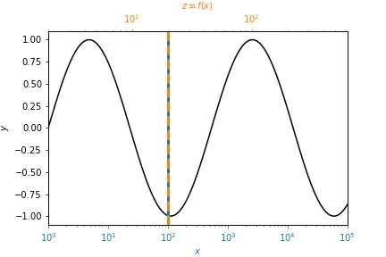
在我的图中,使用了一个次要的x轴来显示一些数据的另一个变量的值。现在,原始轴是对数刻度。不幸的是,双重轴将刻度(和标签)放置在原始轴的线性比例尺上,而不是按照对数比例尺的意图。如何克服这个问题?
以下是代码示例,应该将双重轴的刻度放置在与原始轴相同的(绝对轴)位置:
    def conv(x):
        """some conversion function"""
        # ...
        return x2

    ax = plt.subplot(1,1,1)
    ax.set_xscale('log')

    # get the location of the ticks of ax
    axlocs,axlabels = plt.xticks()

    # twin axis and set limits as in ax
    ax2 = ax.twiny()
    ax2.set_xlim(ax.get_xlim())

    #Set the ticks, should be set referring to the log scale of ax, but are set referring to the linear scale
    ax2.set_xticks(axlocs)

    # put the converted labels
    ax2.set_xticklabels(map(conv,axlocs))

另一种方法是(此时勾号不在相同的位置,但这并不重要):
    from matplotlib.ticker import FuncFormatter

    ax = plt.subplot(1,1,1)
    ax.set_xscale('log')

    ax2 = ax.twiny()
    ax2.set_xlim(ax.get_xlim())
    ax2.xaxis.set_major_formatter(FuncFormatter(lambda x,pos:conv(x)))  

只要不使用对数刻度,这两种方法都能很好地工作。

也许存在一个简单的解决方案。我在文档中是否遗漏了什么?

作为一种解决方法,我尝试获得ax的刻度的ax.transAxes坐标,并将刻度放置在ax2的完全相同位置。但并不存在这样的东西。

    ax2.set_xticks(axlocs,transform=ax2.transAxes)
    TypeError: set_xticks() got an unexpected keyword argument 'transform'

我对你的实际问题有点不清楚,如果你能添加一些随机数据或甚至展示该问题的图形,那将会很有帮助。你考虑过对第二个变量进行对数缩放吗? - Greg
谢谢回复。那也是我的第一个想法。然而,设置ax2.set_xscale('log')并不起作用。它会根据标签重新排序刻度线。因此,与数据和ax的连接丢失了。我将尽快用一些图表来说明问题。 - simsta
不,我的意思是实际记录这些值 - 这样更容易理解发生了什么。 - Greg
那肯定可以运行,因为线性比例尺保持不变。然而,这并不完全是我想要的。我更喜欢物理值(磁场梯度强度)的对数图而不是对数值的线性图。因为在后一种情况下,观察者无法直接看到梯度强度,而必须先应用指数函数。 - simsta
3个回答

2

这个问题之前已经有人问过,但我也碰到了同样的问题。

最终,我通过引入一个对数刻度(semilogx)透明(alpha=0)的虚拟图形来解决了这个问题。

示例:

import numpy as np
import matplotlib.pyplot as plt

def conversion_func(x):  # some arbitrary transformation function
    return 2 * x**0.5        # from x to z

x = np.logspace(0, 5, 100)
y = np.sin(np.log(x))

fig = plt.figure()

ax = plt.gca()
ax.semilogx(x, y, 'k')
ax.set_xlim(x[0], x[-1])  # this is important in order that limits of both axes match
ax.set_ylabel("$y$")
ax.set_xlabel("$x$", color='C0')
ax.tick_params(axis='x', which='both', colors='C0')
ax.axvline(100, c='C0', lw=3)

ticks_x = np.logspace(0, 5, 5 + 1)  # must span limits of first axis with clever spacing
ticks_z = conversion_func(ticks_x)
ax2 = ax.twiny()  # get the twin axis
ax2.semilogx(ticks_z, np.ones_like(ticks_z), alpha=0)  # transparent dummy plot
ax2.set_xlim(ticks_z[0], ticks_z[-1])
ax2.set_xlabel("$z \equiv f(x)$", color='C1')
ax2.xaxis.label.set_color('C1')
ax2.tick_params(axis='x', which='both', colors='C1')
ax2.axvline(20, ls='--', c='C1', lw=3)  # z=20 indeed matches x=100 as desired

fig.show()

在上面的例子中,垂直线表明第一和第二轴确实按照所需进行了移动。 x = 100 被移动到 z = 2*x**0.5 = 20。颜色只是为了澄清哪条垂直线与哪个轴相关。

matplotlib plot with second (twin) axis with different, logarithmic scale.


0

不需要覆盖它们,只需消除勾号!

d= [7,9,14,17,35,70];
j= [100,80,50,40,20,10];

plt.figure()
plt.xscale('log')
plt.plot(freq, freq*spec)  #plot some spectrum

ax1 = plt.gca()  #define my first axis 
ax1.yaxis.set_ticks_position('both')
ax1.tick_params(axis='y',which='both',direction='in');
ax1.tick_params(axis='x',which='both',direction='in');

ax2 = ax1.twiny()  #generates second axis (top) 
ax2.set_xlim(ax1.get_xlim());  #same limits
plt.xscale('log')  #make it log

ax2.set_xticks(freq[d]); #my own 'major' ticks OVERLAPS!!! 
ax2.set_xticklabels(j);  #change labels

ax2.tick_params(axis='x',which='major',direction='in'); 
ax2.tick_params(axis='x',which='minor',top=False); #REMOVE 'MINOR' TICKS
ax2.grid()

0

我认为你可以通过调用ax2.set_xscale('log')来解决你的问题。

import matplotlib.pyplot as plt
import numpy as np

fig, ax = plt.subplots()

ax.semilogx(np.logspace(1.0, 5.0, 20), np.random.random([20]))

new_tick_locations = np.array([10., 100., 1000., 1.0e4])

def tick_function(X):
    V = X / 1000.
    return ["%.3f" % z for z in V]

ax2 = ax.twiny()
ax2.set_xscale('log')
ax2.set_xlim(ax.get_xlim())
ax2.set_xticks(new_tick_locations)
ax2.set_xticklabels(tick_function(new_tick_locations))
ax2.set_xlabel(r"Modified x-axis: $X/1000$")

twiny_logscale


网页内容由stack overflow 提供, 点击上面的
可以查看英文原文,
原文链接