我想修改x轴刻度标签的格式为日期格式(%m-%d)。
我的数据包含一段时间内的每小时数据值。我正在尝试绘制14天的数据,但是当我运行时,x标签完全混乱。
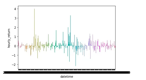
是否有办法仅显示日期并跳过x轴上的小时值? 是否有办法修改x轴刻度,在其中我可以跳过小时标签,并仅显示日期标签?我正在使用seaborn。
在i的评论建议下,我编辑了我的代码以绘制如下图:
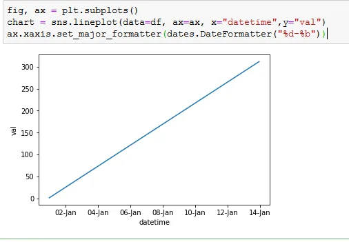
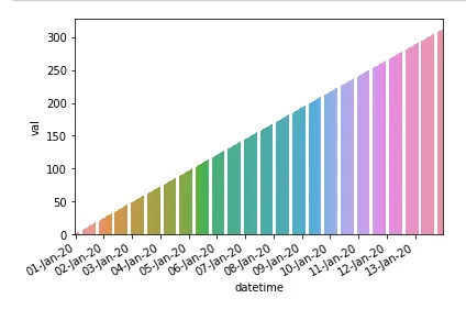
fig, ax = plt.pyplot.subplots()
g = sns.barplot(data=data_n,x='datetime',y='hourly_return')
g.xaxis.set_major_formatter(plt.dates.DateFormatter("%d-%b"))
但是我收到了以下错误:
ValueError: DateFormatter found a value of x=0, which is an illegal
date; this usually occurs because you have not informed the axis that
it is plotting dates, e.g., with ax.xaxis_date()
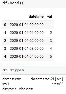
我检查了日期时间列,并得到了以下数据类型的输出:
0     2020-01-01 00:00:00
1     2020-01-01 01:00:00
2     2020-01-01 02:00:00
3     2020-01-01 03:00:00
4     2020-01-01 04:00:00
          ...
307   2020-01-13 19:00:00
308   2020-01-13 20:00:00
309   2020-01-13 21:00:00
310   2020-01-13 22:00:00
311   2020-01-13 23:00:00
Name: datetime, Length: 312, dtype: datetime64[ns]
我怀疑x轴的刻度问题,所以运行g.get_xticks()(获取x轴刻度)时,输出结果为序数。有人能告诉我这是为什么吗?
datetime对象。您可以将x列转换为datetime对象,如pd.to_datetime(df["xaxis"])。 - Narendra Prasath