我注意到当我的条形图中只有5个或更少的数据时,x轴会自动添加额外的刻度线:
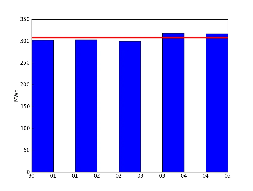 我想要的是像这样的效果:
我想要的是像这样的效果:
我想要的是像这样的效果:
bar方法接受一个名为align的参数。将此参数设置为align='center'。align参数将条形图对齐到我们给定的x值中心,而不是左侧(这是默认值)。
然后使用xticks方法来指定x轴上的刻度数以及它们的位置。
import matplotlib.pyplot as plot

x = range(1, 7)
y = (0, 300, 300, 290, 320, 315)
plot.bar(x, y, width=0.7, align="center")

ind = range(2, 7)    # the x locations for the groups
plot.xticks(ind, x)

plot.axhline(305, linewidth=3, color='r')

plot.show()