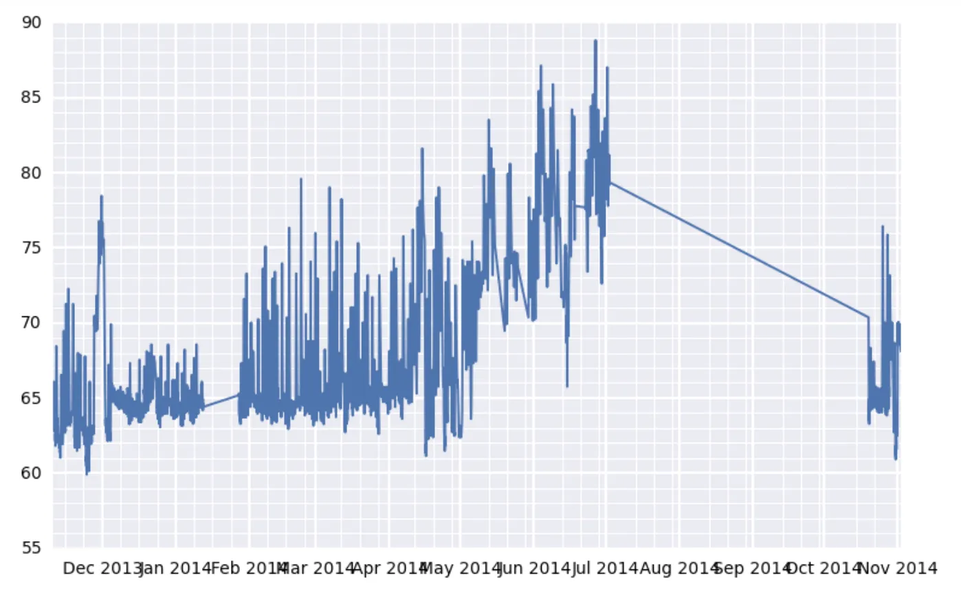
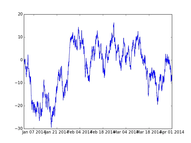
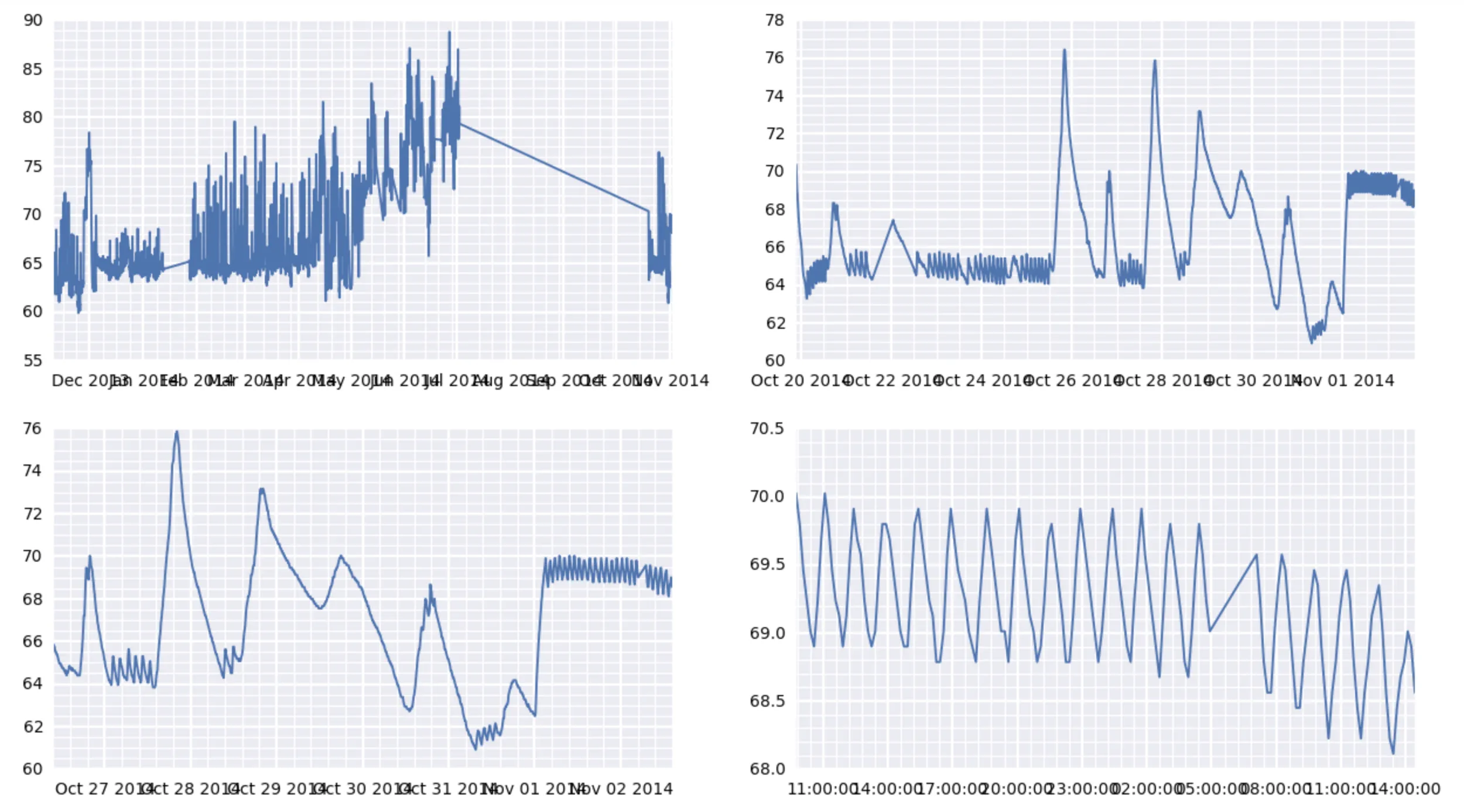
Matplotlib显示x轴刻度标签重叠问题

66
看一下下面的图表: enter image description here

它是这个更大图表的一个子图: enter image description here

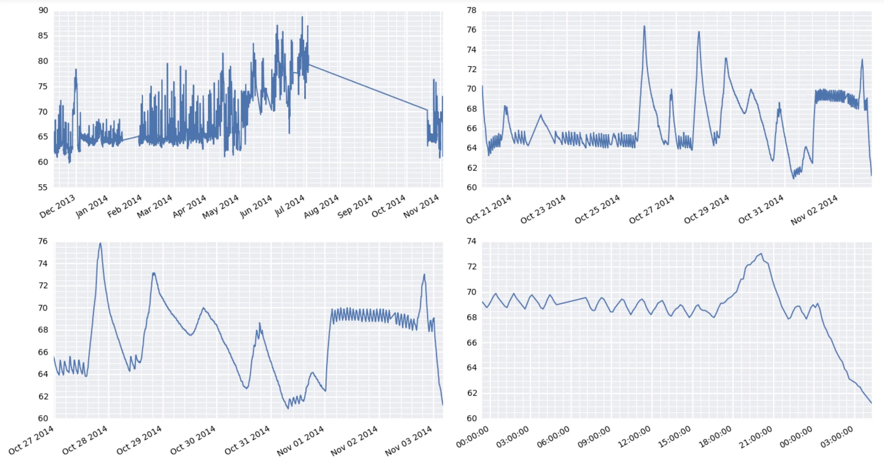
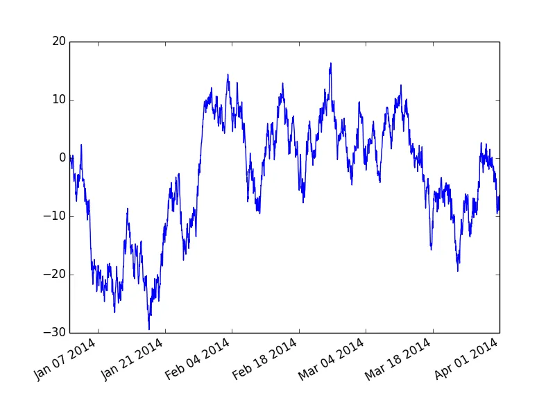
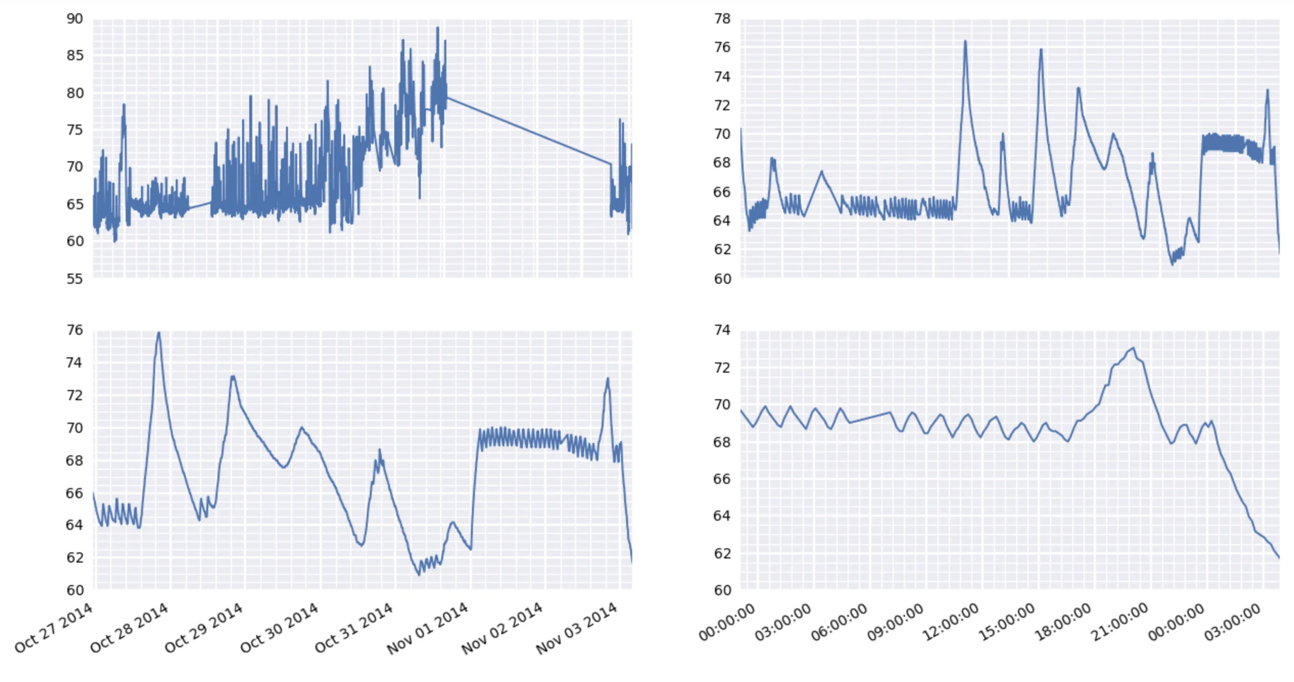
我看到两个问题。首先,x轴标签互相重叠(这是我的主要问题)。第二,x轴次要网格线的位置似乎有点奇怪。在图表的左侧,它们看起来间距适当。但是在右侧,它们似乎挤在了主要网格线上...好像主要网格线的位置不是次要刻度位置的正确倍数。
我的设置是,我有一个名为 df 的数据帧,它在行上具有 DatetimeIndex ,并且包含名为 value 的浮点数列。如果需要,我可以提供 df 内容的示例。参考本帖底部的十几行 df 内容。
下面是生成该图表的代码:
now = dt.datetime.now()

fig, axes = plt.subplots(2, 2, figsize=(15, 8), dpi=200)
for i, d in enumerate([360, 30, 7, 1]):
    ax = axes.flatten()[i]
    earlycut = now - relativedelta(days=d)
    data = df.loc[df.index>=earlycut, :]
    ax.plot(data.index, data['value'])
    ax.xaxis_date()

    ax.get_xaxis().set_minor_locator(mpl.ticker.AutoMinorLocator())
    ax.get_yaxis().set_minor_locator(mpl.ticker.AutoMinorLocator())

    ax.grid(b=True, which='major', color='w', linewidth=1.5)
    ax.grid(b=True, which='minor', color='w', linewidth=0.75)
什么是我在这里解决x轴标签重叠问题的最佳选择(在每个子图中)?此外,分开来说(但不那么紧急),左上角子图中的次刻度问题出了什么问题?
我使用的是Pandas 0.13.1,numpy 1.8.0和matplotlib 1.4.x。
以下是用于参考的df的简短片段:
                                    id scale  tempseries_id    value
timestamp                                                           
2014-11-02 14:45:10.302204+00:00  7564     F              1  68.0000
2014-11-02 14:25:13.532391+00:00  7563     F              1  68.5616
2014-11-02 14:15:12.102229+00:00  7562     F              1  68.9000
2014-11-02 14:05:13.252371+00:00  7561     F              1  69.0116
2014-11-02 13:55:11.792191+00:00  7560     F              1  68.7866
2014-11-02 13:45:10.782227+00:00  7559     F              1  68.6750
2014-11-02 13:35:10.972248+00:00  7558     F              1  68.4500
2014-11-02 13:25:10.362213+00:00  7557     F              1  68.1116
2014-11-02 13:15:10.822247+00:00  7556     F              1  68.2250
2014-11-02 13:05:10.102200+00:00  7555     F              1  68.5616
2014-11-02 12:55:10.292217+00:00  7554     F              1  69.0116
2014-11-02 12:45:10.382226+00:00  7553     F              1  69.3500
2014-11-02 12:35:10.642245+00:00  7552     F              1  69.2366
2014-11-02 12:25:12.642255+00:00  7551     F              1  69.1250
2014-11-02 12:15:11.122382+00:00  7550     F              1  68.7866
2014-11-02 12:05:11.332224+00:00  7549     F              1  68.5616
2014-11-02 11:55:11.662311+00:00  7548     F              1  68.2250
2014-11-02 11:45:11.122193+00:00  7547     F              1  68.4500
2014-11-02 11:35:11.162271+00:00  7546     F              1  68.7866
2014-11-02 11:25:12.102211+00:00  7545     F              1  69.2366
2014-11-02 11:15:10.422226+00:00  7544     F              1  69.4616
2014-11-02 11:05:11.412216+00:00  7543     F              1  69.3500
2014-11-02 10:55:10.772212+00:00  7542     F              1  69.1250
2014-11-02 10:45:11.332220+00:00  7541     F              1  68.7866
2014-11-02 10:35:11.332232+00:00  7540     F              1  68.5616
2014-11-02 10:25:11.202411+00:00  7539     F              1  68.2250
2014-11-02 10:15:11.932326+00:00  7538     F              1  68.5616
2014-11-02 10:05:10.922229+00:00  7537     F              1  68.9000
2014-11-02 09:55:11.602357+00:00  7536     F              1  69.3500

编辑:尝试使用 fig.autofmt_xdate()

我认为这不会起作用。 这似乎是在左侧的两个图和右侧的两个图中都使用相同的 x 刻度标签。 考虑到我的数据,这是不正确的。 请参见以下有问题的输出:

enter image description here

3个回答

67

好的,最后终于搞定了。关键在于使用plt.setp手动旋转刻度标签。当你的图中有多个子图时,使用fig.autofmt_xdate()会做一些意外的事情,所以不能用它。下面是工作代码及其输出:

for i, d in enumerate([360, 30, 7, 1]):
    ax = axes.flatten()[i]
    earlycut = now - relativedelta(days=d)
    data = df.loc[df.index>=earlycut, :]
    ax.plot(data.index, data['value'])

    ax.get_xaxis().set_minor_locator(mpl.ticker.AutoMinorLocator())
    ax.get_yaxis().set_minor_locator(mpl.ticker.AutoMinorLocator())

    ax.grid(b=True, which='major', color='w', linewidth=1.5)
    ax.grid(b=True, which='minor', color='w', linewidth=0.75)

    plt.setp(ax.get_xticklabels(), rotation=30, horizontalalignment='right')

fig.tight_layout()

在此输入图片描述

顺便提一下,之前有人评论说matplotlib的某些东西需要很长时间,这里很有趣。我正在使用树莓派作为一个遥远位置的气象站。它正在收集数据并通过网络提供结果。但是,它真的很费劲地制作这些图形。


7
对我来说,我只需要 plt.setp(ax.get_xticklabels(), rotation=30, horizontalalignment='right', fontsize='x-small')。顺便说一句,做得很好。谢谢! - Trevor Boyd Smith

25

由于matplotlib中文本渲染的方式,自动检测重叠文本会导致速度变慢。(文本占用空间只有在绘制后才能准确计算。)因此,matplotlib不会尝试自动解决这个问题。

因此,最好旋转长刻度标签。由于日期通常存在这个问题,因此有一个名为fig.autofmt_xdate()的图形方法,它将(除其他外)旋转刻度标签以使其更易读。(注意:如果使用pandas plot方法,则会返回一个轴对象,因此需要使用ax.figure.autofmt_xdate()。)

以下是一个快速示例:

import numpy as np
import pandas as pd
import matplotlib.pyplot as plt

time = pd.date_range('01/01/2014', '4/01/2014', freq='H')
values = np.random.normal(0, 1, time.size).cumsum()

fig, ax = plt.subplots()
ax.plot_date(time, values, marker='', linestyle='-')

fig.autofmt_xdate()
plt.show()

如果我们不加入fig.autofmt_xdate()

enter image description here

而如果我们使用fig.autofmt_xdate()

enter image description here


这个解决方案适用于多个子图(例如2x2的矩阵)并且它们上面都有不同的日期时间轴吗? - 8one6
我尝试实现这个解决方案,但它只在子图的底部一行显示刻度标签,而这些标签不能正确对应子图的顶部一行。 - 8one6
这个对我有用,可以在子图中使用:fig, axes = plt.subplots(3, 3, sharex='col') - muon

2

对于在x轴上没有日期值而是字符串的问题,您可以在x轴值中插入\n字符以避免重叠。这里是一个例子 -

数据框如下:

somecol               value
category 1 of column   16
category 2 of column   13
category 3 of column   21
category 4 of column   20
category 5 of column   11
category 6 of column   22
category 7 of column   19
category 8 of column   14
category 9 of column   18
category 10 of column   23
category 11 of column   10
category 12 of column   24
category 13 of column   17
category 14 of column   15
category 15 of column   12

我需要在y轴上绘制,在x轴上绘制somecol,通常会绘制成这样 -

Normal plot with overlap

如您所见,有很多重叠。现在在somecol列中引入\n字符。

somecol = df['somecol'].values.tolist()
for i in range(len(somecol)):   
    x = somecol[i].split(' ')   
    # insert \n before 'of'     
    x.insert(x.index('of'),'\n')
    somecol[i] = ' '.join(x) 

现在,如果你绘制图表,它会像这样 - plt.plot(somecol, df['val']) No overlap 如果你不想旋转标签,这个方法很有效。
到目前为止,我发现这种方法唯一的缺点是你需要调整标签3-4次,即尝试多种格式来显示最佳的图表。

网页内容由stack overflow 提供, 点击上面的
可以查看英文原文,
原文链接