如何旋转seaborn条形图的x轴刻度标签

11
我正在尝试将条形图的X轴标签旋转45°,以使它们可读(目前存在重叠)。 genero的长度为7,filmes_por_genero的长度为20。
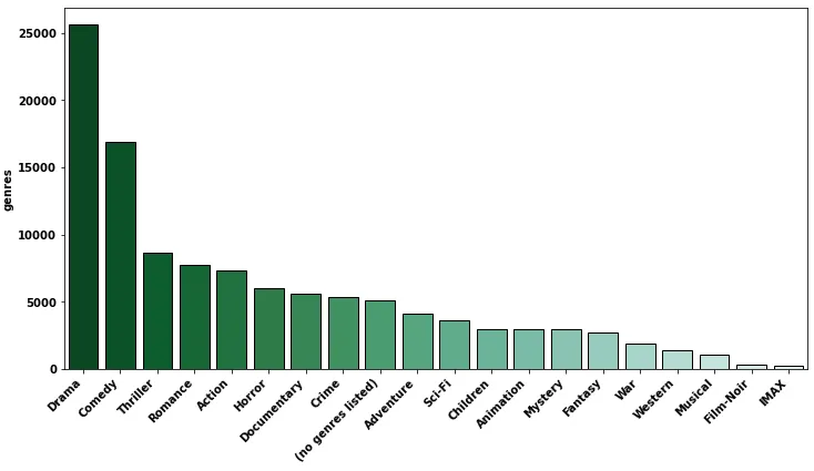
我正在使用MovieLens数据集,并制作一个图表,统计每个单独的流派中电影的数量。以下是我目前的代码:
import seaborn as sns
import matplotlib.pyplot as plt
sns.set_style("whitegrid")

filmes_por_genero = filmes["generos"].str.get_dummies('|').sum().sort_values(ascending=False)
genero = filmes_com_media.index

chart = plt.figure(figsize=(16,8))
sns.barplot(x=genero,
            y=filmes_por_genero.values,
            palette=sns.color_palette("BuGn_r", n_colors=len(filmes_por_genero) + 4)
            )

chart.set_xticklabels(
    chart.get_xticklabels(), 
    rotation=45, 
    horizontalalignment='right'
)

这是完整的错误信息:
/usr/local/lib/python3.6/dist-packages/pandas/core/groupby/grouper.py in get_grouper(obj, key, axis, level, sort, observed, mutated, validate)
    623                 in_axis=in_axis,
    624             )
--> 625             if not isinstance(gpr, Grouping)
    626             else gpr
    627         )

/usr/local/lib/python3.6/dist-packages/pandas/core/groupby/grouper.py in __init__(self, index, grouper, obj, name, level, sort, observed, in_axis)
    254         self.name = name
    255         self.level = level
--> 256         self.grouper = _convert_grouper(index, grouper)
    257         self.all_grouper = None
    258         self.index = index

/usr/local/lib/python3.6/dist-packages/pandas/core/groupby/grouper.py in _convert_grouper(axis, grouper)
    653     elif isinstance(grouper, (list, Series, Index, np.ndarray)):
    654         if len(grouper) != len(axis):
--> 655             raise ValueError("Grouper and axis must be same length")
    656         return grouper
    657     else:

ValueError: Grouper and axis must be same length
2个回答

27
import pandas as pd
import matplotlib.pyplot as plt
import seaborn as sns

# data
df = pd.read_csv('ml-25m/movies.csv')

print(df.head())

   movieId                               title                                       genres
0        1                    Toy Story (1995)  Adventure|Animation|Children|Comedy|Fantasy
1        2                      Jumanji (1995)                   Adventure|Children|Fantasy
2        3             Grumpier Old Men (1995)                               Comedy|Romance
3        4            Waiting to Exhale (1995)                         Comedy|Drama|Romance
4        5  Father of the Bride Part II (1995)                                       Comedy

# split the strings in the genres column
df['genres'] = df['genres'].str.split('|')

# explode the lists that result for str.split
df = df.explode('genres', ignore_index=True)

print(df.head())

   movieId             title     genres
0        1  Toy Story (1995)  Adventure
1        1  Toy Story (1995)  Animation
2        1  Toy Story (1995)   Children
3        1  Toy Story (1995)     Comedy
4        1  Toy Story (1995)    Fantasy

流派统计

gc = df.genres.value_counts().reset_index()

print(gc)

                genres  count
0                Drama  25606
1               Comedy  16870
2             Thriller   8654
3              Romance   7719
4               Action   7348
5               Horror   5989
6          Documentary   5605
7                Crime   5319
8   (no genres listed)   5062
9            Adventure   4145
10              Sci-Fi   3595
11            Children   2935
12           Animation   2929
13             Mystery   2925
14             Fantasy   2731
15                 War   1874
16             Western   1399
17             Musical   1054
18           Film-Noir    353
19                IMAX    195

sns.barplot

fig, ax = plt.subplots(figsize=(12, 6))
sns.barplot(data=gc, x='genres', y='count', hue='genres', palette=sns.color_palette("BuGn_r", n_colors=len(gc)), ec='k', legend=False, ax=ax)

ax.tick_params(axis='x', labelrotation=45)
# ax.set_xticklabels(ax.get_xticklabels(), rotation=45, ha='right')
# ax.set_xticks(ticks=ax.get_xticks(), labels=ax.get_xticklabels(), rotation=45, ha='right')
plt.show()

plt.figure(figsize=(12, 6))
ax = sns.barplot(data=gc, x='genres', y='count', hue='genres', palette=sns.color_palette("BuGn_r", n_colors=len(gc)), ec='k', legend=False)

ax.tick_params(axis='x', labelrotation=45)
# ax.set_xticklabels(ax.get_xticklabels(), rotation=45, ha='right')
# ax.set_xticks(ticks=ax.get_xticks(), labels=ax.get_xticklabels(), rotation=45, ha='right')
plt.show()

enter image description here

sns.countplot

使用`sns.countplot`来跳过使用`.value_counts()`,如果绘图顺序不重要的话。 要对`countplot`进行排序,必须使用`order=df.genres.value_counts().index`,所以`countplot`并不能真正帮助你避免使用`.value_counts()`,如果想要按降序排序的话。
fig, ax = plt.subplots(figsize=(12, 6))
sns.countplot(data=df, x='genres', ax=ax)

ax.tick_params(axis='x', labelrotation=45)
# ax.set_xticklabels(ax.get_xticklabels(), rotation=45, ha='right')
# ax.set_xticks(ticks=ax.get_xticks(), labels=ax.get_xticklabels(), rotation=45, ha='right')
plt.show()

enter image description here

pandas.DataFrame.plot

  • .value_counts 可以直接绘制,并且可以使用 rot= 参数来旋转 xticklabels。
ax = df.genres.value_counts().plot(kind='bar', rot=45, width=0.85, ec='k', figsize=(12, 6))

在一个具有长x轴刻度标签的条形图中,更简洁的选择可能是使用水平条形。
plt.figure(figsize=(6, 4))
ax = sns.barplot(data=gc, y='genres', x='count', orient='h', hue='genres',
                 palette=sns.color_palette("BuGn_r", n_colors=len(gc)), ec='k', legend=False)

enter image description here


1
@Jurriaan 这是一个警告,而且仍然可以正常使用,不过,答案已经更新了。 - undefined

10

更短的标签旋转代码:

plt.xticks(rotation=45, ha='right')
  • 将标签旋转45度
  • 水平对齐标签以提高可读性

完整示例

带有排序x轴的sns.countplot

import seaborn as sns
import matplotlib.pyplot as plt
df = sns.load_dataset('planets')
sns.countplot(data=df,
              x='method',
              order=df['method'].value_counts().index)
plt.xticks(rotation=45, ha='right');

countplot


网页内容由stack overflow 提供, 点击上面的
可以查看英文原文,
原文链接