我有一个数据框,它有多个列和许多行。许多行对于某些列没有值,在数据框中表示为NaN。以下是示例数据框:
df.head()
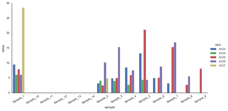
GEN Sample_1 Sample_2 Sample_3 Sample_4 Sample_5 Sample_6 Sample_7 Sample_8 Sample_9 Sample_10 Sample_11 Sample_12 Sample_13 Sample_14
A123 9.4697 3.19689 4.8946 8.54594 13.2568 4.93848 3.16809 NAN NAN NAN NAN NAN NAN NAN
A124 6.02592 4.0663 3.9218 2.66058 4.38232 NAN NAN NAN NAN NAN NAN NAN
A125 7.88999 2.51576 4.97483 5.8901 21.1346 5.06414 15.3094 2.68169 8.12449 NAN NAN NAN NAN NAN
A126 5.99825 10.2186 15.2986 7.53729 4.34196 8.75048 16.9358 5.52708 NAN NAN NAN NAN NAN NAN
A127 28.5014 4.86702 NAN NAN NAN NAN NAN NAN NAN NAN NAN NAN NAN NAN
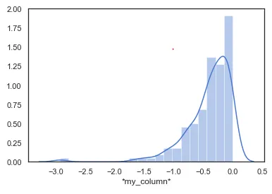
我想使用Python中的Seaborn函数为这个数据框绘制直方图,因此我尝试了以下代码:
sns.set(color_codes=True)
sns.set(style="white", palette="muted")
sns.distplot(df)
但是它抛出了以下错误:
    ValueError                                Traceback (most recent call last)
    <ipython-input-80-896d7fe85ef3> in <module>()
          1 sns.set(color_codes=True)
          2 sns.set(style="white", palette="muted")
    ----> 3 sns.distplot(df)

    /anaconda3/lib/python3.4/site-packages/seaborn/distributions.py in distplot(a, bins, hist, kde, rug, fit, hist_kws, kde_kws, rug_kws, fit_kws, color, vertical, norm_hist, axlabel, label, ax)
        210         hist_color = hist_kws.pop("color", color)
        211         ax.hist(a, bins, orientation=orientation,
    --> 212                 color=hist_color, **hist_kws)
        213         if hist_color != color:
        214             hist_kws["color"] = hist_color

   /anaconda3/lib/python3.4/site-packages/matplotlib/axes/_axes.py in hist(self, x, bins, range, normed, weights, cumulative, bottom, histtype, align, orientation, rwidth, log, color, label, stacked, **kwargs)
       5627             color = mcolors.colorConverter.to_rgba_array(color)
       5628             if len(color) != nx:
    -> 5629                 raise ValueError("color kwarg must have one color per dataset")
       5630
       5631         # We need to do to 'weights' what was done to 'x'

    ValueError: color kwarg must have one color per dataset
非常感谢任何帮助/建议,以消除这个错误..!!!
distplot接受1D数组、Series或list。您可以尝试传递color=X,其中X是颜色映射的字典,例如{'Sample_1': 'Red', ...},但我严重怀疑它会起作用。 - soupaultmatplotlib开始(seaborn只是在matplotlib上工作的一组高级工具)。对于你的任务,分配一个子图数组(plt.subplots(nrows=?, ncols=?)),迭代df的列并为每个subplot+column调用matplotlib的hist函数。 - soupault