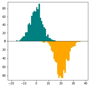
我希望能够使用seaborn distplot绘制一个像这里展示的双柱状图。这种图也可以被称为背对背柱状图,或者是沿x轴翻转/镜像的双直方图,如此处所讨论。
以下是我的代码:
以下是我的代码:
import numpy as np
import matplotlib.pyplot as plt
import seaborn as sns

green = np.random.normal(20,10,1000)
blue = np.random.poisson(60,1000)

fig, ax = plt.subplots(figsize=(8,6))

sns.distplot(blue, hist=True, kde=True, hist_kws={'edgecolor':'black'}, kde_kws={'linewidth':2}, bins=10, color='blue')
sns.distplot(green, hist=True, kde=True, hist_kws={'edgecolor':'black'}, kde_kws={'linewidth':2}, bins=10, color='green')
ax.set_xticks(np.arange(-20,121,20))
ax.set_yticks(np.arange(0.0,0.07,0.01))
ax.spines['top'].set_visible(False)
ax.spines['right'].set_visible(False)

plt.show()
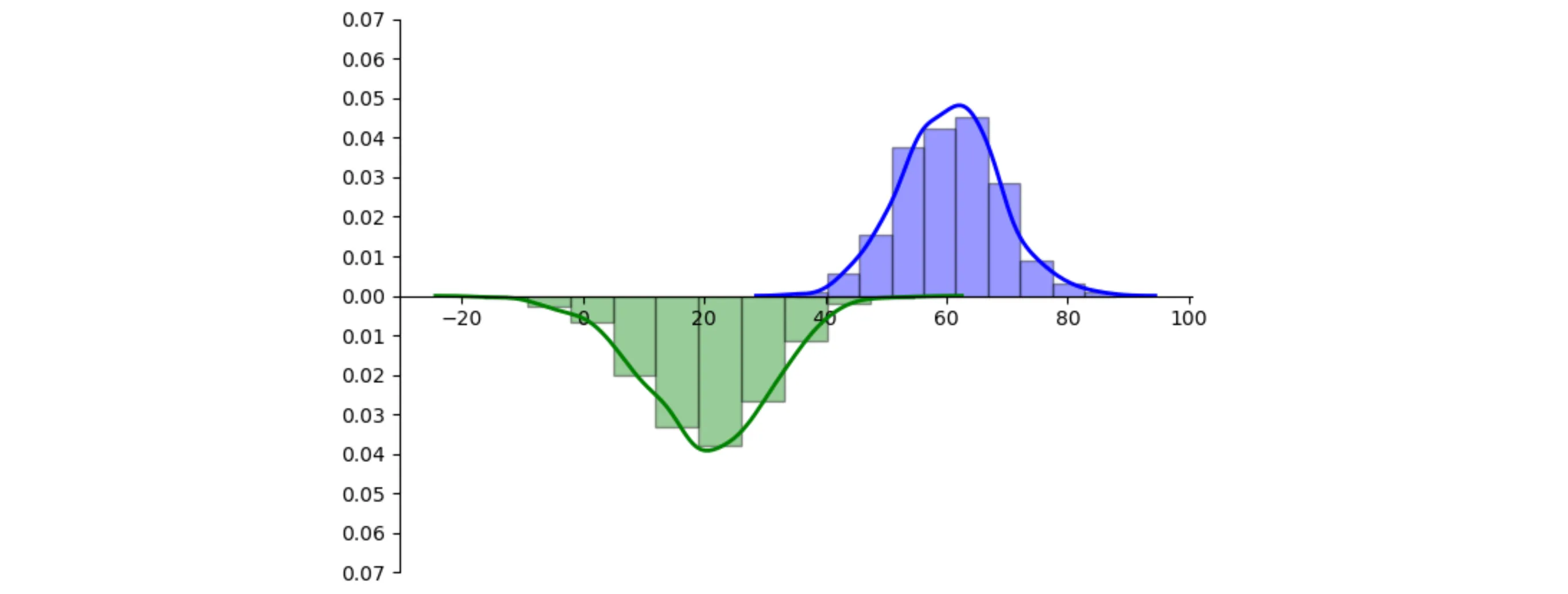
这是输出结果:
当我使用在这里讨论的方法(plt.barh)时,我得到了下面显示的条形图,这不是我想要的。
或者我没有很好地理解解决方法……
一个简单/短小的Python-seaborn-distplot实现类似于这些图的绘制将是完美的。我编辑了上面第一个图的图形以显示我希望实现的图形类型(尽管y轴不是倒置的):
任何线索将不胜感激。
subplots_adjust将h_pad调整为零,就会更好。 - mwaskom