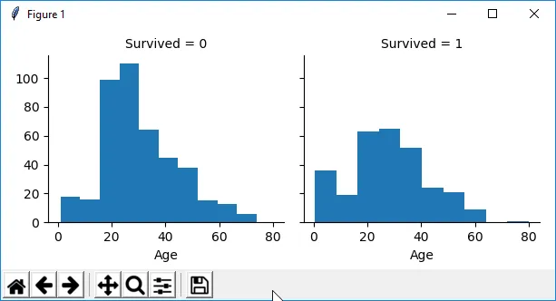
我有一个 pandas.DataFrame,我想根据两列数据绘制图表: Age (整数类型), Survived (整数类型 - 0 或 1)。现在我有类似这样的东西:
这是我使用的代码:
class DataAnalyzer:

    def _facet_grid(self, func, x: List[str], col: str = None, row: str = None) -> None:
        g = sns.FacetGrid(self.train_data, col=col, row=row)
        if func == sns.barplot:
            g.map(func, *x, ci=None)
        else:
            g.map(func, *x)
        g.add_legend()
        plt.show()

    def analyze(self) -> None:
        # Check if survival rate is connected with Age
        self._facet_grid(plt.hist, col='Survived', x=['Age'])
所以这个图表显示在两个子图上。这很好,但是在特定年龄范围内,很难看出具有0和1的Survived列中记录数量之间的差异。
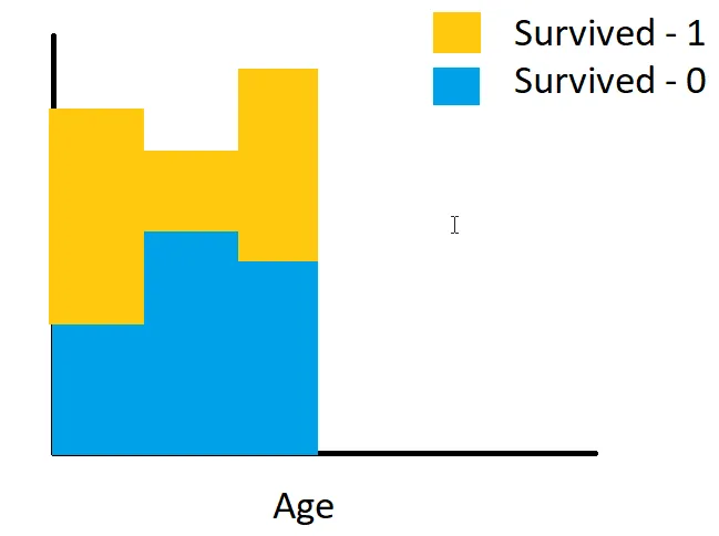
因此,我希望得到类似于以下内容:
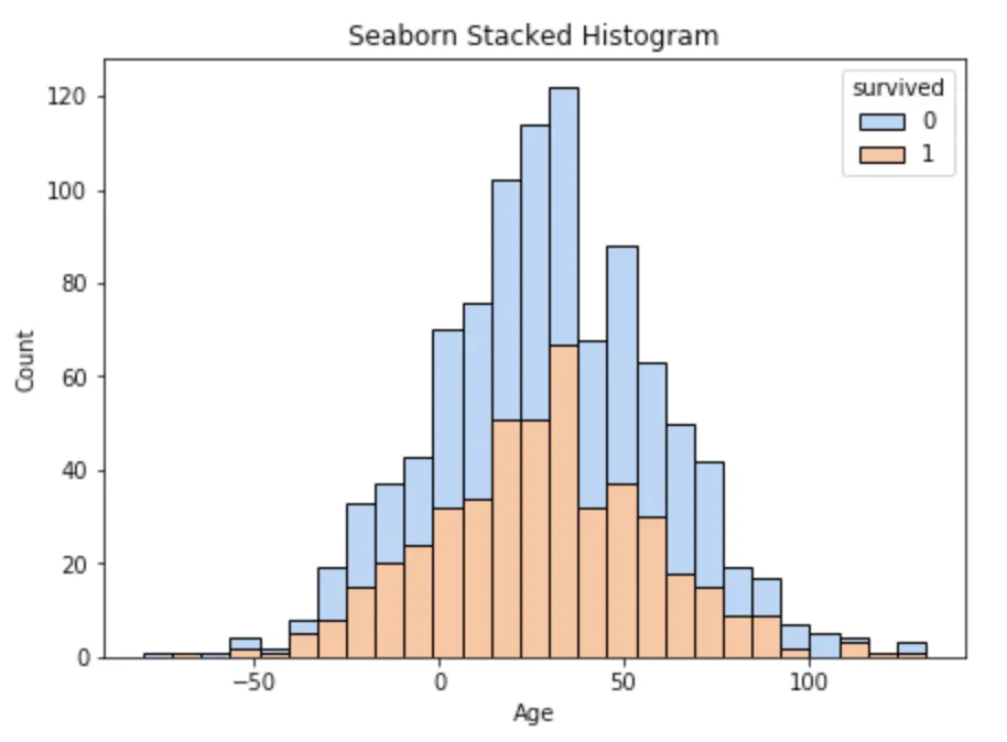
stat="probability"时,它并不像预期的那样工作,因为它会将概率相加。在预期应该是100%的地方,实际上结果是200%。有什么方法可以克服这个问题吗? - Anonymous