我有一个名为df的数据框,长这样
   success        type
1  0.197642  Technique 1
2  0.177575  Technique 2
0  0.018519  Technique 3
然后我画出它:
df.success.plot(kind="bar")
但是条形图的标签是1,2,0。我想让它们成为数据帧中类型列中的字符串。我在寻找如何自定义直方图的文档时遇到了困难,除了改变条的颜色之外。
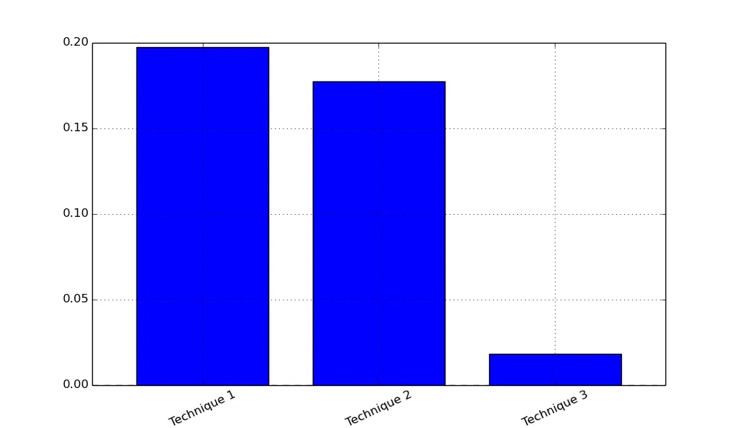
我有一个名为df的数据框,长这样
success type
1 0.197642 Technique 1
2 0.177575 Technique 2
0 0.018519 Technique 3
然后我画出它:
df.success.plot(kind="bar")
但是条形图的标签是1,2,0。我想让它们成为数据帧中类型列中的字符串。我在寻找如何自定义直方图的文档时遇到了困难,除了改变条的颜色之外。
df.plot(x='type', y='success', kind='bar')
plt.xticks(rotation=25)
我通过查看文档字符串找到了这个:
In [11]: df.plot?
...
Parameters
----------
frame : DataFrame
x : label or position, default None
y : label or position, default None
    Allows plotting of one column versus another