Pandas:如何使用带有标签的数据框绘制条形图?

4

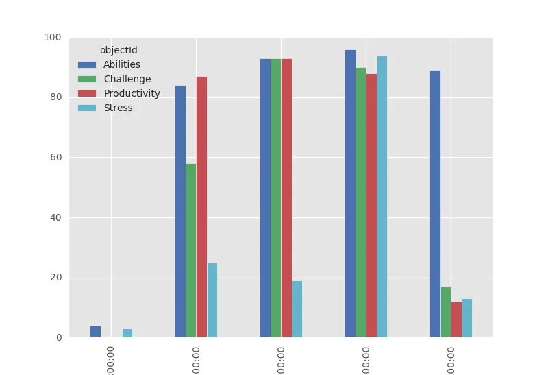
I have the following dataframe df:

             timestamp      objectId  result
0  2015-11-24 09:00:00        Stress       3
1  2015-11-24 09:00:00  Productivity       0
2  2015-11-24 09:00:00     Abilities       4
3  2015-11-24 09:00:00     Challenge       0
4  2015-11-24 10:00:00  Productivity      87
5  2015-11-24 10:00:00     Abilities      84
6  2015-11-24 10:00:00     Challenge      58
7  2015-11-24 10:00:00        Stress      25
8  2015-11-24 11:00:00  Productivity      93
9  2015-11-24 11:00:00     Abilities      93
10 2015-11-24 11:00:00     Challenge      93
11 2015-11-24 11:00:00        Stress      19
12 2015-11-24 12:00:00     Challenge      90
13 2015-11-24 12:00:00     Abilities      96
14 2015-11-24 12:00:00        Stress      94
15 2015-11-24 12:00:00  Productivity      88
16 2015-11-24 13:00:00  Productivity      12
17 2015-11-24 13:00:00     Challenge      17
18 2015-11-24 13:00:00     Abilities      89
19 2015-11-24 13:00:00        Stress      13
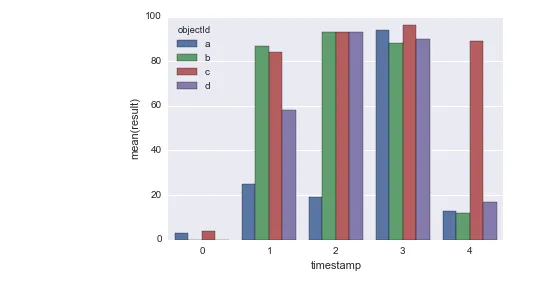
我希望能实现如下所示的条形图,Picture taken from here http://pandas.pydata.org/pandas-docs/stable/visualization.html 其中,纵轴应对应于
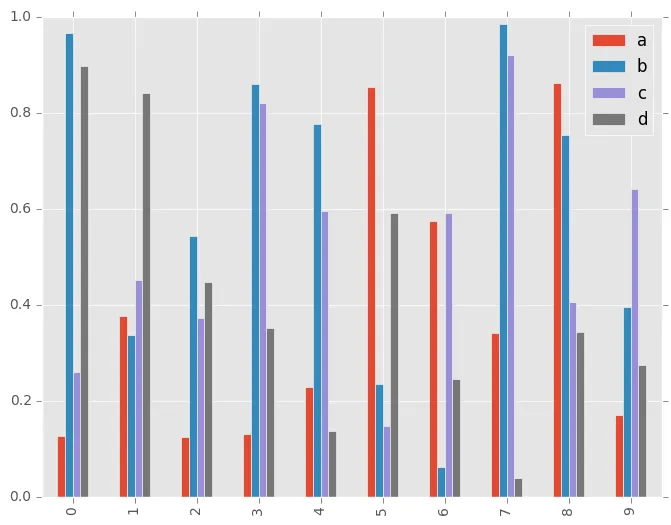
result列,横轴应该是按照timestamp列分组的值。标签应该是ObjectID列中的标签,而非a,b,c,d。我尝试了几种方法,但都没有成功。最接近的方法是使用plot()方法,但它不能通过参数进行任何自定义(例如,kind='bar'不起作用)。
groups = df.groupby('objectId')
sgb = groups['result']
sgb.plot()

还有其他想法吗?


你能具体说明你想要绘制什么吗?因为你展示的图形似乎与你展示的数据无关。应该用不同的颜色表示什么,条形图应该按哪个变量分组? - joris
你好Joris,感谢你的回答。我编辑了我的问题。希望现在问题已经足够清晰了。 - dimstudio
2个回答

3
import seaborn as sns

In [36]:
df.timestamp = df.timestamp.factorize()[0]

In [39]:
df.objectId = df.objectId.map({'Stress' : 'a' , 'Productivity' : 'b' , 'Abilities' : 'c' , 'Challenge' : 'd'})

In [41]:
df
Out[41]:
   timestamp    objectId    result
0       0           a           3
1       0           b           0
2       0           c           4
3       0           d           0
4       1           b           87
5       1           c           84
6       1           d           58
7       1           a           25
8       2           b           93
9       2           c           93
10      2           d           93
11      2           a           19
12      3           d           90
13      3           c           96
14      3           a           94
15      3           b           88
16      4           b           12
17      4           d           17
18      4           c           89
19      4           a           13

In [40]:
sns.barplot(x = 'timestamp' , y = 'result' , hue = 'objectId' , data = df );

enter image description here


你的答案非常好。谢谢,但是Joris给出的解决方案也非常有效。 - dimstudio

1

@NaderHisham的答案是一个非常简单的解决方案!
但是,如果由于某种原因不能使用seaborn,则可以使用纯pandas/matplotlib解决方案:

您需要重塑数据,以便不同的objectIds成为列:

In [20]: df.set_index(['timestamp', 'objectId'])['result'].unstack()
Out[20]:
objectId   Abilities  Challenge  Productivity  Stress
timestamp
09:00:00           4          0             0       3
10:00:00          84         58            87      25
11:00:00          93         93            93      19
12:00:00          96         90            88      94
13:00:00          89         17            12      13

如果您制作一个条形图,就可以得到所需的结果:
In [24]: df.set_index(['timestamp', 'objectId'])['result'].unstack().plot(kind='bar')
Out[24]: <matplotlib.axes._subplots.AxesSubplot at 0xc44a5c0>

enter image description here


非常感谢您完美地回答了我的问题。 - dimstudio

网页内容由stack overflow 提供, 点击上面的
可以查看英文原文,
原文链接