我有一个带有 TIMESTAMP 列的 pandas DataFrame(不是索引),时间戳格式如下:
2015-03-31 22:56:45.510
我还有两列名为
CLASS和AXLES。 我想要分别计算每个月对于每个唯一的AXLES值(AXLES 可以取3-12之间的整数)的记录数量。我想到了使用
resample和groupby的组合方法:resamp = dfWIM.set_index('TIMESTAMP').groupby('AXLES').resample('M', how='count').CLASS
这似乎给我一个MultiIndex数据帧对象,如下所示。
In [72]: resamp
Out [72]:
AXLES TIMESTAMP
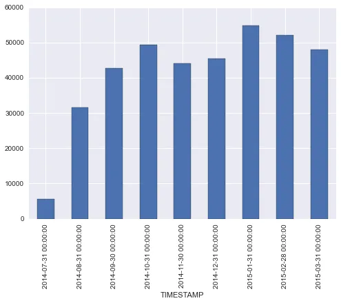
3 2014-07-31 5517
2014-08-31 31553
2014-09-30 42816
2014-10-31 49308
2014-11-30 44168
2014-12-31 45518
2015-01-31 54782
2015-02-28 52166
2015-03-31 47929
4 2014-07-31 3147
2014-08-31 24810
2014-09-30 39075
2014-10-31 46857
2014-11-30 42651
2014-12-31 48282
2015-01-31 42708
2015-02-28 43904
2015-03-31 50033
从这里开始,我该如何访问此multiIndex对象的不同组件以创建以下条件的条形图?
- 当AXLES = 3时显示数据
- 以月-年格式显示x轴刻度(没有天,小时,分钟等)
谢谢!
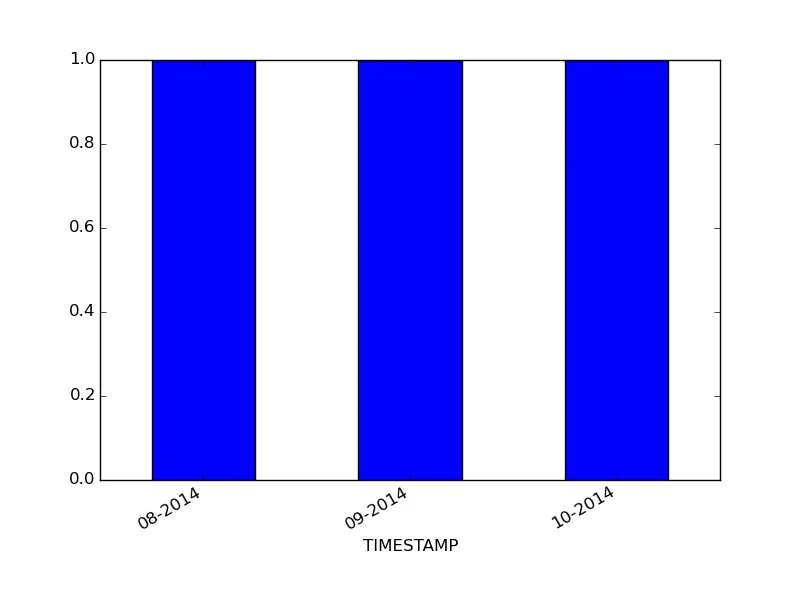
编辑:以下代码给我提供了绘图,但我无法将xtick格式更改为MM-YY。
resamp[3].plot(kind='bar')
编辑2 下面是一个代码片段,生成了与我所拥有的类似的小样本数据:
dftest = {'TIMESTAMP':['2014-08-31','2014-09-30','2014-10-31'], 'AXLES':[3, 3, 3], 'CLASS':[5,6,7]}
dfTest = pd.DataFrame(dftest)
dfTest.TIMESTAMP = pd.to_datetime(pd.Series(dfTest.TIMESTAMP))
resamp = dfTest.set_index('TIMESTAMP').groupby('AXLES').resample('M', how='count').CLASS
resamp[3].plot(kind='bar')
编辑 3:
下面是解决方案:
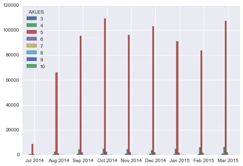
A. 绘制整个经过重新采样的数据框(基于 @Ako 的建议):
df = resamp.unstack(0)
df.index = [ts.strftime('%b 20%y') for ts in df.index]
df.plot(kind='bar', rot=0)
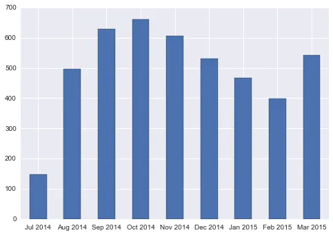
根据 @Alexander 的建议,从重新采样的数据框中绘制一个单独的指数。
df = resamp[3]
df.index = [ts.strftime('%b 20%y') for ts in df.index]
df.plot(kind='bar', rot=0)

resamp.unstack(0).plot(kind='bar')。这将把轴转换为单独绘制的系列。 - ako