我想将拟合的分布转换为频数。
import numpy as np
import matplotlib.pyplot as plt
from scipy import stats
%matplotlib notebook
# sample data generation
np.random.seed(42)
data = sorted(stats.lognorm.rvs(s=0.5, loc=1, scale=1000, size=1000))
# fit lognormal distribution
shape, loc, scale = stats.lognorm.fit(data, loc=0)
pdf_lognorm = stats.lognorm.pdf(data, shape, loc, scale)
fig, ax = plt.subplots(figsize=(8, 4))
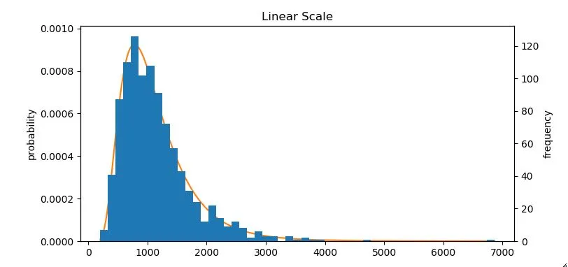
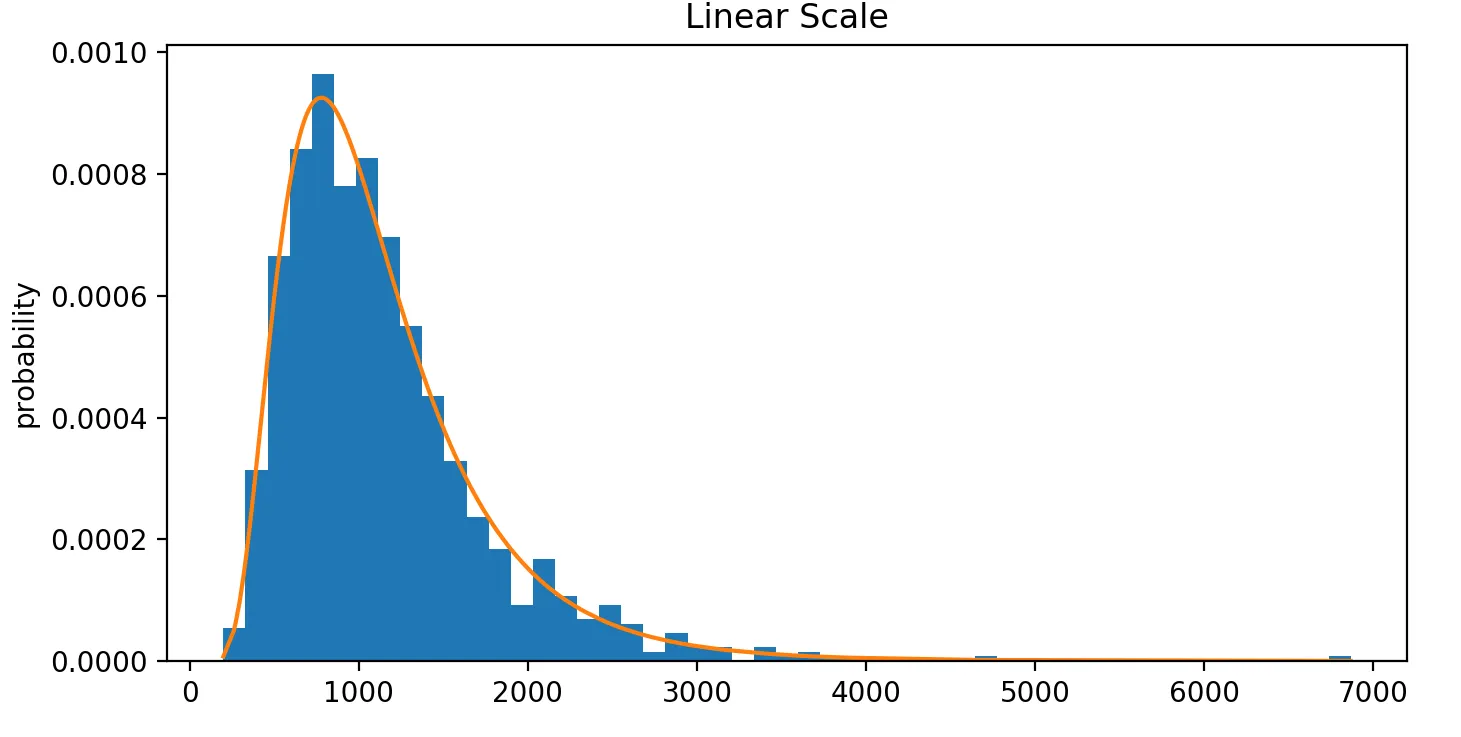
ax.hist(data, bins='auto', density=True)
ax.plot(data, pdf_lognorm)
ax.set_ylabel('probability')
ax.set_title('Linear Scale')
上面的代码片段将生成以下图表:
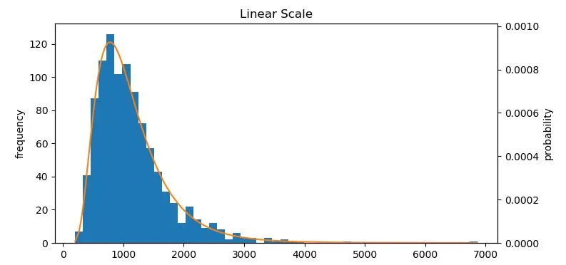
如您所见,y轴是以概率为单位的。但我想要它按照频率来显示。
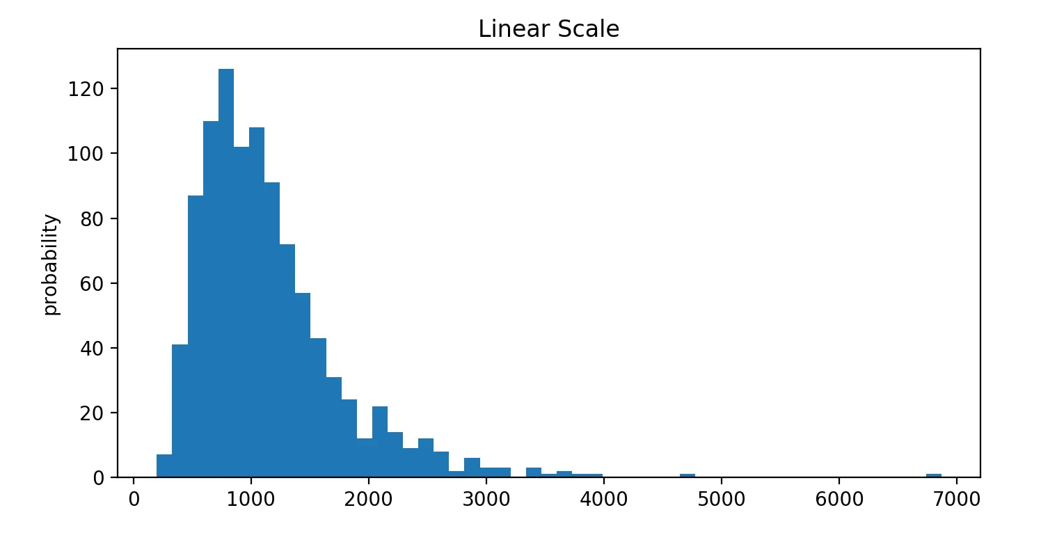
fig, ax = plt.subplots(figsize=(8, 4))
ax.hist(data, bins='auto')
ax.set_ylabel('probability')
ax.set_title('Linear Scale')
通过取消
density=True,直方图将以频率显示。但是我不知道如何像在直方图中那样拟合分布-请注意我无法在此直方图中绘制橙色拟合线。
我该怎么做?我认为应该将拟合分布乘以直方图曲线下的面积,但我不知道如何操作。