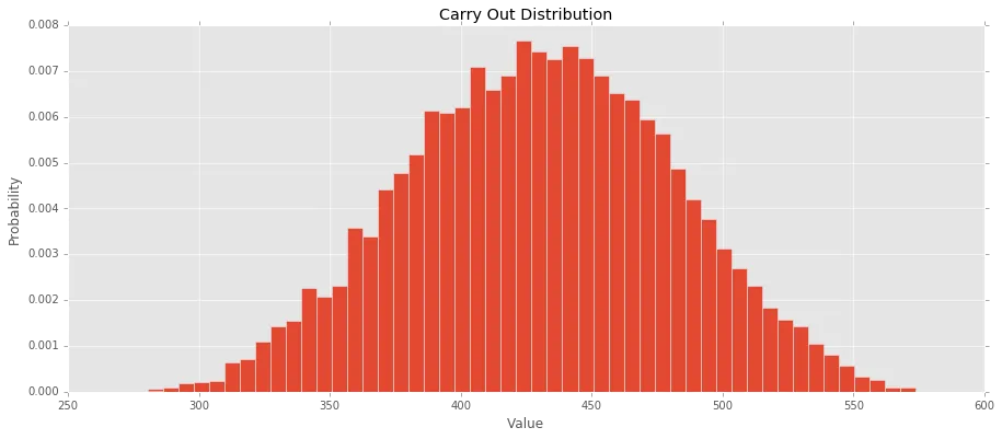
我刚刚尝试绘制我运行的模拟的概率密度直方图。然而,当我绘制它时,每个bin的概率似乎与频率图的结果不匹配。使用50个bins,我期望每个bin的平均概率为2%,但这在图表中没有反映。
提前致谢。
import pandas as pd
import numpy as np
import matplotlib.pyplot as plt

plntAcres = 88.0
hvstPer = 0.99
hvstAcres = plntAcres*hvstPer
yldAcre = np.random.triangular(47,48,49, 10000)

carryIn = 464
pdn = hvstAcres * yldAcre
imp = 25.0
ttlSup = carryIn + pdn + imp

crush = np.random.uniform(1945, 1990,10000)
expts = np.random.uniform(2085, 2200,10000)
seedRes = 130
ttlDem = crush + expts + seedRes

carryOut = ttlSup - ttlDem

print carryOut

plt.hist(carryOut, bins=50,normed=True)
plt.title("Carry Out Distribution")
plt.xlabel("Value")
plt.ylabel("Probability")
plt.show()