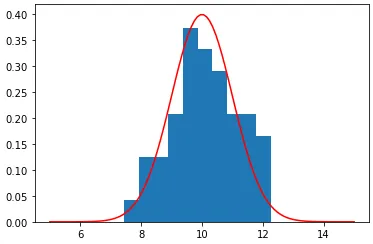
我尝试使用numpy.random.normal文档中的示例绘制归一化直方图。为此,我生成了正态分布的随机样本。
然后我对数据进行正态分布拟合,并计算概率密度函数。
显示拟合的 PDF 和数据直方图。
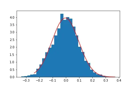
mu_true = 0
sigma_true = 0.1
s = np.random.normal(mu_true, sigma_true, 2000)
然后我对数据进行正态分布拟合,并计算概率密度函数。
mu, sigma = stats.norm.fit(s)
points = np.linspace(stats.norm.ppf(0.01,loc=mu,scale=sigma),
                 stats.norm.ppf(0.9999,loc=mu,scale=sigma),100)
pdf = stats.norm.pdf(points,loc=mu,scale=sigma)
显示拟合的 PDF 和数据直方图。
plt.hist(s, 30, density=True);
plt.plot(points, pdf, color='r')
plt.show()
我使用 density=True,但显然,pdf 和直方图并未归一化。
import seaborn as sns
ax = sns.distplot(s)