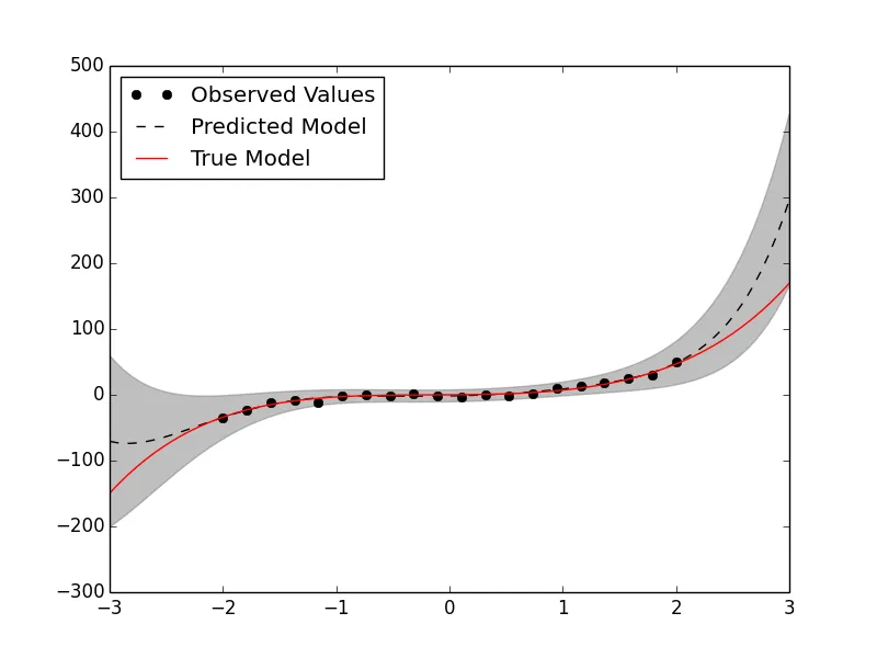
我想绘制一条曲线,例如
使用
我使用了类似于以下的代码:
x^5 + x^4 + x^3 + x + 1,其中每个x值都来自正态分布。我有一个均值向量和一个标准差向量。使用
matplotlib.pyplot,我可以绘制平均值并绘制围绕平均值的方差,但这看起来不够优雅,并且会使输出混乱(如下图所示)。是否有其他方法来绘制密度函数?我使用了类似于以下的代码:
mu = [mu1, mu2, mu3..]
sigma = [sigma1, sigma2, sigma3..]
variance1 = [mu1+sigma1, mu2+sigma2, ..]
variance2 = [mu1-sigma1, mu2-sigma2,..]


import matplotlib.pyplot as plt
plt.plot(x,mu)
plt.plot(x,variance1, ls = "--")
plt.plot(x,variance2,ls="--")
其中x是一个输入数组。
imshow?bar? 我们需要更多关于您的图表、其他元素以及示例的信息。提供示例代码作为起点也会有帮助。 - Thorsten Kranz