我有两个NumPy数组需要绘制:
runoff = np.array([1,4,5,6,7,8,9])
precipitation = np.array([4,5,6,7,3,3,7])
我有两个NumPy数组需要绘制:
runoff = np.array([1,4,5,6,7,8,9])
precipitation = np.array([4,5,6,7,3,3,7])
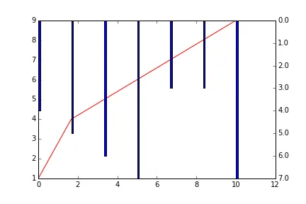
import matplotlib.pyplot as plt
import numpy as np

runoff = np.array([1,4,5,6,7,8,9])
precipitation = np.array([4,5,6,7,3,3,7])


fig, ax = plt.subplots()

# x axis to plot both runoff and precip. against
x = np.linspace(0, 10, len(runoff))

ax.plot(x, runoff, color="r")

# Create second axes, in order to get the bars from the top you can multiply
# by -1
ax2 = ax.twinx()
ax2.bar(x, -precipitation, 0.1)

# Now need to fix the axis labels
max_pre = max(precipitation)
y2_ticks = np.linspace(0, max_pre, max_pre+1)
y2_ticklabels = [str(i) for i in y2_ticks]
ax2.set_yticks(-1 * y2_ticks)
ax2.set_yticklabels(y2_ticklabels)

plt.show()
当然,有更好的方法来实现这个功能,而且从 @Pierre_GM 的回答中看来,已经有现成的更好的方式了。
scikits.timeseries不再受支持,scikits.hydroclimpy也不再受支持。因此,它不是一个一揽子解决方案。
然而,阅读代码应该会给您一些想法。
@Greg Greg的回答很好。但是,通常情况下,您不需要反转y轴并手动修复轴标签。只需将以下代码替换为Greg的答案
# Now need to fix the axis labels
max_pre = max(precipitation)
y2_ticks = np.linspace(0, max_pre, max_pre+1)
y2_ticklabels = [str(i) for i in y2_ticks]
ax2.set_yticks(-1 * y2_ticks)
ax2.set_yticklabels(y2_ticklabels)
只需一行代码:
plt.gca().invert_yaxis()