针对这个问题,为了完整起见,我修改了已接受的答案并定制了结果图,但仍然面临着一些重要的问题。
总之,我正在做反映Kruskal-Wallis和成对Wilcoxon检验比较的箱形图。
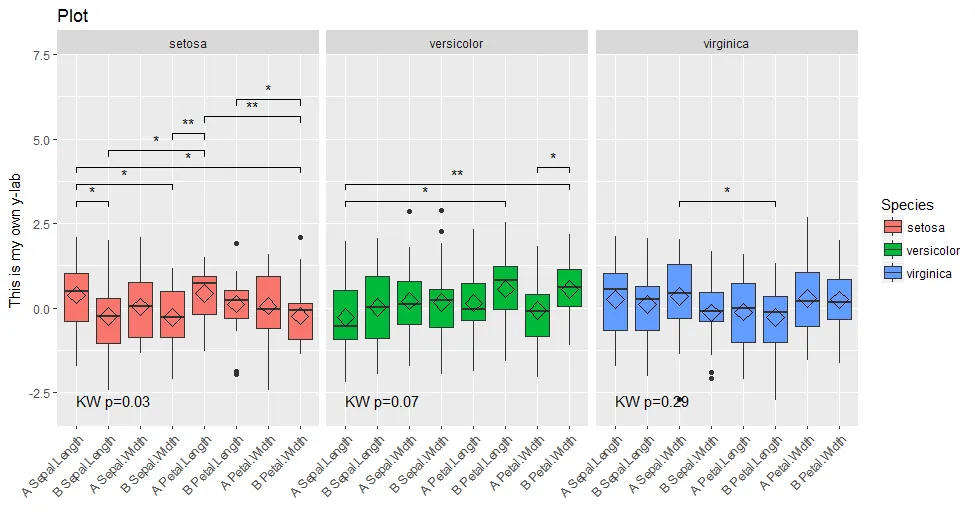
我想用星号替换p值数字,并仅显示显著性比较,将垂直间距减小到最大。
基本上,我想做这个,但加上了facet的问题,这使得一切都混乱了。
到目前为止,我已经在一个非常体面的MWE上工作,但仍存在问题...
library(reshape2)
library(ggplot2)
library(gridExtra)
library(tidyverse)
library(data.table)
library(ggsignif)
library(RColorBrewer)

data(iris)
iris$treatment <- rep(c("A","B"), length(iris$Species)/2)
mydf <- melt(iris, measure.vars=names(iris)[1:4])
mydf$treatment <- as.factor(mydf$treatment)
mydf$variable <- factor(mydf$variable, levels=sort(levels(mydf$variable)))
mydf$both <- factor(paste(mydf$treatment, mydf$variable), levels=(unique(paste(mydf$treatment, mydf$variable))))

# Change data to reduce number of statistically significant differences
set.seed(2)
mydf <- mydf %>% mutate(value=rnorm(nrow(mydf)))
##

##FIRST TEST BOTH

#Kruskal-Wallis
addkw <- as.data.frame(mydf %>% group_by(Species) %>%
                       summarize(p.value = kruskal.test(value ~ both)$p.value))
#addkw$p.adjust <- p.adjust(addkw$p.value, "BH")
a <- combn(levels(mydf$both), 2, simplify = FALSE)
#new p.values
pv.final <- data.frame()
for (gr in unique(mydf$Species)){
    for (i in 1:length(a)){
        tis <- a[[i]] #variable pair to test
        as <- subset(mydf, Species==gr & both %in% tis)
        pv <- wilcox.test(value ~ both, data=as)$p.value
        ddd <- data.table(as)
        asm <- as.data.frame(ddd[, list(value=mean(value)), by=list(both=both)])
        asm2 <- dcast(asm, .~both, value.var="value")[,-1]
        pf <- data.frame(group1=paste(tis[1], gr), group2=paste(tis[2], gr), mean.group1=asm2[,1], mean.group2=asm2[,2], FC.1over2=asm2[,1]/asm2[,2], p.value=pv)
        pv.final <- rbind(pv.final, pf)
    }
}
#pv.final$p.adjust <- p.adjust(pv.final$p.value, method="BH")
pv.final$map.signif <- ifelse(pv.final$p.value > 0.05, "", ifelse(pv.final$p.value > 0.01,"*", "**"))

cols <- colorRampPalette(brewer.pal(length(unique(mydf$Species)), "Set1"))
myPal <- cols(length(unique(mydf$Species)))

#Function to get a list of plots to use as "facets" with grid.arrange
plot.list=function(mydf, pv.final, addkw, a, myPal){
    mylist <- list()
    i <- 0
    for (sp in unique(mydf$Species)){
        i <- i+1
        mydf0 <- subset(mydf, Species==sp)
        addkw0 <- subset(addkw, Species==sp)
        pv.final0 <- pv.final[grep(sp, pv.final$group1), ]
        num.signif <- sum(pv.final0$p.value <= 0.05)
        P <- ggplot(mydf0,aes(x=both, y=value)) +
            geom_boxplot(aes(fill=Species)) +
            stat_summary(fun.y=mean, geom="point", shape=5, size=4) +
            facet_grid(~Species, scales="free", space="free_x") +
            scale_fill_manual(values=myPal[i]) + #WHY IS COLOR IGNORED?
            geom_text(data=addkw0, hjust=0, size=4.5, aes(x=0, y=round(max(mydf0$value, na.rm=TRUE)+0.5), label=paste0("KW p=",p.value))) +
            geom_signif(test="wilcox.test", comparisons = a[which(pv.final0$p.value<=0.05)],#I can use "a"here
              map_signif_level = F,
              vjust=0,
              textsize=4,
              size=0.5,
              step_increase = 0.05)
        if (i==1){
            P <- P + theme(legend.position="none",
                  axis.text.x=element_text(size=20, angle=90, hjust=1),
                  axis.text.y=element_text(size=20),
                  axis.title=element_blank(),
                  strip.text.x=element_text(size=20,face="bold"),
                  strip.text.y=element_text(size=20,face="bold"))
        } else{
            P <- P + theme(legend.position="none",
                  axis.text.x=element_text(size=20, angle=90, hjust=1),
                  axis.text.y=element_blank(),
                  axis.ticks.y=element_blank(),
                  axis.title=element_blank(),
                  strip.text.x=element_text(size=20,face="bold"),
                  strip.text.y=element_text(size=20,face="bold"))
        }
        #WHY USING THE CODE BELOW TO CHANGE NUMBERS TO ASTERISKS I GET ERRORS?
        #P2 <- ggplot_build(P)
        #P2$data[[3]]$annotation <- rep(subset(pv.final0, p.value<=0.05)$map.signif, each=3)
        #P <- plot(ggplot_gtable(P2))
        mylist[[sp]] <- list(num.signif, P)
    }
    return(mylist)
}
p.list <- plot.list(mydf, pv.final, addkw, a, myPal)
y.rng <- range(mydf$value)
# Get the highest number of significant p-values across all three "facets"
height.factor <- 0.3
max.signif <- max(sapply(p.list, function(x) x[[1]]))
# Lay out the three plots as facets (one for each Species), but adjust so that y-range is same for each facet. Top of y-range is adjusted using max_signif.
png(filename="test.png", height=800, width=1200)
grid.arrange(grobs=lapply(p.list, function(x) x[[2]] +
             scale_y_continuous(limits=c(y.rng[1], y.rng[2] + height.factor*max.signif))),
             ncol=length(unique(mydf$Species)), top="Random title", left="Value") #HOW TO CHANGE THE SIZE OF THE TITLE AND THE Y AXIS TEXT?
             #HOW TO ADD A COMMON LEGEND?
dev.off()
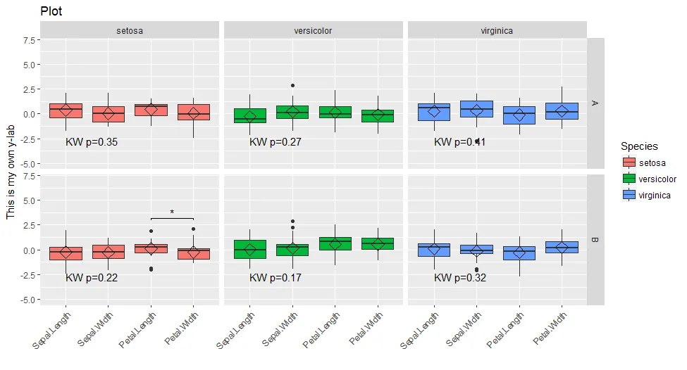
它生成以下图表:
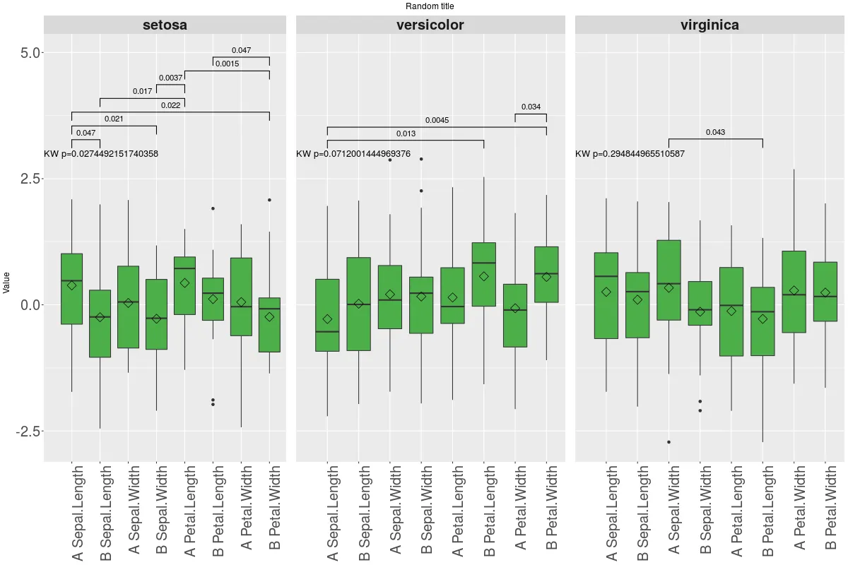 如您所见,存在一些问题,最明显的是:
1- 染色出了问题
2- 似乎无法更改带星号的注释
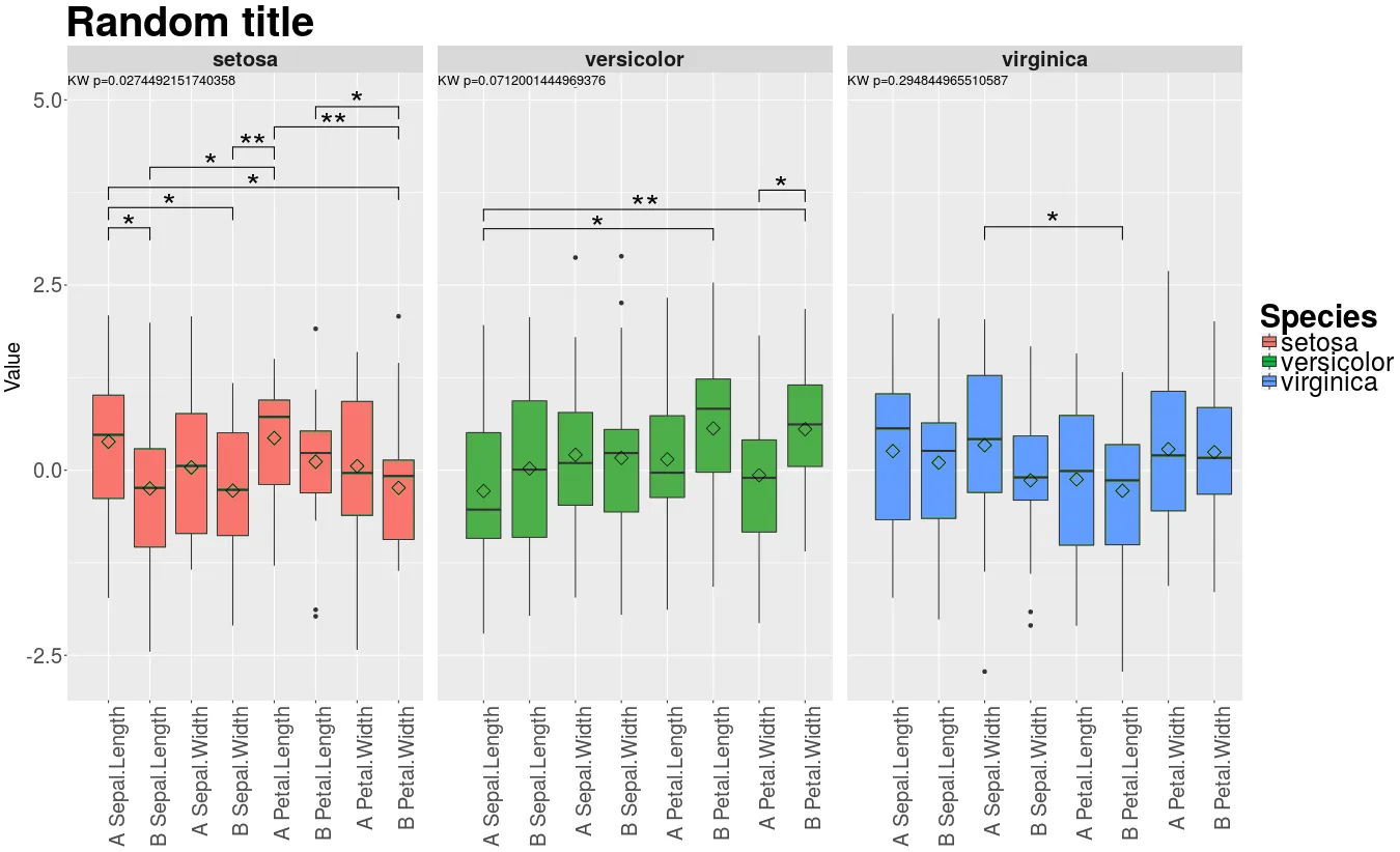
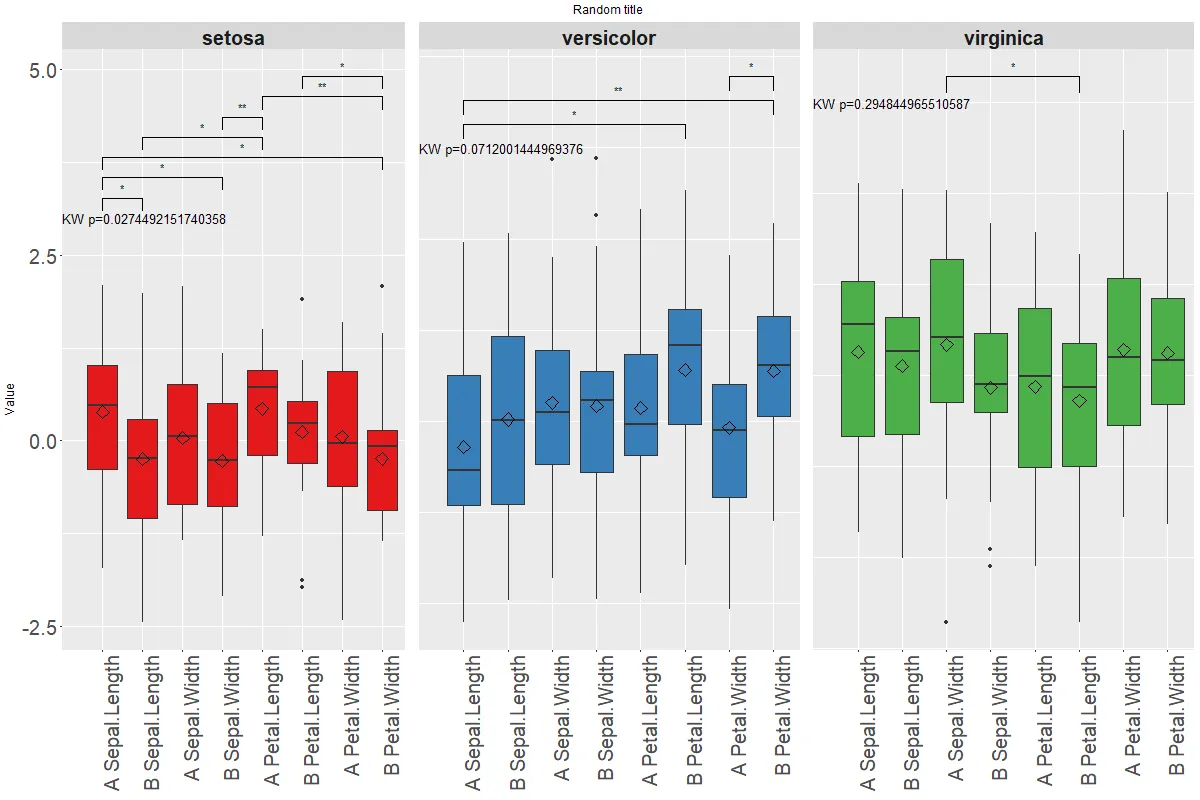
我想要更像这个(模拟):
 因此我们需要:
1- 使染色正常工作
2- 显示星号而不是数字
…并且为了胜利:
3- 制作一个通用的图例
4- 将Kruskal-Wallis线放在顶部
5- 更改标题和y轴文本的大小(和对齐方式)
重要提示:
即使代码不是最漂亮的,我仍然希望保留它尽可能完整,因为我仍然需要使用类似“CNb”或“pv.final”的中间对象。
解决方案应该易于转移到其他情况;请考虑仅测试“variable”而不是“both”……在这种情况下,我们有6个“facets”(垂直和水平),一切都变得更加混乱……
我做了另一个MWE:
##NOW TEST MEASURE, TO GET VERTICAL AND HORIZONTAL FACETS

addkw <- as.data.frame(mydf %>% group_by(treatment, Species) %>%
                       summarize(p.value = kruskal.test(value ~ variable)$p.value))
#addkw$p.adjust <- p.adjust(addkw$p.value, "BH")
a <- combn(levels(mydf$variable), 2, simplify = FALSE)
#new p.values
pv.final <- data.frame()
for (tr in levels(mydf$treatment)){
    for (gr in levels(mydf$Species)){
        for (i in 1:length(a)){
            tis <- a[[i]] #variable pair to test
            as <- subset(mydf, treatment==tr & Species==gr & variable %in% tis)
            pv <- wilcox.test(value ~ variable, data=as)$p.value
            ddd <- data.table(as)
            asm <- as.data.frame(ddd[, list(value=mean(value, na.rm=T)), by=list(variable=variable)])
            asm2 <- dcast(asm, .~variable, value.var="value")[,-1]
            pf <- data.frame(group1=paste(tis[1], gr, tr), group2=paste(tis[2], gr, tr), mean.group1=asm2[,1], mean.group2=asm2[,2], FC.1over2=asm2[,1]/asm2[,2], p.value=pv)
            pv.final <- rbind(pv.final, pf)
        }
    }
}
#pv.final$p.adjust <- p.adjust(pv.final$p.value, method="BH")
# set signif level
pv.final$map.signif <- ifelse(pv.final$p.value > 0.05, "", ifelse(pv.final$p.value > 0.01,"*", "**"))
plot.list2=function(mydf, pv.final, addkw, a, myPal){
    mylist <- list()
    i <- 0
    for (sp in unique(mydf$Species)){
    for (tr in unique(mydf$treatment)){
        i <- i+1
        mydf0 <- subset(mydf, Species==sp & treatment==tr)
        addkw0 <- subset(addkw, Species==sp & treatment==tr)
        pv.final0 <- pv.final[grep(paste(sp,tr), pv.final$group1), ]
        num.signif <- sum(pv.final0$p.value <= 0.05)
        P <- ggplot(mydf0,aes(x=variable, y=value)) +
            geom_boxplot(aes(fill=Species)) +
            stat_summary(fun.y=mean, geom="point", shape=5, size=4) +
            facet_grid(treatment~Species, scales="free", space="free_x") +
            scale_fill_manual(values=myPal[i]) + #WHY IS COLOR IGNORED?
            geom_text(data=addkw0, hjust=0, size=4.5, aes(x=0, y=round(max(mydf0$value, na.rm=TRUE)+0.5), label=paste0("KW p=",p.value))) +
            geom_signif(test="wilcox.test", comparisons = a[which(pv.final0$p.value<=0.05)],#I can use "a"here
              map_signif_level = F,
              vjust=0,
              textsize=4,
              size=0.5,
              step_increase = 0.05)
        if (i==1){
            P <- P + theme(legend.position="none",
                  axis.text.x=element_blank(),
                  axis.text.y=element_text(size=20),
                  axis.title=element_blank(),
                  axis.ticks.x=element_blank(),
                  strip.text.x=element_text(size=20,face="bold"),
                  strip.text.y=element_text(size=20,face="bold"))
        }
        if (i==4){
            P <- P + theme(legend.position="none",
                  axis.text.x=element_text(size=20, angle=90, hjust=1),
                  axis.text.y=element_text(size=20),
                  axis.title=element_blank(),
                  strip.text.x=element_text(size=20,face="bold"),
                  strip.text.y=element_text(size=20,face="bold"))
        }
        if ((i==2)|(i==3)){
            P <- P + theme(legend.position="none",
                  axis.text.x=element_blank(),
                  axis.text.y=element_blank(),
                  axis.title=element_blank(),
                  axis.ticks.x=element_blank(),
                  axis.ticks.y=element_blank(),
                  strip.text.x=element_text(size=20,face="bold"),
                  strip.text.y=element_text(size=20,face="bold"))
        }
        if ((i==5)|(i==6)){
            P <- P + theme(legend.position="none",
                  axis.text.x=element_text(size=20, angle=90, hjust=1),
                  axis.text.y=element_blank(),
                  #axis.ticks.y=element_blank(), #WHY SPECIFYING THIS GIVES ERROR?
                  axis.title=element_blank(),
                  axis.ticks.y=element_blank(),
                  strip.text.x=element_text(size=20,face="bold"),
                  strip.text.y=element_text(size=20,face="bold"))
        }
        #WHY USING THE CODE BELOW TO CHANGE NUMBERS TO ASTERISKS I GET ERRORS?
        #P2 <- ggplot_build(P)
        #P2$data[[3]]$annotation <- rep(subset(pv.final0, p.value<=0.05)$map.signif, each=3)
        #P <- plot(ggplot_gtable(P2))
        sptr <- paste(sp,tr)
        mylist[[sptr]] <- list(num.signif, P)
    }
    }
    return(mylist)
}
p.list2 <- plot.list2(mydf, pv.final, addkw, a, myPal)
y.rng <- range(mydf$value)
# Get the highest number of significant p-values across all three "facets"
height.factor <- 0.5
max.signif <- max(sapply(p.list2, function(x) x[[1]]))
# Lay out the three plots as facets (one for each Species), but adjust so that y-range is same for each facet. Top of y-range is adjusted using max_signif.
png(filename="test2.png", height=800, width=1200)
grid.arrange(grobs=lapply(p.list2, function(x) x[[2]] +
             scale_y_continuous(limits=c(y.rng[1], y.rng[2] + height.factor*max.signif))),
             ncol=length(unique(mydf$Species)), top="Random title", left="Value") #HOW TO CHANGE THE SIZE OF THE TITLE AND THE Y AXIS TEXT?
             #HOW TO ADD A COMMON LEGEND?
dev.off()
这将产生以下绘图:
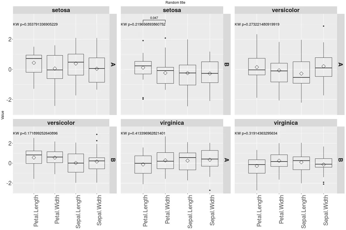
现在颜色问题更加突出,分面高度不均匀,冗余的分面条形文本也需要处理。
我卡在这一点上,所以会感激任何帮助。对于这个长问题表示抱歉,但是我认为它几乎完成了!谢谢!
myPal [i],而此时i是固定的。如何克服:https://stackoverflow.com/questions/32698616/ggplot2-adding-lines-in-a-loop-and-retaining-colour-mappings - tonytonov