这是我的数据集 dput_data。
dput_data <- structure(list(Label = c(" Flight", " Flight", " Flight", " Flight",
" Flight", " Ground Control", " Ground Control", " Ground Control",
" Ground Control", " Ground Control", " Ground Control"), `210885` = c(2.46726120893655,
-0.174636990542105, -0.463404328357544, 2.3996395908089, -0.150507030748742,
5.64497005685753, 3.36669883823842, 0.0291245138878325, -0.0720040453347311,
1.23592496897254, -0.435680321628551), `110647` = c(-0.183451995597915,
-0.232101174582698, -0.418549509261665, 3.12474114229781, -0.963627404680163,
-0.295591624345765, 3.74110668642539, -0.307620588051106, 4.95070981495709,
-0.248418667713625, 0.556071497195402), `120996` = c(2.958740197185,
-0.658764097795927, -0.720985892268865, -0.605140415143121, -0.614856607147667,
2.84170000321244, 2.4703391289031, 1.89042697528755, 1.38117056072924,
2.66548725562505, -0.775258323014181)), class = "data.frame", row.names = c(35L,
36L, 37L, 38L, 39L, 44L, 45L, 46L, 47L, 48L, 49L))
看起来像这样
             Label      210885     110647     120996
35          Flight  2.46726121 -0.1834520  2.9587402
36          Flight -0.17463699 -0.2321012 -0.6587641
37          Flight -0.46340433 -0.4185495 -0.7209859
38          Flight  2.39963959  3.1247411 -0.6051404
39          Flight -0.15050703 -0.9636274 -0.6148566
44  Ground Control  5.64497006 -0.2955916  2.8417000
45  Ground Control  3.36669884  3.7411067  2.4703391
46  Ground Control  0.02912451 -0.3076206  1.8904270
47  Ground Control -0.07200405  4.9507098  1.3811706
48  Ground Control  1.23592497 -0.2484187  2.6654873
49  Ground Control -0.43568032  0.5560715 -0.7752583
目前我已经尝试过:
library(reshape2)
dput_dat <- melt(dput_data, id.vars = 'Label', measure.vars = c('210885', '110647', '120996'))
library(ggplot2)
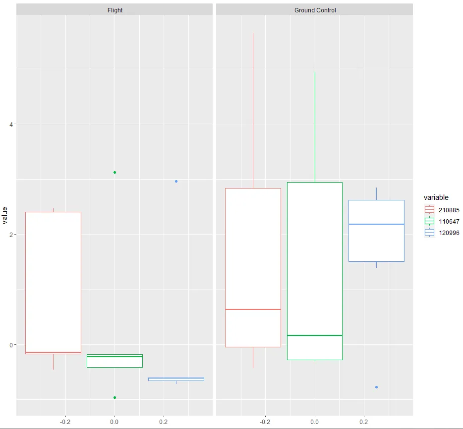
ggplot(dput_dat) + geom_boxplot(aes(y=value, color=variable)) + facet_grid(.~`Label`)
这给我两组箱线图,一组是航班数据,另一组是地面控制数据。
 但我更希望将
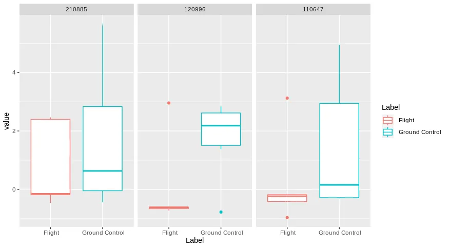
210885的航班和地面控制箱线图并排放置,以便进行直接的对比(航班和地面控制使用不同颜色)。110647和120996也是如此。所有这些都应该在一个图表中。我有点不知道该怎么做。
mutate(type = factor(type, levels = c("210885", "110647", "120996")))更改mutate函数,这应该可以解决问题。 - dc37