在条形图或箱线图上放置星号以显示一个或两个组的显著性水平(p值)是很常见的,下面是一些示例:

星号的数量由p值定义,例如,可以为p值<0.001放置3个星号,p值<0.01放置2个星号,依此类推(尽管这因文章而异)。
我的问题是:如何生成类似的图表?基于显著性水平自动放置星号的方法更加受欢迎。
在条形图或箱线图上放置星号以显示一个或两个组的显著性水平(p值)是很常见的,下面是一些示例:
星号的数量由p值定义,例如,可以为p值<0.001放置3个星号,p值<0.01放置2个星号,依此类推(尽管这因文章而异)。
我的问题是:如何生成类似的图表?基于显著性水平自动放置星号的方法更加受欢迎。
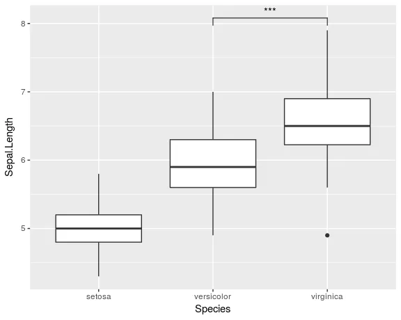
geom_signif,而不是费力地将geom_line和geom_text添加到您的图表中。library(ggplot2)
library(ggsignif)
ggplot(iris, aes(x=Species, y=Sepal.Length)) +
geom_boxplot() +
geom_signif(comparisons = list(c("versicolor", "virginica")),
map_signif_level=TRUE)
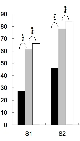
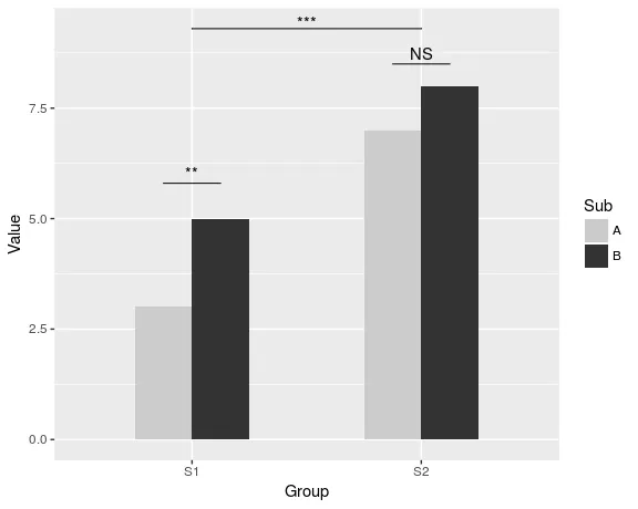
要创建类似于Jens Tierling所展示的更高级别的绘图,可以执行以下操作:
dat <- data.frame(Group = c("S1", "S1", "S2", "S2"),
              Sub   = c("A", "B", "A", "B"),
              Value = c(3,5,7,8))

ggplot(dat, aes(Group, Value)) +
  geom_bar(aes(fill = Sub), stat="identity", position="dodge", width=.5) +
  geom_signif(stat="identity",
              data=data.frame(x=c(0.875, 1.875), xend=c(1.125, 2.125),
                              y=c(5.8, 8.5), annotation=c("**", "NS")),
              aes(x=x,xend=xend, y=y, yend=y, annotation=annotation)) +
  geom_signif(comparisons=list(c("S1", "S2")), annotations="***",
              y_position = 9.3, tip_length = 0, vjust=0.4) +
  scale_fill_manual(values = c("grey80", "grey20"))
该软件包的完整文档可在CRAN上找到。
tip_length 设置为非零值即可。 - const-aegeom_signif起作用,而不是第一个(包含data.frame的那个)。 - Guilherme Parreiratest参数,您可以调用任何您想要的测试。 - const-ae请看下面我的尝试。
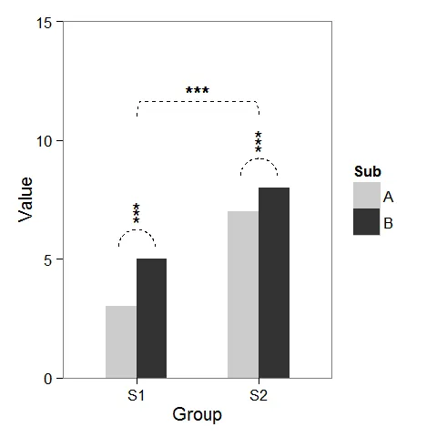
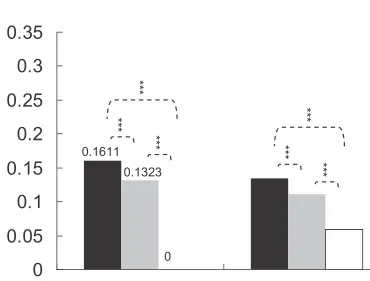
首先,我创建了一些虚拟数据和一个可以根据我们的需要进行修改的条形图。
windows(4,4)

dat <- data.frame(Group = c("S1", "S1", "S2", "S2"),
                  Sub   = c("A", "B", "A", "B"),
                  Value = c(3,5,7,8))

## Define base plot
p <-
ggplot(dat, aes(Group, Value)) +
    theme_bw() + theme(panel.grid = element_blank()) +
    coord_cartesian(ylim = c(0, 15)) +
    scale_fill_manual(values = c("grey80", "grey20")) +
    geom_bar(aes(fill = Sub), stat="identity", position="dodge", width=.5)
如baptiste所提到的,在列上方添加星号很容易。只需创建一个带有坐标的data.frame即可。
label.df <- data.frame(Group = c("S1", "S2"),
                       Value = c(6, 9))

p + geom_text(data = label.df, label = "***")
geom_line 连接它们。星号也需要新的坐标。label.df <- data.frame(Group = c(1,1,1, 2,2,2),
Value = c(6.5,6.8,7.1, 9.5,9.8,10.1))
# Define arc coordinates
r <- 0.15
t <- seq(0, 180, by = 1) * pi / 180
x <- r * cos(t)
y <- r*5 * sin(t)
arc.df <- data.frame(Group = x, Value = y)
p2 <-
p + geom_text(data = label.df, label = "*") +
geom_line(data = arc.df, aes(Group+1, Value+5.5), lty = 2) +
geom_line(data = arc.df, aes(Group+2, Value+8.5), lty = 2)
r <- .5
x <- r * cos(t)
y <- r*4 * sin(t)
y[20:162] <- y[20] # Flattens the arc

arc.df <- data.frame(Group = x, Value = y)

p2 + geom_line(data = arc.df, aes(Group+1.5, Value+11), lty = 2) +
     geom_text(x = 1.5, y = 12, label = "***")
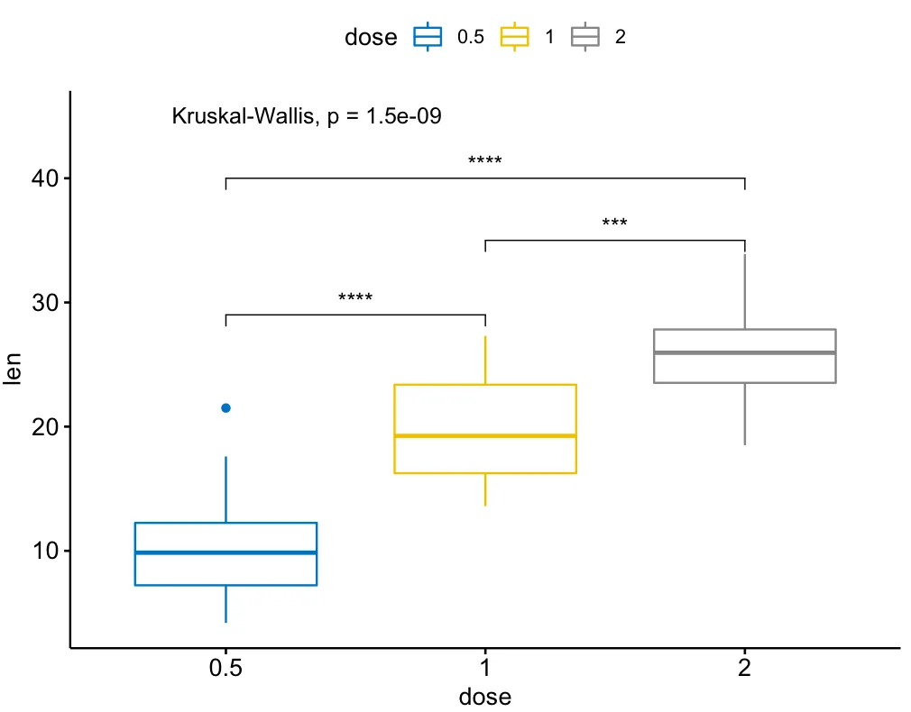
size 进行设置,例如:geom_text(size=1)。 - pengchy还有一个扩展包叫做ggsignif的扩展包,名为ggpubr,在多组比较时更加强大。它建立在ggsignif之上,同时处理anova和kruskal-wallis以及与全局均值的成对比较。
示例:
library(ggpubr)

my_comparisons = list( c("0.5", "1"), c("1", "2"), c("0.5", "2") )

ggboxplot(ToothGrowth, x = "dose", y = "len",
          color = "dose", palette = "jco")+
  stat_compare_means(comparisons = my_comparisons, label.y = c(29, 35, 40))+
  stat_compare_means(label.y = 45)
ggplot中的geom_boxplot结合起来呢? - wasmetqall我发现这个很有用。
library(ggplot2)
library(ggpval)
data("PlantGrowth")
plt <- ggplot(PlantGrowth, aes(group, weight)) +
  geom_boxplot()
add_pval(plt, pairs = list(c(1, 3)), test='wilcox.test')
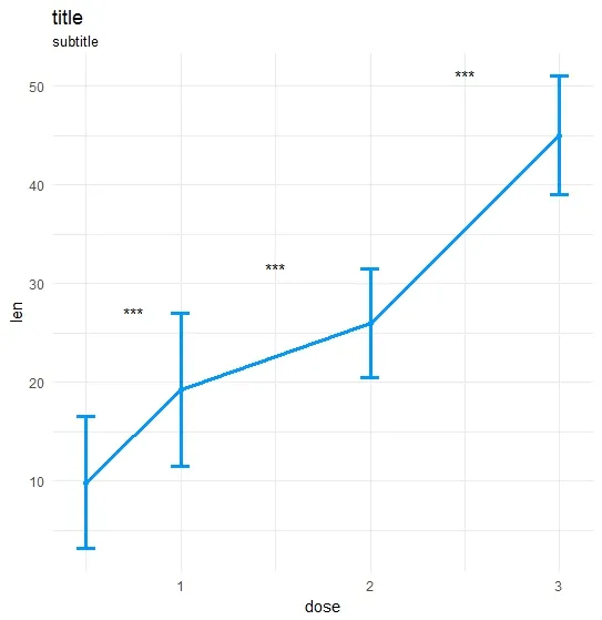
ts_test <- function(dataL,x,y,method="t.test",idCol=NULL,paired=F,label = "p.signif",p.adjust.method="none",alternative = c("two.sided", "less", "greater"),...) {
    options(scipen = 999)

    annoList <- list()

    setDT(dataL)

    if(paired) {
        allSubs <- dataL[,.SD,.SDcols=idCol] %>% na.omit %>% unique
        dataL   <- dataL[,merge(.SD,allSubs,by=idCol,all=T),by=x]  #idCol!!!
    }

    if(method =="t.test") {
        dataA <- eval(parse(text=paste0(
                       "dataL[,.(",as.name(y),"=mean(get(y),na.rm=T),sd=sd(get(y),na.rm=T)),by=x] %>% setDF"
                       )))
        res<-pairwise.t.test(x=dataL[[y]], g=dataL[[x]], p.adjust.method = p.adjust.method,
                        pool.sd = !paired, paired = paired,
                        alternative = alternative, ...)
    }

    if(method =="wilcox.test") {
        dataA <- eval(parse(text=paste0(
            "dataL[,.(",as.name(y),"=median(get(y),na.rm=T),sd=IQR(get(y),na.rm=T,type=6)),by=x] %>% setDF"
        )))
        res<-pairwise.wilcox.test(x=dataL[[y]], g=dataL[[x]], p.adjust.method = p.adjust.method,
                             paired = paired, ...)
    }

    #Output the groups
    res$p.value %>% dimnames %>%  {paste(.[[2]],.[[1]],sep="_")} %>% cat("Groups ",.)

    #Make annotations ready
    annoList[["label"]] <- res$p.value %>% diag %>% round(5)

    if(!is.null(label)) {
        if(label == "p.signif"){
            annoList[["label"]] %<>% cut(.,breaks = c(-0.1, 0.0001, 0.001, 0.01, 0.05, 1),
                                         labels = c("****", "***", "**", "*", "ns")) %>% as.character
        }
    }

    annoList[["x"]] <- dataA[[x]] %>% {diff(.)/2 + .[-length(.)]}
    annoList[["y"]] <- {dataA[[y]] + dataA[["sd"]]} %>% {pmax(lag(.), .)} %>% na.omit

    #Make plot
    coli="#0099ff";sizei=1.3

    p <-ggplot(dataA, aes(x=get(x), y=get(y))) +
        geom_errorbar(aes(ymin=len-sd, ymax=len+sd),width=.1,color=coli,size=sizei) +
        geom_line(color=coli,size=sizei) + geom_point(color=coli,size=sizei) +
        scale_color_brewer(palette="Paired") + theme_minimal() +
        xlab(x) + ylab(y) + ggtitle("title","subtitle")


    #Annotate significances
    p <-p + annotate("text", x = annoList[["x"]], y = annoList[["y"]], label = annoList[["label"]])

    return(p)
}
library(ggplot2);library(data.table);library(magrittr);

df_long    <- rbind(ToothGrowth[,-2],data.frame(len=40:50,dose=3.0))
df_long$ID <- data.table::rowid(df_long$dose)

ts_test(dataL=df_long,x="dose",y="len",idCol="ID",method="wilcox.test",paired=T)
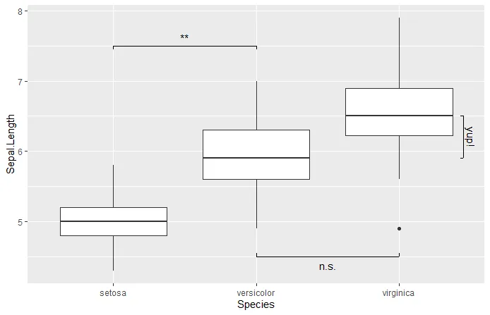
superb,它被称为showSignificance,可以让你以水平或垂直的方式放置任何文本。例如:library(ggplot2)
library(superb)
ggplot(iris, aes(x=Species, y=Sepal.Length)) +
geom_boxplot() +
showSignificance( c(1,2), 7.5, -0.05, "**") +
showSignificance( c(2,3), 4.5, +0.05, "n.s.") +
showSignificance( 3.45, c(6.5,5.9), -0.02, "yup!")