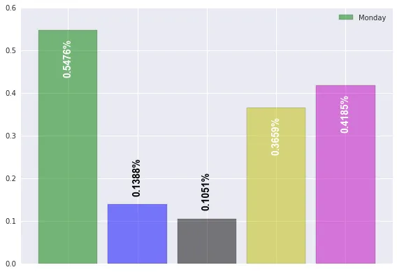
我正在尝试使用pandas数据框的值来设置条形图的图例。我搜索了很多但找不到解决方案,我已经使用了Stack Overflow上的另一个代码片段来注释这些条形图。生成的图表显示了我想要的系列中不同颜色的条形,并且甚至带有条形的值。例如,在Excel中,您可以将系列值作为图例显示。我正在尝试在此处获得该功能。
以下是MWE:
import pandas as pd
import numpy as np
import matplotlib.pyplot as plt
from pylab import *
import seaborn, itertools
seaborn.set()

def flip(items, ncol):
    return itertools.chain(*[items[i::ncol] for i in range(ncol)])

def annotateBars(row, ax=ax):
    if row['A'] < 0.2:
        color = 'black'
        vertalign = 'bottom'
        vertpad = 0.02
    else:
        color = 'white'
        vertalign = 'top'
        vertpad = -0.02

    ax.text(row.name, row['A'] + vertpad, "{:.4f}%".format(row['A']),
            zorder=10, rotation=90, color=color,
            horizontalalignment='center',
            verticalalignment=vertalign,
            fontsize=14, weight='heavy')

labels1=["Monday", "Tuesday", "Wednesday", "Thursday", "Friday", "Saturday", "Sunday"]
width = 0.75
my_colors = 'gbkymc'
arr1 = np.random.random((1, 5))
arr1_ind = np.arange((arr1.shape[1]))
df_arr1 = pd.DataFrame(zip(*arr1), index = arr1_ind, columns = ['A'])
ax = df_arr1.plot(kind='bar', width = 0.85, alpha = 0.5, color = my_colors)
# plt.xticks(arr1_ind+width/4, arr1_ind)

ax.set_xticks(arr1_ind)
ax.set_xticklabels([labels1[i] for i in arr1_ind])
hndls, lbls = ax.get_legend_handles_labels()
plt.legend(flip(hndls, 2), flip(labels1, 2), loc='best', ncol=2)

junk = df_arr1.apply(annotateBars, ax=ax, axis=1)
plt.tick_params(
    axis='x',          # changes apply to the x-axis
    which='both',      # both major and minor ticks are affected
    bottom='off',      # ticks along the bottom edge are off
    top='off',         # ticks along the top edge are off
    labelbottom='off') # labels along the bottom edge are off
plt.tight_layout()
plt.show()