我有一个pandas的DataFrameGroupBy对象需要作图,代码如下...
grouped.sum().plot(kind='bar')
这个图表显示了...
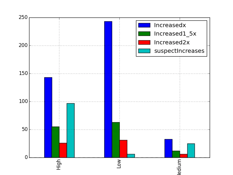
但我想要更像这样的...
我只想知道如何为每一列添加数据标签,可能还有一个表格?
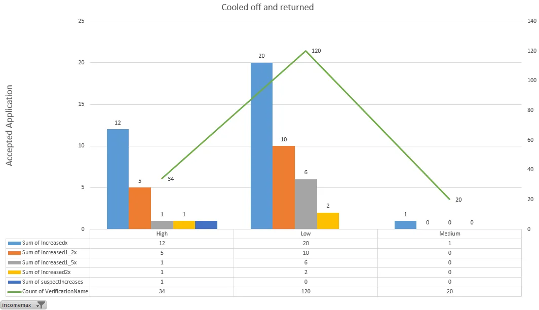
grouped.sum().plot(kind='bar')
这个图表显示了...
但我想要更像这样的...
我只想知道如何为每一列添加数据标签,可能还有一个表格?
要在柱状图的顶部添加值标签,您可以循环遍历每个索引中的列,并使用text来显示这些值,类似于以下代码:
df = DataFrame(rand(3,2), columns=['A', 'B'])
ax = df.plot(table=True, kind='bar', title='Random')
for i, each in enumerate(df.index):
    for col in df.columns:
        y = df.ix[each][col]
        ax.text(i, y, y)
pandas从0.14+开始支持表格功能。现在,在DataFrame.plot()和Series.plot()中支持使用table关键字绘制matplotlib表格。table关键字可以接受bool、DataFrame或Series。绘制表格的简单方法是指定table=True。数据将被转置以满足matplotlib的默认布局。
fig, ax = plt.subplots(1, 1)
df = DataFrame(rand(5, 3), columns=['a', 'b', 'c'])
ax.get_xaxis().set_visible(False)   # Hide Ticks
df.plot(table=True, ax=ax)
fig, ax = plt.subplots(1, 1)
ax.get_xaxis().set_visible(False)   # Hide Ticks
df.plot(table=np.round(df.T, 2), ax=ax)