如何为条形图添加分组标签

49
我想使用 matplotlib 的柱状图绘制以下形式的数据。
data = {'Room A':
           {'Shelf 1':
               {'Milk': 10,
                'Water': 20},
            'Shelf 2':
               {'Sugar': 5,
                'Honey': 6}
           },
        'Room B':
           {'Shelf 1':
               {'Wheat': 4,
                'Corn': 7},
            'Shelf 2':
               {'Chicken': 2,
                'Cow': 1}
           }
       }

柱状图应该是这样的。

like this

条形图的分组应该从x轴上的标签中可见。有没有办法用matplotlib实现这个?
2个回答

70

由于在matplotlib中找不到内置的解决方案,所以我编写了自己的代码:

#!/usr/bin/env python

from matplotlib import pyplot as plt

def mk_groups(data):
    try:
        newdata = data.items()
    except:
        return

    thisgroup = []
    groups = []
    for key, value in newdata:
        newgroups = mk_groups(value)
        if newgroups is None:
            thisgroup.append((key, value))
        else:
            thisgroup.append((key, len(newgroups[-1])))
            if groups:
                groups = [g + n for n, g in zip(newgroups, groups)]
            else:
                groups = newgroups
    return [thisgroup] + groups

def add_line(ax, xpos, ypos):
    line = plt.Line2D([xpos, xpos], [ypos + .1, ypos],
                      transform=ax.transAxes, color='black')
    line.set_clip_on(False)
    ax.add_line(line)

def label_group_bar(ax, data):
    groups = mk_groups(data)
    xy = groups.pop()
    x, y = zip(*xy)
    ly = len(y)
    xticks = range(1, ly + 1)

    ax.bar(xticks, y, align='center')
    ax.set_xticks(xticks)
    ax.set_xticklabels(x)
    ax.set_xlim(.5, ly + .5)
    ax.yaxis.grid(True)

    scale = 1. / ly
    for pos in xrange(ly + 1):  # change xrange to range for python3
        add_line(ax, pos * scale, -.1)
    ypos = -.2
    while groups:
        group = groups.pop()
        pos = 0
        for label, rpos in group:
            lxpos = (pos + .5 * rpos) * scale
            ax.text(lxpos, ypos, label, ha='center', transform=ax.transAxes)
            add_line(ax, pos * scale, ypos)
            pos += rpos
        add_line(ax, pos * scale, ypos)
        ypos -= .1

if __name__ == '__main__':
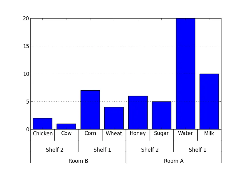
    data = {'Room A':
               {'Shelf 1':
                   {'Milk': 10,
                    'Water': 20},
                'Shelf 2':
                   {'Sugar': 5,
                    'Honey': 6}
               },
            'Room B':
               {'Shelf 1':
                   {'Wheat': 4,
                    'Corn': 7},
                'Shelf 2':
                   {'Chicken': 2,
                    'Cow': 1}
               }
           }
    fig = plt.figure()
    ax = fig.add_subplot(1,1,1)
    label_group_bar(ax, data)
    fig.subplots_adjust(bottom=0.3)
    fig.savefig('label_group_bar_example.png')

mk_groups函数接受一个字典(或任何具有items()方法的东西,比如collections.OrderedDict),并将其转换为一种数据格式,然后用于创建图表。它基本上是一个形式为列表的数据:

[ [(label, bars_to_span), ...], ..., [(tick_label, bar_value), ...] ]

add_line 函数在子图中指定的位置(以坐标轴坐标表示)创建一个垂直线条。

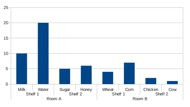
label_group_bar 函数接受字典并在子图中创建带有标签的条形图。 示例的结果看起来像 这样

更简单或更好的解决方案和建议仍然非常欢迎。

bar chart with groups


2
如果您正在使用Python 3,则xrange已更名为range。因此,请改用range而不是xrange。 - Varicus

37

我寻找这个解决方案已经有一段时间了。为了使其与pandas数据表配合使用,我进行了一些修改。公平地分享。

import pandas as pd
import numpy as np
from matplotlib import pyplot as plt
from itertools import groupby

def test_table():
    data_table = pd.DataFrame({'Room':['Room A']*4 + ['Room B']*4,
                               'Shelf':(['Shelf 1']*2 + ['Shelf 2']*2)*2,
                               'Staple':['Milk','Water','Sugar','Honey','Wheat','Corn','Chicken','Cow'],
                               'Quantity':[10,20,5,6,4,7,2,1],
                               'Ordered':np.random.randint(0,10,8)
                               })
    return data_table

def add_line(ax, xpos, ypos):
    line = plt.Line2D([xpos, xpos], [ypos + .1, ypos],
                      transform=ax.transAxes, color='black')
    line.set_clip_on(False)
    ax.add_line(line)

def label_len(my_index,level):
    labels = my_index.get_level_values(level)
    return [(k, sum(1 for i in g)) for k,g in groupby(labels)]
    
def label_group_bar_table(ax, df):
    ypos = -.1
    scale = 1./df.index.size
    for level in range(df.index.nlevels)[::-1]:
        pos = 0
        for label, rpos in label_len(df.index,level):
            lxpos = (pos + .5 * rpos)*scale
            ax.text(lxpos, ypos, label, ha='center', transform=ax.transAxes)
            add_line(ax, pos*scale, ypos)
            pos += rpos
        add_line(ax, pos*scale , ypos)
        ypos -= .1

df = test_table().groupby(['Room','Shelf','Staple']).sum()
fig = plt.figure()
ax = fig.add_subplot(111)
df.plot(kind='bar',stacked=True,ax=fig.gca())
#Below 3 lines remove default labels
labels = ['' for item in ax.get_xticklabels()]
ax.set_xticklabels(labels)
ax.set_xlabel('')
label_group_bar_table(ax, df)
fig.subplots_adjust(bottom=.1*df.index.nlevels)
plt.show()

这里输入图片描述


这个怎么修改才能让一个总的条形图显示“房间A”内的总数,另一个条形图显示“房间B”的总数? - Colton Campbell

网页内容由stack overflow 提供, 点击上面的
可以查看英文原文,
原文链接