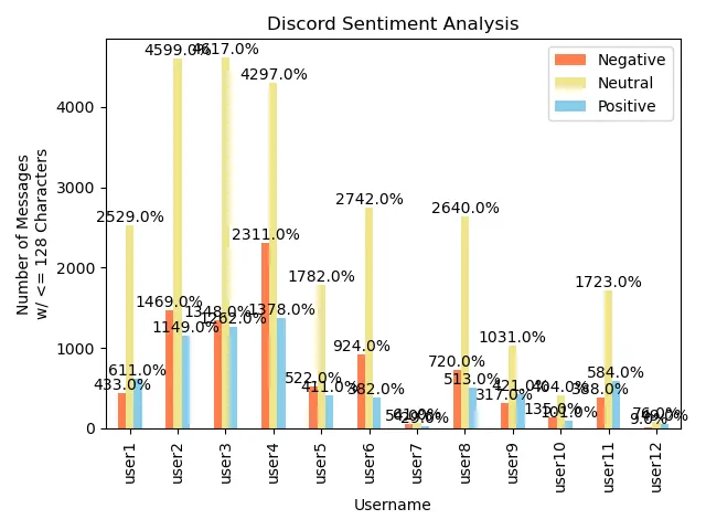
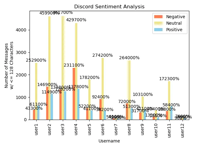
我用以下代码创建了一个条形图。我想为每个用户标记添加到 ~100% 的百分比,就像我在下面的 user1 和 user2 中所做的那样:
import matplotlib.pyplot as plt
import numpy as np
import pandas as pd

users = ['user1', 'user2', 'user3', 'user4', 'user5', 'user6', 'user7',\
         'user8', 'user9', 'user10', 'user11', 'user12']
NEG = [433, 1469, 1348, 2311, 522, 924, 54, 720, 317, 135, 388, 9]
NEU = [2529, 4599, 4617, 4297, 1782, 2742, 61, 2640, 1031, 404, 1723, 76]
POS = [611, 1149, 1262, 1378, 411, 382, 29, 513, 421, 101, 584, 49]

data = {'Negative': NEG, 'Neutral': NEU, 'Positive': POS}
df = pd.DataFrame(data, index=users)
ax = df.plot(kind='bar', ylabel='Number of Messages\nw/ <= 128 Characters',\
             xlabel='Username', title='Discord Sentiment Analysis',\
             color=['coral', 'khaki', 'skyblue'])

plt.tight_layout()
plt.show()
根据这个帖子的建议,我尝试了以下方法:
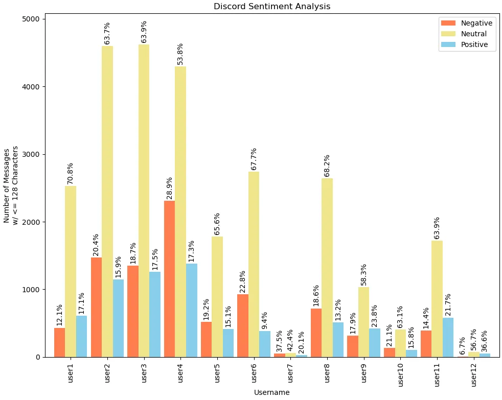
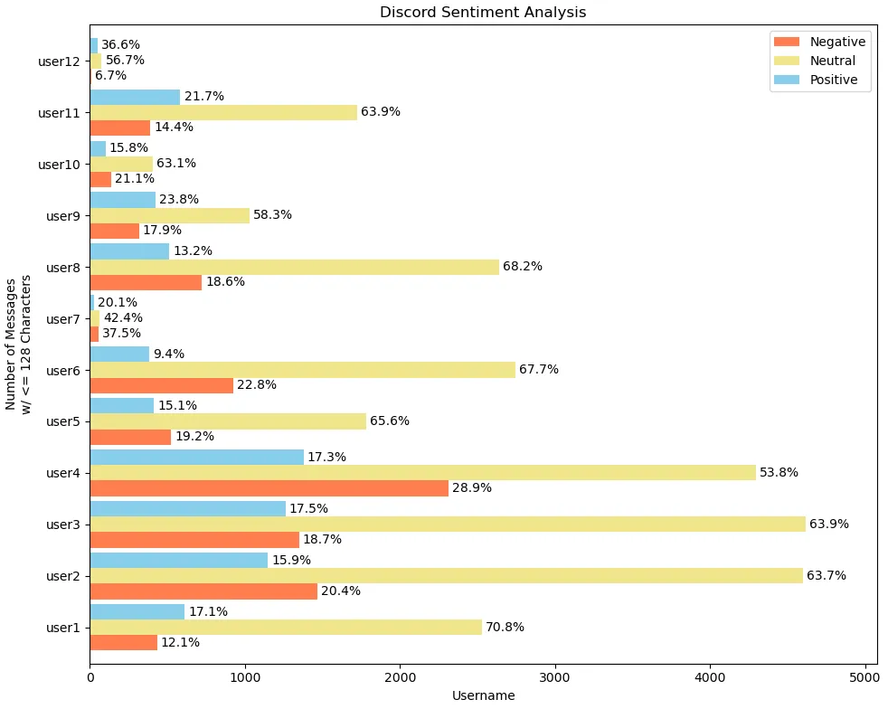
方法一
ax = df.plot(kind='bar', ylabel='Number of Messages\nw/ <= 128 Characters',\
             xlabel='Username', title='Discord Sentiment Analysis',\
             color=['coral', 'khaki', 'skyblue'])

for p in ax.containers:
    ax.bar_label(p, fmt='%.1f%%', label_type='edge')`

plt.tight_layout()
plt.show()

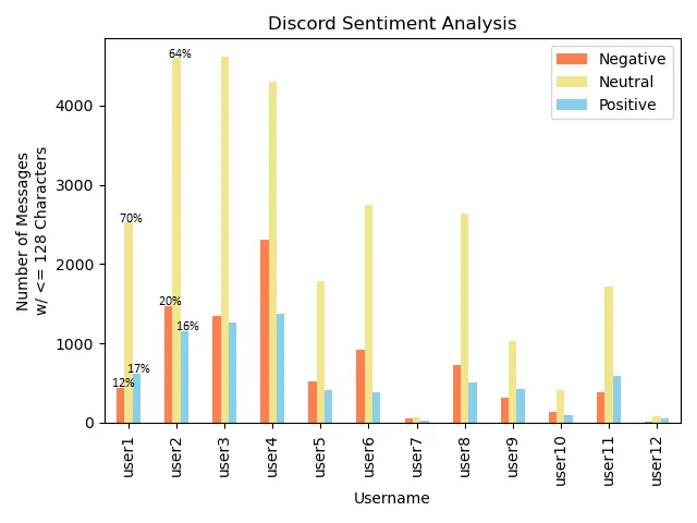
尝试 2
ax = df.plot(kind='bar', ylabel='Number of Messages\nw/ <= 128 Characters',\
             xlabel='Username', title='Discord Sentiment Analysis',\
             color=['coral', 'khaki', 'skyblue'])

for p in ax.patches:
    width = p.get_width()
    height = p.get_height()
    x, y = p.get_xy()
    ax.annotate(f'{height:.0%}', (x + width/2, y + height*1.02), ha='center')

plt.tight_layout()
plt.show()
尝试三
ax = df.plot(kind='bar', ylabel='Number of Messages\nw/ <= 128 Characters',\
             xlabel='Username', title='Discord Sentiment Analysis',\
             color=['coral', 'khaki', 'skyblue'])

for p in ax.containers:
    ax.bar_label(p, fmt='%.1f%%', label_type='edge')

plt.tight_layout()
plt.show()