Pandas条形图,如何注释分组的水平条形图

7
我提出这个问题是因为我还没有找到一个可行的例子来注解 Pandas 水平分组柱状图。我知道以下两种方法: 但它们都是关于垂直条形图的。也就是说,要么没有水平条形图的解决方案,要么不完全适用。
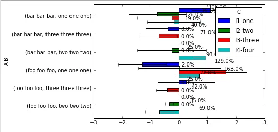
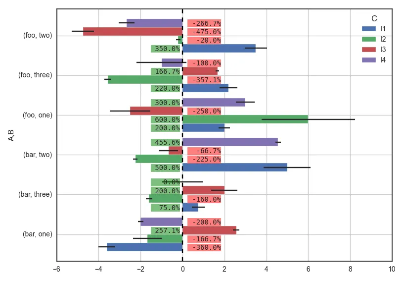
经过几个星期的研究,我终于能够用示例代码问问题了,这个示例代码几乎符合我的要求,只是没有百分之百地工作。需要您的帮助来实现 100% 的效果。
下面是上传到Github的完整代码。结果看起来像这样:

Pandas chart

你可以看到,它几乎可以工作,只是标签没有放在我想要的位置,我自己无法将其移动到更好的位置。此外,由于图表条的顶部用于显示误差栏,因此我真正想要的是将注释文本向 y 轴移动,使其在 y 轴的左侧或右侧很好地对齐,具体取决于 X 值。例如,这是我的同事可以在 MS Excel 中完成的操作:

MS Excel chart

Python 可以使用 Pandas 图表实现这个吗?
我包括来自上面 URL 的注释代码,一个是我所能做的全部内容,另一个是参考(来自In [23]):
# my all-that-I-can-do
def autolabel(rects):
    #if height constant: hbars, vbars otherwise
    if (np.diff([plt.getp(item, 'width') for item in rects])==0).all():
        x_pos = [rect.get_x() + rect.get_width()/2. for rect in rects]
        y_pos = [rect.get_y() + 1.05*rect.get_height() for rect in rects]
        scores = [plt.getp(item, 'height') for item in rects]
    else:
        x_pos = [rect.get_width()+.3 for rect in rects]
        y_pos = [rect.get_y()+.3*rect.get_height() for rect in rects]
        scores = [plt.getp(item, 'width') for item in rects]
    # attach some text labels
    for rect, x, y, s in zip(rects, x_pos, y_pos, scores):
        ax.text(x, 
                y,
                #'%s'%s,
                str(round(s, 2)*100)+'%',
                ha='center', va='bottom')

# for the reference 
ax.bar(1. + np.arange(len(xv)), xv, align='center')
# Annotate with text
ax.set_xticks(1. + np.arange(len(xv)))
for i, val in enumerate(xv):
    ax.text(i+1, val/2, str(round(val, 2)*100)+'%', va='center',
ha='center', color='black')             

Please help. Thanks.

1个回答

3

所以,为了简单起见,我稍微改变了构建数据的方式:

import numpy as np
import matplotlib.pyplot as plt
import pandas as pd
import seaborn as sns 
sns.set_style("white") #for aesthetic purpose only

# fake data
df = pd.DataFrame({'A': np.random.choice(['foo', 'bar'], 100),
                   'B': np.random.choice(['one', 'two', 'three'], 100),
                   'C': np.random.choice(['I1', 'I2', 'I3', 'I4'], 100),
                   'D': np.random.randint(-10,11,100),
                   'E': np.random.randn(100)})

p = pd.pivot_table(df, index=['A','B'], columns='C', values='D')
e = pd.pivot_table(df, index=['A','B'], columns='C', values='E')

ax = p.plot(kind='barh', xerr=e, width=0.85)

for r in ax.patches:
    if r.get_x() < 0: # it it's a negative bar
        ax.text(0.25, # set label on the opposite side
                r.get_y() + r.get_height()/5., # y
                "{:" ">7.1f}%".format(r.get_x()*100), # text
                bbox={"facecolor":"red", 
                      "alpha":0.5,
                      "pad":1},
                fontsize=10, family="monospace", zorder=10)
    else:
        ax.text(-1.5, # set label on the opposite side
                r.get_y() + r.get_height()/5., # y
                "{:" ">6.1f}%".format(r.get_width()*100), 
                bbox={"facecolor":"green",
                      "alpha":0.5,
                      "pad":1},
                fontsize=10, family="monospace", zorder=10)
plt.tight_layout()

这将呈现:

barh plot error bar annotated

我根据平均值绘制标签,并将其放在0线的另一侧,以确保它不会重叠到其他内容,除了有时可能与误差线重叠。我在文本后面设置一个框,以反映均值的值。 有一些值需要根据你的图像大小进行调整,以使标签正确适应,例如:

  • width=0.85
  • +r.get_height()/5. # y
  • "pad":1
  • fontsize=10
  • "{:" ">6.1f}%".format(r.get_width()*100):设置标签中的字符总数(这里是6个最小值,如果少于6个,则在右侧用空格填充)。它需要family="monospace"

如果有不清楚的地方,请告诉我。

希望能对您有所帮助。


@xpt,好的,请告诉我如果您有任何不理解的地方。自从您留言以来,我已经进行了一些修改。 - jrjc
太棒了,太好了!很抱歉回复晚了。我唯一的问题是,在整个代码中我没有看到为什么需要 import seaborn,但是当我注释掉那行时,它仍然可以工作,但是图表看起来更难看。我想这回答了问题,但是为什么会这样呢?再次感谢。 - xpt
@xpt,是的,请看第5行(sns.set_style...),我注释说这是为了美观目的。 - jrjc
谢谢,第一次知道seaborn可以这样使用。也就是说,它没有使用任何单独的seaborn特定功能,但在幕后进行了美化。太棒了。 - xpt

网页内容由stack overflow 提供, 点击上面的
可以查看英文原文,
原文链接