我的数据是:
>>> ts = pd.TimeSeries(data,indexconv)
>>> tsgroup = ts.resample('t',how='sum')
>>> tsgroup
2014-11-08 10:30:00    3
2014-11-08 10:31:00    4
2014-11-08 10:32:00    7
  [snip]
2014-11-08 10:54:00    5
2014-11-08 10:55:00    2
Freq: T, dtype: int64
>>> tsgroup.plot()
>>> plt.show()
indexconv是使用datetime.strptime转换的字符串。
当前图形非常棱角分明(以下不是我的实际图形):
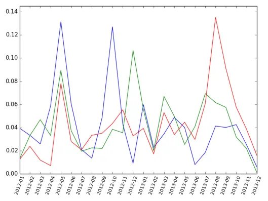
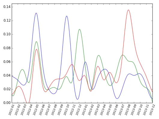
我如何将它变得平滑,如下所示:
我知道在这篇文章中提到了scipy.interpolate,但我该如何将其应用于Pandas时间序列?
我发现了这个很棒的库Vincent,可以处理Pandas,但它不支持Python 2.6。

10:40或10:43),但是秒数(例如10:40:04)被添加到图形中。tsgroup['2014-11-08 10:43:00']和tsint['2014-11-08 10:43:00']都返回3。注意:子图中的y轴起点不同。 - Alaa Ali