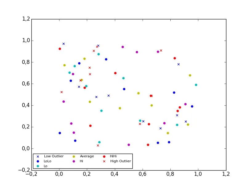
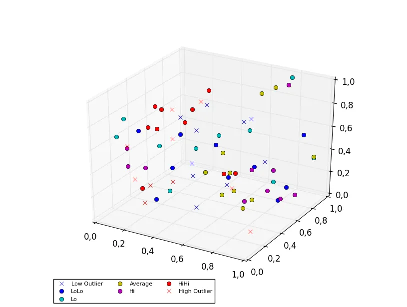
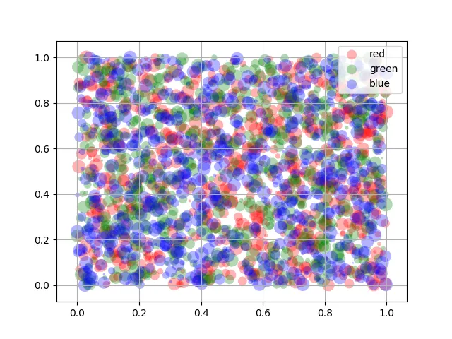
我创建了一个四维散点图来表示特定区域的不同温度。当我创建图例时,图例显示了正确的符号和颜色,但在上面添加了一条线。我使用的代码是:
colors=['b', 'c', 'y', 'm', 'r']
lo = plt.Line2D(range(10), range(10), marker='x', color=colors[0])
ll = plt.Line2D(range(10), range(10), marker='o', color=colors[0])
l = plt.Line2D(range(10), range(10), marker='o',color=colors[1])
a = plt.Line2D(range(10), range(10), marker='o',color=colors[2])
h = plt.Line2D(range(10), range(10), marker='o',color=colors[3])
hh = plt.Line2D(range(10), range(10), marker='o',color=colors[4])
ho = plt.Line2D(range(10), range(10), marker='x', color=colors[4])
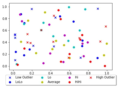
plt.legend((lo,ll,l,a, h, hh, ho),('Low Outlier', 'LoLo','Lo', 'Average', 'Hi', 'HiHi', 'High Outlier'),numpoints=1, loc='lower left', ncol=3, fontsize=8)
我尝试将Line2D更改为Scatter和scatter,Scatter返回错误,而scatter则改变了图表并返回了错误。
对于scatter,我将range(10)更改为包含数据点的列表。每个列表都包含x、y或z变量。
lo = plt.scatter(xLOutlier, yLOutlier, zLOutlier, marker='x', color=colors[0])
ll = plt.scatter(xLoLo, yLoLo, zLoLo, marker='o', color=colors[0])
l = plt.scatter(xLo, yLo, zLo, marker='o',color=colors[1])
a = plt.scatter(xAverage, yAverage, zAverage, marker='o',color=colors[2])
h = plt.scatter(xHi, yHi, zHi, marker='o',color=colors[3])
hh = plt.scatter(xHiHi, yHiHi, zHiHi, marker='o',color=colors[4])
ho = plt.scatter(xHOutlier, yHOutlier, zHOutlier, marker='x', color=colors[4])
plt.legend((lo,ll,l,a, h, hh, ho),('Low Outlier', 'LoLo','Lo', 'Average', 'Hi', 'HiHi',     'High Outlier'),scatterpoints=1, loc='lower left', ncol=3, fontsize=8)
有任何建议吗?