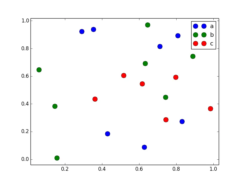
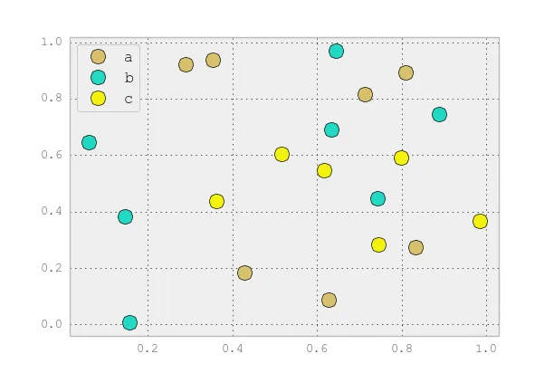
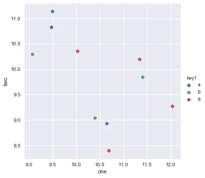
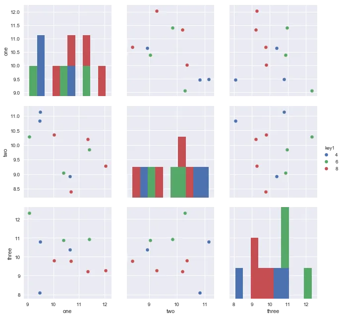
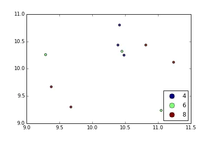
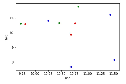
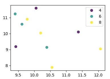
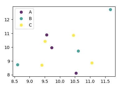
我正在尝试使用Pandas DataFrame对象在pyplot中制作一个简单的散点图,但希望找到一种有效的方法来绘制两个变量,但符号由第三列(key)指定。 我已经尝试过使用df.groupby的各种方法,但都没有成功。下面是一个样本df脚本。这将根据“key1”为标记着色,但我想看到一个带有“key1”类别的图例。我接近了吗?谢谢。
import numpy as np
import pandas as pd
import matplotlib.pyplot as plt
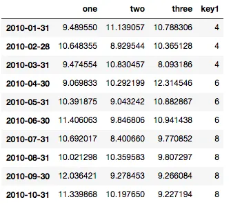
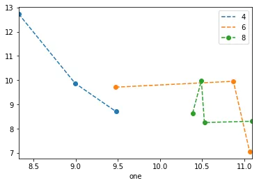
df = pd.DataFrame(np.random.normal(10,1,30).reshape(10,3), index = pd.date_range('2010-01-01', freq = 'M', periods = 10), columns = ('one', 'two', 'three'))
df['key1'] = (4,4,4,6,6,6,8,8,8,8)
fig1 = plt.figure(1)
ax1 = fig1.add_subplot(111)
ax1.scatter(df['one'], df['two'], marker = 'o', c = df['key1'], alpha = 0.8)
plt.show()

ax.legend(numpoints=1)来仅显示一个标记。通常使用Line2D时有两个标记,并且它们之间经常连接一条线。 - Joe Kingtonax.plot()命令之后添加plt.hold(True)后,这段代码才对我起作用。 有任何想法为什么会这样吗? - Yuval Atzmonset_color_cycle()在matplotlib 1.5中已被弃用。现在有set_prop_cycle()可用。 - a.l.e