编辑:
生成一些随机数据:
from scipy.cluster.vq import kmeans2
import pandas as pd
import matplotlib.pyplot as plt
import seaborn as sns

n_clusters = 10
df = pd.DataFrame({'x':np.random.randn(1000), 'y':np.random.randn(1000)})
_, df['cluster'] = kmeans2(df, n_clusters)
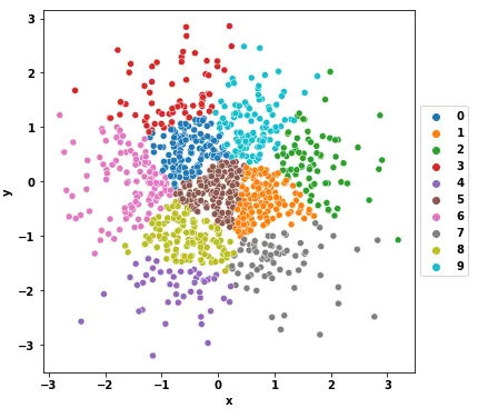
更新
- 使用
seaborn.relplot函数并设置kind='scatter',或使用seaborn.scatterplot函数。
sns.relplot(data=df, x='x', y='y', hue='cluster', palette='tab10', kind='scatter')
fig, axes = plt.subplots(figsize=(6, 6))
sns.scatterplot(data=df, x='x', y='y', hue='cluster', palette='tab10', ax=axes)
axes.legend(loc='center left', bbox_to_anchor=(1, 0.5))
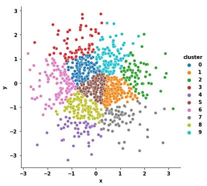
Original Answer
Plotting (matplotlib v3.3.4):
fig, ax = plt.subplots(figsize=(8, 6))
cmap = plt.cm.get_cmap('jet')
for i, cluster in df.groupby('cluster'):
    _ = ax.scatter(cluster['x'], cluster['y'], color=cmap(i/n_clusters), label=i, ec='k')
ax.legend(loc='center left', bbox_to_anchor=(1, 0.5))
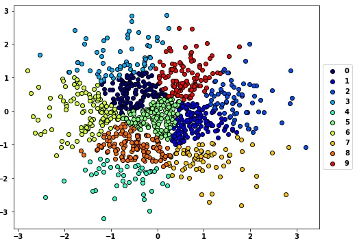
结果:
解释:
不深入讨论matplotlib内部细节,一次只绘制一个簇似乎能够解决这个问题。
具体而言,ax.scatter()返回一个PathCollection对象,我们在这里明确地丢弃了它,但是它似乎被传递给某种图例处理程序的内部。一次性绘制只会生成一个PathCollection/label对,而逐个绘制每个簇会生成n_clusters个PathCollection/label对。您可以通过调用ax.get_legend_handles_labels()来查看这些对象,它返回类似以下内容:
([<matplotlib.collections.PathCollection at 0x7f60c2ff2ac8>,
  <matplotlib.collections.PathCollection at 0x7f60c2ff9d68>,
  <matplotlib.collections.PathCollection at 0x7f60c2ff9390>,
  <matplotlib.collections.PathCollection at 0x7f60c2f802e8>,
  <matplotlib.collections.PathCollection at 0x7f60c2f809b0>,
  <matplotlib.collections.PathCollection at 0x7f60c2ff9908>,
  <matplotlib.collections.PathCollection at 0x7f60c2f85668>,
  <matplotlib.collections.PathCollection at 0x7f60c2f8cc88>,
  <matplotlib.collections.PathCollection at 0x7f60c2f8c748>,
  <matplotlib.collections.PathCollection at 0x7f60c2f92d30>],
 ['0', '1', '2', '3', '4', '5', '6', '7', '8', '9'])
实际上,ax.legend() 相当于 ax.legend(*ax.get_legend_handles_labels())。
注意事项:
如果使用 Python 2,请确保 i/n_clusters 是一个 float。
省略 fig, ax = plt.subplots() ,并使用 plt.<method> 而不是 ax.<method> ,这样做也可以正常工作,但我总是更喜欢明确地指定我正在使用的 Axes 对象,而不是隐式地使用 "current axes" (plt.gca())。
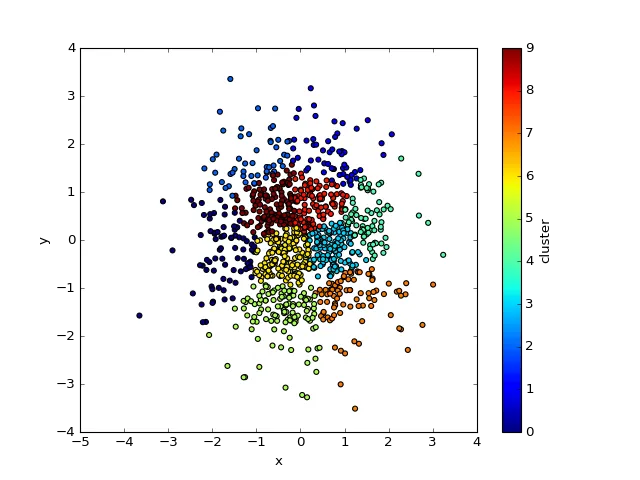
旧的简单解决方案
如果您可以接受颜色条(而不是离散值标签),则可以使用 Pandas 内置的 Matplotlib 功能:
df.plot.scatter('x', 'y', c='cluster', cmap='jet')