问题:在Matplotlib中绘制多个直方图时,我无法区分一个图形和另一个图形。
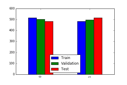
问题图片:**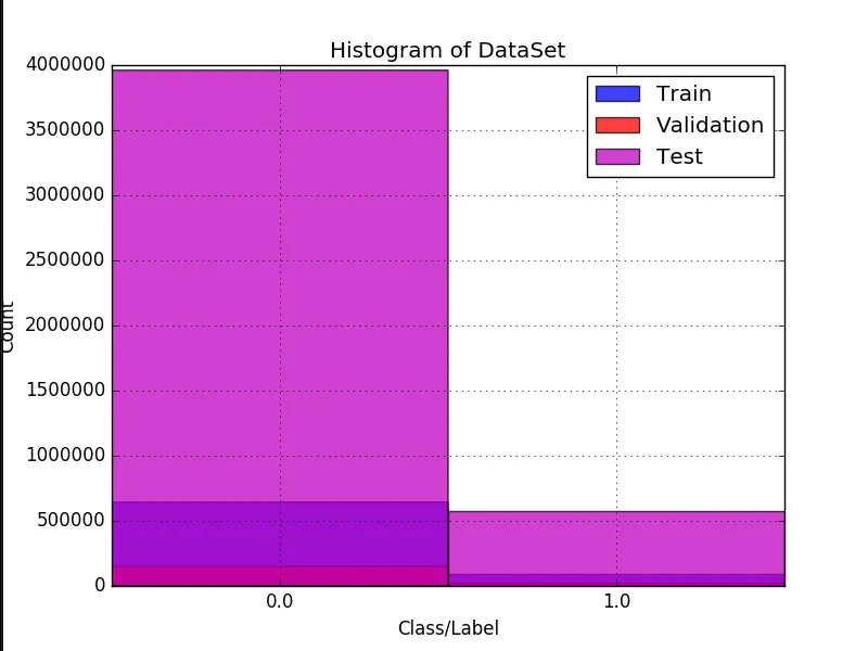 **小问题:左侧标签“Count”部分超出图像。为什么?
描述:
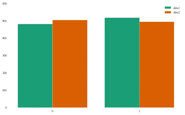
我想绘制3个不同集合的直方图。每个集合都是由0和1组成的数组。我想要每个集合的直方图,以便检测数据集中的不平衡情况。
我已经将它们单独绘制出来了,但我希望将它们一起绘制成一个图形。
可以将条形并排绘制成不同的图形,或者甚至可以将其绘制为三维图形,但我不知道阅读或理解该图形有多容易。
现在,我想在同一图形的每侧绘制[训练]、[验证]和[测试]条形。就像这样:
现在工作了,但左侧的标签有点超出边界,我想更好地居中条形图... 我该怎么做?
结果: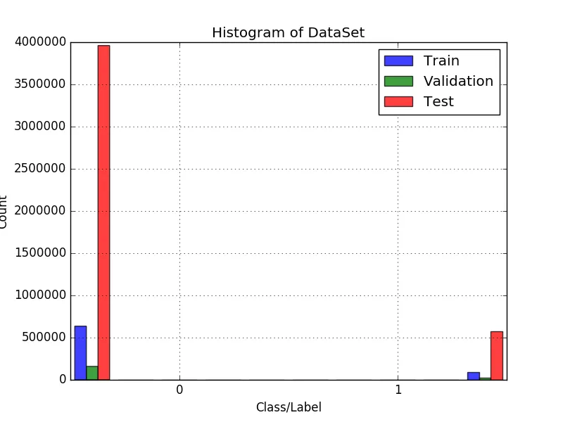
问题图片:**
**小问题:左侧标签“Count”部分超出图像。为什么?描述:
我想绘制3个不同集合的直方图。每个集合都是由0和1组成的数组。我想要每个集合的直方图,以便检测数据集中的不平衡情况。
我已经将它们单独绘制出来了,但我希望将它们一起绘制成一个图形。
可以将条形并排绘制成不同的图形,或者甚至可以将其绘制为三维图形,但我不知道阅读或理解该图形有多容易。
现在,我想在同一图形的每侧绘制[训练]、[验证]和[测试]条形。就像这样:
PS:我的搜索没有返回任何我能理解的代码。另外,我希望有人检查一下我的代码是否存在任何疯狂行为。
非常感谢大家!
代码:
def generate_histogram_from_array_of_labels(Y=[], labels=[], xLabel="Class/Label", yLabel="Count", title="Histogram of Trainset"):
    plt.figure()
    plt.clf()

    colors = ["b", "r", "m", "w", "k", "g", "c", "y"]

    information = []
    for index in xrange(0, len(Y)):
        y = Y[index]

        if index > len(colors):
            color = colors[0]
        else:
            color = colors[index]

        if labels is None:
            label = "?"
        else:
            if index < len(labels):
                label = labels[index]
            else:
                label = "?"

        unique, counts = np.unique(y, return_counts=True)
        unique_count = np.empty(shape=(unique.shape[0], 2), dtype=np.uint32)

        for x in xrange(0, unique.shape[0]):
            unique_count[x, 0] = unique[x]
            unique_count[x, 1] = counts[x]

        information.append(unique_count)

        # the histogram of the data
        n, bins, patches = plt.hist(y, unique.shape[0], normed=False, facecolor=color, alpha=0.75, range=[np.min(unique), np.max(unique) + 1], label=label)

    xticks_pos = [0.5 * patch.get_width() + patch.get_xy()[0] for patch in patches]

    plt.xticks(xticks_pos, unique)

    plt.xlabel(xLabel)
    plt.ylabel(yLabel)
    plt.title(title)
    plt.grid(True)
    plt.legend()
    # plt.show()

    string_of_graphic_image = cStringIO.StringIO()

    plt.savefig(string_of_graphic_image, format='png')
    string_of_graphic_image.seek(0)

    return base64.b64encode(string_of_graphic_image.read()), information
编辑
根据hashcode的回答,这段新代码:
def generate_histogram_from_array_of_labels(Y=[], labels=[], xLabel="Class/Label", yLabel="Count", title="Histogram of Trainset"):
    plt.figure()
    plt.clf()

    colors = ["b", "r", "m", "w", "k", "g", "c", "y"]
    to_use_colors = []
    information = []


    for index in xrange(0, len(Y)):
        y = Y[index]

        if index > len(colors):
            to_use_colors.append(colors[0])
        else:
            to_use_colors.append(colors[index])

        unique, counts = np.unique(y, return_counts=True)
        unique_count = np.empty(shape=(unique.shape[0], 2), dtype=np.uint32)

        for x in xrange(0, unique.shape[0]):
            unique_count[x, 0] = unique[x]
            unique_count[x, 1] = counts[x]

        information.append(unique_count)

    unique, counts = np.unique(Y[0], return_counts=True)
    histrange = [np.min(unique), np.max(unique) + 1]
    # the histogram of the data
    n, bins, patches = plt.hist(Y, 1000, normed=False, alpha=0.75, range=histrange, label=labels)


    #xticks_pos = [0.5 * patch.get_width() + patch.get_xy()[0] for patch in patches]

    #plt.xticks(xticks_pos, unique)

    plt.xlabel(xLabel)
    plt.ylabel(yLabel)
    plt.title(title)
    plt.grid(True)
    plt.legend()
正在生产这个:
def generate_histogram_from_array_of_labels(Y=[], labels=[], xLabel="Class/Label", yLabel="Count", title="Histogram of Trainset"):
    plt.figure()
    plt.clf()

    information = []

    for index in xrange(0, len(Y)):
        y = Y[index]

        unique, counts = np.unique(y, return_counts=True)
        unique_count = np.empty(shape=(unique.shape[0], 2), dtype=np.uint32)

        for x in xrange(0, unique.shape[0]):
            unique_count[x, 0] = unique[x]
            unique_count[x, 1] = counts[x]

        information.append(unique_count)

    n, bins, patches = plt.hist(Y, normed=False, alpha=0.75, label=labels)

    plt.xticks((0.25, 0.75), (0, 1))

    plt.xlabel(xLabel)
    plt.ylabel(yLabel)
    plt.title(title)
    plt.grid(True)
    plt.legend()
现在工作了,但左侧的标签有点超出边界,我想更好地居中条形图... 我该怎么做?
结果:
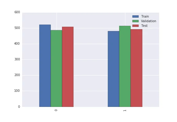
bins参数,默认设置为 10。只需像这样添加一个 bins 参数 -n,bins,patches = plt.hist(Y,bins = 2,normed=False,alpha=0.75,range=histrange,label=labels)。 - hashcode55rcparams来完成。从matplotlib中导入rcParams。 - hashcode55