我将尝试使用
seaborn和pandas创建这种“并排”的条形图。
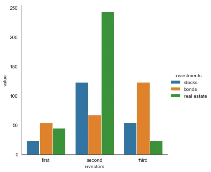
以下是我创建数据框的方式:
dfs = pd.DataFrame(data={'investors': ['first','second','third'], 'stocks': [23, 123, 54], 'bonds': [54, 67, 123], 'real estate': [45, 243, 23]})
以下是条形图的代码:
sns.factorplot(x='investors', y='bonds', data=dfs, kind='bar')
有人可以帮忙吗?谢谢