如何用渐变填充matplotlib柱形图?

6
我对使用不同渐变填充matplotlib/seaborn条形图非常感兴趣,就像这里所做的那样(据我所知,不是使用matplotlib): enter image description here 我还查看了这个相关主题Pyplot: vertical gradient fill under curve?
这只能通过gr-framework实现吗: enter image description here 还是有其他替代策略?
4个回答

10
如同在Pyplot: vertical gradient fill under curve?中所描绘的那样,我们可以使用图像来创建渐变图。由于条形图是矩形的,因此图像的范围可以直接设置为条形的位置和大小。我们可以循环遍历所有的条形,并在相应的位置创建一个图像。最终结果是一个渐变条形图。
import numpy as np
import matplotlib.pyplot as plt

fig, ax = plt.subplots()

bar = ax.bar([1,2,3,4,5,6],[4,5,6,3,7,5])

def gradientbars(bars):
    grad = np.atleast_2d(np.linspace(0,1,256)).T
    ax = bars[0].axes
    lim = ax.get_xlim()+ax.get_ylim()
    for bar in bars:
        bar.set_zorder(1)
        bar.set_facecolor("none")
        x,y = bar.get_xy()
        w, h = bar.get_width(), bar.get_height()
        ax.imshow(grad, extent=[x,x+w,y,y+h], aspect="auto", zorder=0)
    ax.axis(lim)

gradientbars(bar)

plt.show() 

enter image description here


5

我正在使用带有palette选项的seaborn barplot。假设你有一个简单的数据框:

df = pd.DataFrame({'a':[1,2,3,4,5], 'b':[10,5,2,4,5]})

使用 seaborn:

sns.barplot(df['a'], df['b'], palette='Blues_d')

您可以获得类似以下的东西:

enter image description here

然后您还可以通过添加渐变来使用palette选项和colormap,根据一些数据进行调整:
sns.barplot(df['a'], df['b'], palette=cm.Blues(df['b']*10)

获取:

enter image description here

希望这有所帮助。


3
非常感谢,但我正在寻找每个条形图内相同的渐变效果,而不是跨越不同条形图的渐变效果! - cattt84

4
我使用Seaborn而不是Matplotlib来改编@ImportanceOfBeingErnest的回答here
import matplotlib.pyplot as plt
import seaborn as sns
import numpy as np

def gradientbars(bars):
    grad = np.atleast_2d(np.linspace(0,1,256)).T # Gradient of your choice

    rectangles = bars.containers[0]
    # ax = bars[0].axes
    fig, ax = plt.subplots()

    xList = []
    yList = []
    for rectangle in rectangles:
        x0 = rectangle._x0
        x1 = rectangle._x1
        y0 = rectangle._y0
        y1 = rectangle._y1

        xList.extend([x0,x1])
        yList.extend([y0,y1])

        ax.imshow(grad, extent=[x0,x1,y0,y1], aspect="auto", zorder=0)

    ax.axis([min(xList), max(xList), min(yList), max(yList)*1.1]) # *1.1 to add some buffer to top of plot

    return fig,ax


sns.set(style="whitegrid", color_codes=True)
np.random.seed(sum(map(ord, "categorical")))

# Load dataset
titanic = sns.load_dataset("titanic")

# Make Seaborn countplot
seabornAxHandle = sns.countplot(x="deck", data=titanic, palette="Greens_d")
plt.show() # Vertical bars with horizontal gradient

# Call gradientbars to make vertical gradient barplot using Seaborn ax
figVerticalGradient, axVerticalGradient = gradientbars(seabornAxHandle)

# Styling using the returned ax
axVerticalGradient.xaxis.grid(False)
axVerticalGradient.yaxis.grid(True)

# Labeling plot to match Seaborn
labels=titanic['deck'].dropna().unique().to_list() # Chaining to get tick labels as a list
labels.sort()
plt.ylabel('count')
plt.xlabel('deck')
plt.xticks(range(0,len(labels)), labels)  # Set locations and labels

plt.show() # Vertical bars with vertical gradient

Seaborn计数图的输出: Seaborn计数图输出

带有垂直渐变条的输出: 带有渐变条的输出


1

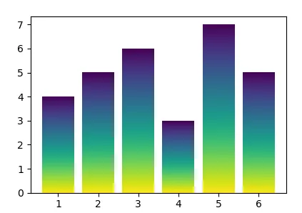
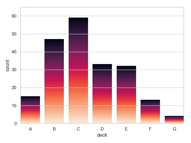
不确定这种样式是否有帮助,因为颜色几乎没有任何指示作用,只是让你的图表看起来更好一点。

A Sample Figure

我结合了@ImportanceOfBeingErnest的答案和@unutbu的答案来形成这个解决方案。修改的方法是将截断的颜色映射传递给ax.imshow()
import numpy as np
import matplotlib.pyplot as plt
import matplotlib.colors as colors


def truncate_colormap(cmap, min_val=0.0, max_val=1.0, n=100):
    """
    Truncate the color map according to the min_val and max_val from the
    original color map.
    """
    new_cmap = colors.LinearSegmentedColormap.from_list(
        'trunc({n},{a:.2f},{b:.2f})'.format(n=cmap.name, a=min_val, b=max_val),
        cmap(np.linspace(min_val, max_val, n)))
    return new_cmap


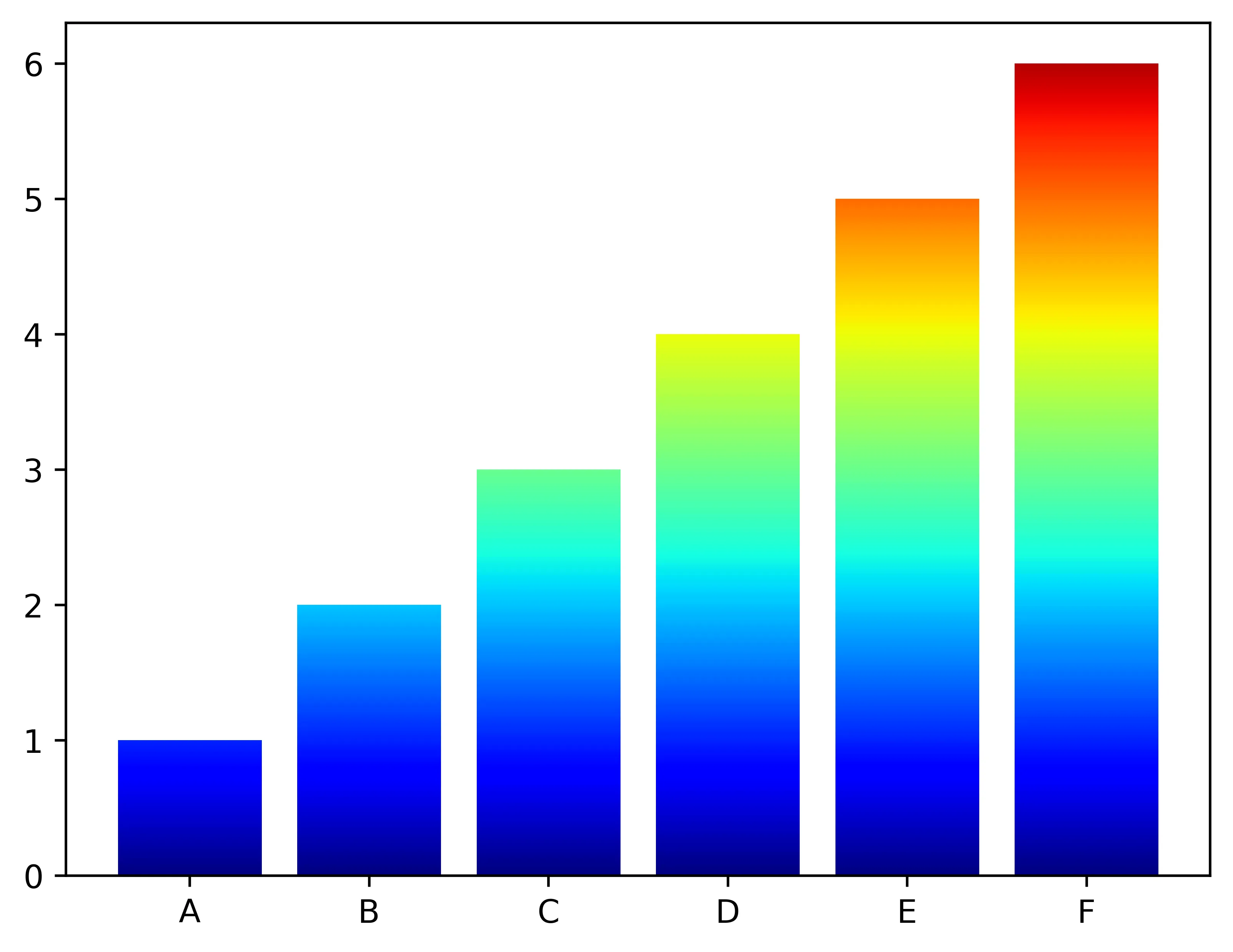
x = ['A', 'B', 'C', 'D', 'E', 'F']
y = [1, 2, 3, 4, 5, 6]

fig, ax = plt.subplots()
bars = ax.bar(x, y)

y_min, y_max = ax.get_ylim()
grad = np.atleast_2d(np.linspace(0, 1, 256)).T
ax = bars[0].axes  # axis handle
lim = ax.get_xlim()+ax.get_ylim()
for bar in bars:
    bar.set_zorder(1)  # put the bars in front
    bar.set_facecolor("none")  # make the bars transparent
    x, _ = bar.get_xy()  # get the corners
    w, h = bar.get_width(), bar.get_height()  # get the width and height

    # Define a new color map.
    # For instance, if one bar only takes 10% of the y-axis, then the color
    # map will only use the first 10% of the color map.
    c_map = truncate_colormap(plt.cm.jet, min_val=0,
                              max_val=(h - y_min) / (y_max - y_min))

    # Let the imshow only use part of the color map
    ax.imshow(grad, extent=[x, x+w, h, y_min], aspect="auto", zorder=0,
              cmap=c_map)
ax.axis(lim)

plt.show()

提示:很抱歉无法使用嵌入式图像。


网页内容由stack overflow 提供, 点击上面的
可以查看英文原文,
原文链接